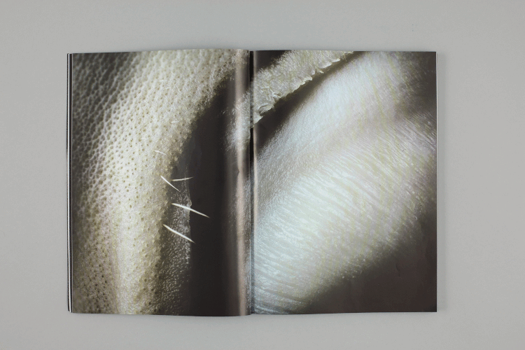
Anyway, from looking at this magazine I found I really appreciated the aesthetic and finish, it felt like a professional and contemporary publication. Although our vagina guide will only have illustrations, I want to think about ways to include different stocks, layers, types and arrangements. The magazine uses metallic ink and paper which really stands out and creates another layer to the design. The use of negative space is also something I want to look at - the open spaces really emphasise the imagery and text. Because the vagina guide will have a large amount of information to communicate, it will be important to make sure each page isn't overcrowded.
No comments:
Post a Comment