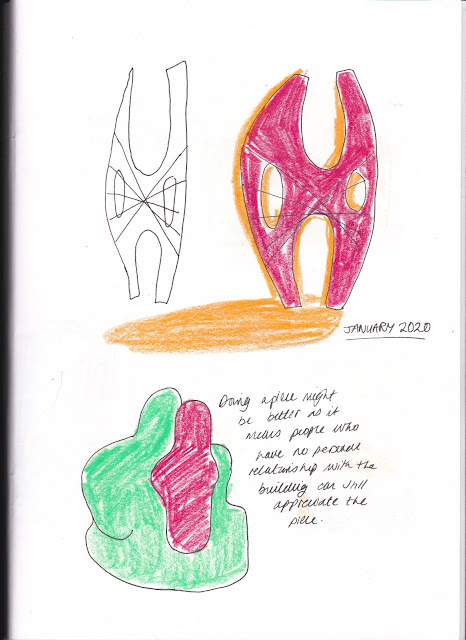
I then began experimenting with the different ways the gallery images could be laid out. I wanted to take a very shape based approach and considering I wanted to screen print the calendars, I began thinking about what the inks would look like if the shapes overlapped. The blue and yellow for example might potentially make a green hue - creating an interesting overlapped effect. I also did some brief experiments with layout, thinking about where the coloured image would be most fitting on the page.
From doing these sketches I realised that the art pieces of each gallery may work better than the actual architecture. People who buy the calendars will be lovers of art but not necessarily of architecture. If they have never visited the gallery of that month, they will have no personal connection with it and may view it as just a building. Whereas with an art piece, they may recognise it or the artist, or even just appreciate the piece as it is.
I wanted to think about how using two colours for the print can be implemented in the illustration - make it in one colour and then giving the shape a shadow was one consideration. This could especially work as if there is some misalignment in the printing process it will work in the design's favour.


No comments:
Post a Comment