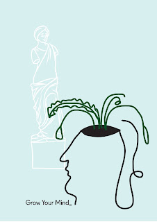
I then developed the more abstract sketches to represent a person with a plant growing from their head because they visited a museum or gallery. The colours were soft and muted but arranged to resemble simple abstract art. From feedback it was suggested that these were nice but were perhaps too ambiguous and don't even immediately indicate that the shape is a head. These could have been developed to be more detailed and obvious but the project went in a different direction after this.
Another abstract illustration was created based on previous sketches and the art in the background is inspired by Matisse. These again are quite ambiguous and perhaps need further development. The line needs to be developed to further resemble the ArtFund branding line, to give the idea more grounding. I believe these designs might be too abstract and arty to appeal to the general student market. The designs need to be better considering the audience and think in more obvious and general terms in order to meet the brief requirements.


No comments:
Post a Comment