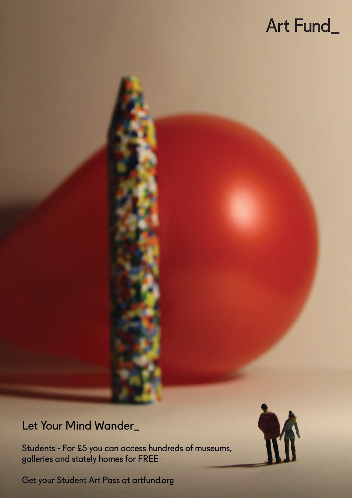
Below are some of the more successful photographs. It felt important to have the two foreground figures in focus to convey that it is their personal experience and opportunity to have the minds broadened. I also ensured that in each composition, the figures were only in a small section of the image - building on the idea of being in an open space for the imagination and to allow for additional text and details explaining the student art pass above.


I then took some faces involving some doll parts which I sourced for the project. I originally thought that these would be quirky and interesting and indicate to the viewer how a gallery can surprise you and isn't all about traditional art. I thought that these would fit within the current modern trend of retro horror, which can be seen in popular student shows such as Stranger Things. However, due to the lighting, and lets be honest, the general connotations dolls have, this photographs look far more sinister and out of place in comparison to the balloon and crayon compositions.
Although they don't have quite the right atmosphere, in many respects I still think they produce curiosity and indicate a deeper layer of meaning modern art can have. The doll's head caught in the tree in certainly too sinister, but the pieces in the jar could indicate a far deeper meaning involving body image or something similar. I also thought the composition with the jar resting in the middle of the page could produce an interesting outcome - so I began doing some digital experiments.


The main aim of the designs was to still carry though this 'thought strand' idea, linking to the Art Fund branding and the idea of detox. I thought the white worked well in contrast to the warmer tones of the images. Also the designs were the lines are free flowing rather than looping felt a lot more relevant to the idea of letting your mind wander free (not constrained by day-to-day worries.)
I also thought that the designs involving the larger text 'Let Your Mind Wander_' stood out far better. All the typography is Art Fund's branding typeface to keep the designs consistent with the brand, keeping the images professional. Although in these designs on black writing was experimented with and this did appear to be lost on the page. For any other colour text to work well the background image needed to be white, rather than cream, so I began planning to re-shoot the images (also considering a change in sculptural content...!)


No comments:
Post a Comment