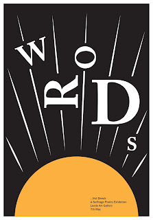
I then began experimenting with imagery involving a sun. This is because in a lot of suffragette design work there are suns in the background - perhaps symbolising the dawn of a new day. These experiments worked to an extent but are not so well related to the poetry theme. In some where red has been used they look more violent and physical - with the shafts of light cutting through the words angrily. This was not my intention, I wanted the words seem part of the composition - not in conflict with it. Although I suppose this does iterate the strong and powerful actions of the suffragettes - but really the purpose of this exhibition is to showcase that peaceful protest also has some merit.
Adding the orange tone made the design look a lot better, it paid better reference the original Bugler Girl image and gives a general more peaceful atmosphere - with impact still being achieved by the extreme size of the letters and the forceful direction of the lines.
I then experimented with adding the '...not deeds' a lot larger than the previous designs. This worked to an extent and was a lot more successful in lowercase. The Caslon typeface works to create a literary style aesthetic, which is key when the content of the exhibition will be poetry. Perhaps something like this could be explored further in future.
Finally, The image of the woman's face was added to the designs to test how this would look within the composition, it didn't work amazingly but having another layer did create some depth. Perhaps adding something different in the foreground would be much more successful. The inverted design with the black background seems to work a lot better, it makes the design felt light and powerful and balances the composition well.


No comments:
Post a Comment