The colours shown below are just used to exemplify a lighter layer and a darker layer. There will be further colour experiments later on.


I then split the design into the separate colours so the negatives could be exposed. This was an intricate process using the layers feature in Illustrator, but the results are worth it.


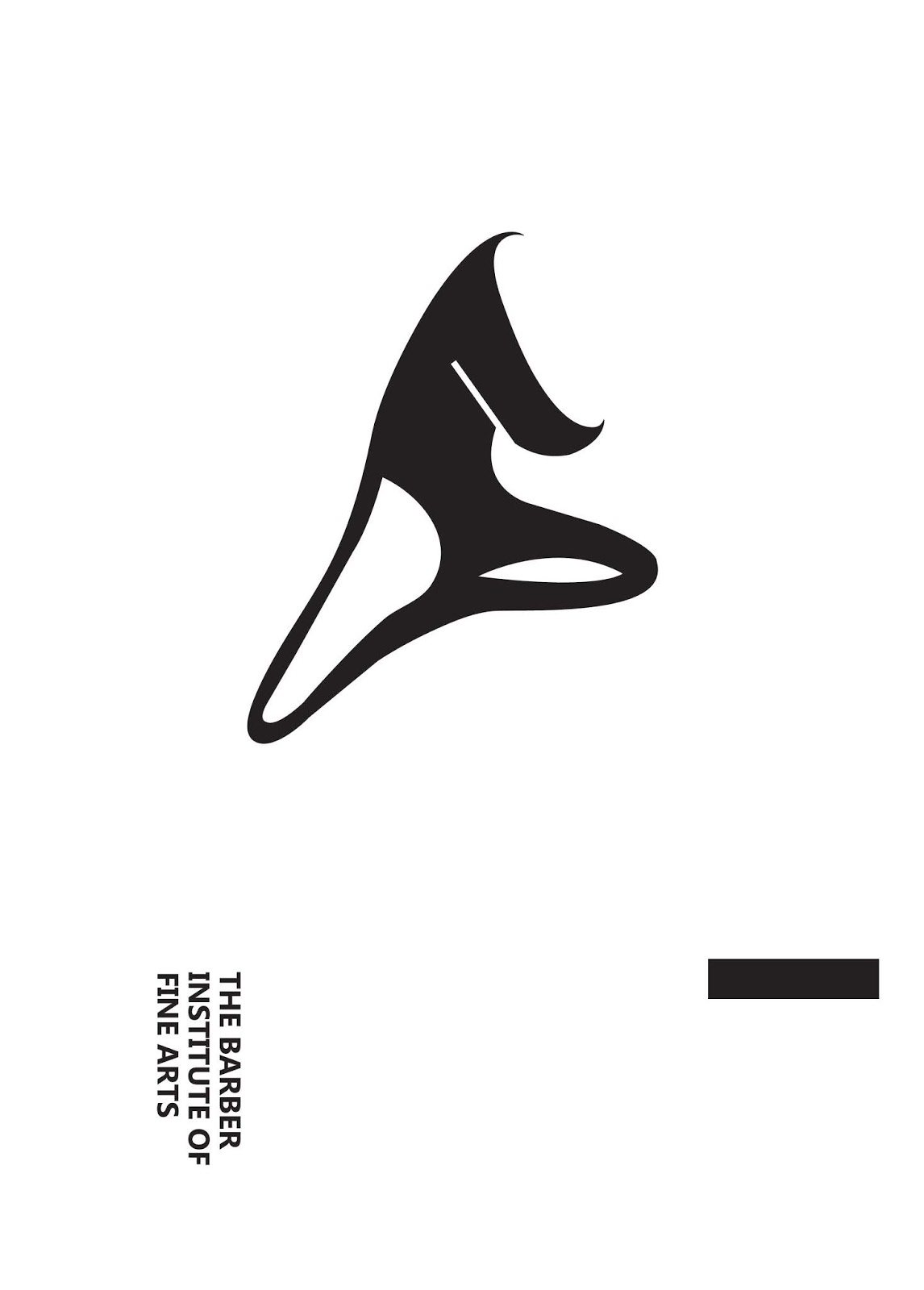
Below shows the second colour negatives. In some ways simplifying these designs down into their core shapes, using only black makes them powerful and strong. This is something I may experiment with in future. The designs need colour in order to better represent the range of art in galleries across the UK.


No comments:
Post a Comment