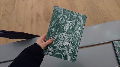
I looked at the gallery catalogue and the aesthetic has been communicated effectively. By toning the image to have a green hue it allows the title '50 50' to stand out well. Shortening the title was also an effective idea and means the cover is not crowded. It creates a contemporary item that people will likely buy to remind them of the exhibition or to use for reference. The addition of the purple strip is simple but it rounds off the design well, and makes the design consistent with the overall branding. I did find it odd that the same image has been used for both the cover and the back so perhaps it could have been made better if two separate images had been used.
The exhibition branding was shown here again through the way the walls have been painted and through the typography used. The information has been laid out in quite a classic and traditional way which reflects the content of the project. I wonder if this could be subverted so that the branding modernises and refreshes the concept of the exhibition. So that the branding shows a more modern feminist style which could be paralleled with the traditional art pieces.
"Re-vision - the act of looking back, of seeing with fresh eyes, of entering an old text from a new critical direction - is for women more than a chapter in cultural history: is is an act of survival" - Adrienne Rich.
The exhibition guide used this quote to explain the purpose of the exhibition. It shows that the act of reinserting lost voices and reclaiming their historical presence is important for the future status of female artists. And this is true for suffragette design too - their work and actions need to be seen with fresh eyes and taken in new directions. And I need to consider ways that design can reflect this.
I then took pictures of a few of the works from the exhibition, thinking about styles and colour schemes which could be recreated in branding for a similar exhibition. I liked the more abstract pieces best although I also thought the women in the first image, doing aviation work, was quite powerful. Perhaps something that has a similar aesthetic, with the combination of thicker and lighter lines might work well. The image also feels quite unique or 'untold' and that in part, is what makes it so striking. I also particularly liked the colour scheme of the second image by Amy Gladys Donovan, I thought the simple, serious colours worked well together and could be something I take swatches from for later designs.
 |
| Ethel Gabain - 'Women's Work in the War' c.1940 |
 |
| Amy Gladys Donovan - 'Self-portrait' 1926 |
 |
| Ithell Colquhoun - 'Tree Anatomy' 1942 |
 |
| Marion Adnams - Medusa Grown Old 1947 |


No comments:
Post a Comment