Layout Developments - The Vagina Guide - External Collaboration Brief
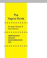
- Due to feedback it was suggested that two of the covers could be developed further. One as the cover and one as the contents.
- It was important that the cover was more simple and striking so as to not overwhelm or off-put the viewer.
- The red design with the typographic style was favoured because it creates a strong link with the teenage audience - who often favour digital means of communication. Printing it physically was to create an interesting juxtaposition.
- The title was experimented with but eventually a centered version was favoured because it matched the symmetrical nature of the type imagery.


- Feedback suggested that the most successful layout was the cover design which involved two additional side panel pages with information. So it was decided that this would be the contents.
- Different versions of the panel were experimented with in order to maintain a quirky teenager aesthetic.
- The lines were varied - dots/zig-zag/wave but these felt too childish and eventually a thick line was taken forward.
- The yellow was to be printed on yellow paper, so as the colour was strong and full. Creating more interest because of the change in stock.
- Different layouts were experimented with. Considering indents and numbering.
- Indents looked strange so were eventually changed.
- Each section has been given a number so it is easier to reference and creates a more orangised and professional aesthetic for the book - and less like a zine.
- A white background was experimented with for the text sections but this didn't work as well as it separated the information from the composition too much.


- Titles and key words were written in different colours in order to create more emphasis.
- After experimentation on each white page the titles were in red and on each black page the titles were made yellow. This is to match the aesthetic of the illustrations.
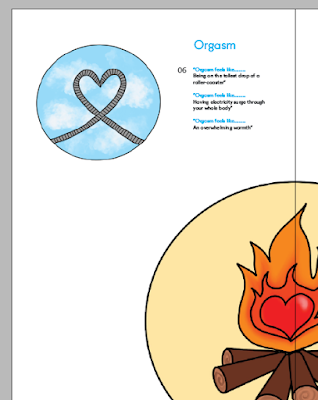
- Since the illustrations were circular they were sometimes difficult to place, but eventually they were made to follow a grid - rather than overlap in this way.
- The paragraphs also follow a grid and are clear and precise but are also arranged in interesting and unusual ways - such as starting the information close to the bottom of the page so there is negative space above.


- Colours were experimented with on several of the pages but eventually it was decided that the guide would be refined and only use white, pink, red and black backgrounds in order to remain consistent.
- There was also some type experiments, all using the typeface Embrima as it is bold and striking. These are playful and mean that the page is more interesting to look at. The type arrangement compliments the imagery.
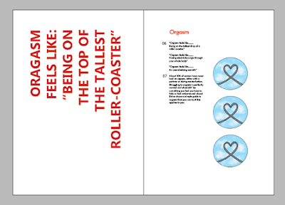
- Layouts for the circular images were experimented with. When made large and inconsistent with each other, it seemed too childish.
- They were more effective and mature when made smaller to allow some space within the design
- One of the quotes from the text was experimented with in order to give it added emphasis. This worked best when it was diagonal, because of the way the words are shaped.
- The image of the roller-coaster was placed underneath the text in order to frame the words.
- This has taken a highly experimental approach and reflects the experimental nature of the teenage experience, especially concerning sexuality.
- A middle insert was experimented with to add some additional information and create another reason for engagement.
- This was to be on yellow stock to create consistency with the yellow stock used early on.
- Throughout the book it was important to also showcase Hope's illustrations. So for this spread the illustration was made large against a red background, so it would pop from the page.
- Due to the page structure another piece of information had to be slotted underneath this, removing some of the impact. However, upon reflection this works well to maintain the informative aesthetic of the publication - with a lot of text on both pages the spread feels full and informative but still stylised but the colour and large illustration.


No comments:
Post a Comment