
These designs are called matchbook calendars and I thought they used an interesting folding technique which I considered for the gallery calendar. It would be an interesting use of serration but it does mean that each sheet of the calendar would have to be torn away once used - which in some respects would make the calendar less of something special to keep once used. This design also doesn't include imagery which is something I am keen to implement for the gallery calendar. This method of propping up is notable however.

I then looked at some ring bound calendars and methods that I could recreate this type of binding. The first image below shows a patterned letterpress calendar by 'Linda and Harriet'. I thought this created a really simple but effective design. The use of hand printing seems to create a truly contemporary and stylised design and is something I would like to consider doing.
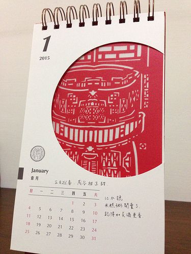
I also looked at this calendar 'Rediscover Old House' which used layers of paper to create an interesting design. The idea of cutting shapes to see through to under-layers is interesting, especially simple geometric shapes. It looks very considered and contemporary.

Since printing by hand is one of my main ideas I looked at a screen-printed calendars. I really liked this style, especially the playful layouts and pastel illustrations. It seemed to be intentionally misaligned which is something interesting to think about.
Then I looked at some prints by the stuido Raw Color for Keukenconfessies, a food design studio. These had a really interesting style, that was completely made by their hand-printed texture. I also think that the simple, shape based illustrations work well, especially with two tones overlaid to make another colour in the overlap.


Finally, I found a calendar design that rests on an card easel, I thought this was a really clever idea and could be something to explore. It takes the idea of an art institution and represents it physically in its core frame. I would have to consider how this would be constructed though and how it would fold down.

No comments:
Post a Comment