Tuesday 30 April 2019

Poems To Be Used in the Exhibition - Suffragette Design - Research-led Brief

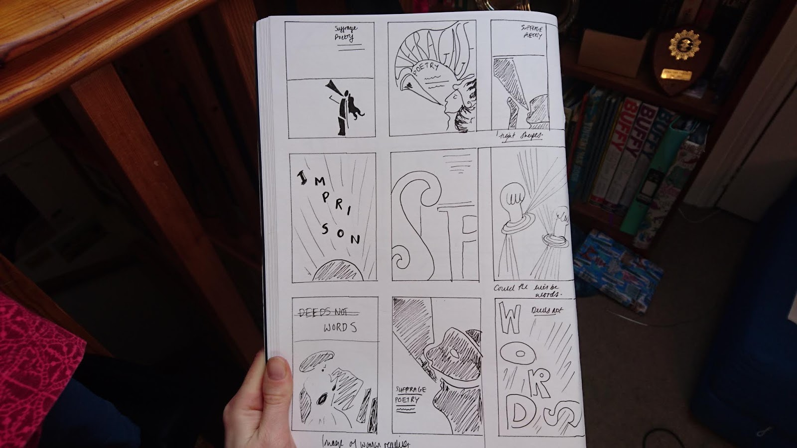
Often the poems written by suffragists about their experiences, are only discussed as 'visual artefacts' and nothing more to the movement. Links between the fight for enfranchisement and women's poetry concentrating on themes of disenfranchisement are still overlooked by many current anthologists and critics The purpose of this exhibition is to explore these poems, considering their impact on those both pro and anti-suffrage. It will highlight unspoken stories and gave suffrage poets the recognition they deserve. 

A suffrage poetry exhibition – celebrating poetry written by suffragists about their fight for the vote.

The Dreamer 
 
By Eva Gore-Booth
 
All night I stumble through the fields of light,
And chase in dreams the starry rays divine
That shine through soft folds of the robe of night,
Hung like a curtain round a sacred shrine.

When daylight dawns I leave the meadows sweet
And come back to the dark house built of clay,
Over the threshold pass with lagging feet,
Open the shutters and let in the day.

The gray lit day heavy with griefs and cares,
And many a dull desire and foolish whim,
Leans o’er my shoulder as I spread my wares
On dusty counters and at windows dim.

She gazes at me with her sunken eyes,
That never yet have looked on moonlit flowers,
And amid glaring deeds and noisy cries
Counts out her golden tale of lagging hours.

Over the shrine of life no curtain falls,
All men may enter at the open gate,
The very rats find refuge in her walls—
Her tedious prison walls of love and hate.

Yet when the twilight vails that dim abode
I bar the door and make the shutters fast,
And hurry down the shadowy western road,
To seek in dreams my starlit home and vast.

The Anti-Suffragist 
 
By Eva Gore-Booth
 
The princess in her world-old tower pined
A prisoner, brazen-caged, without a gleam
Of sunlight, or a windowful of wind;
She lived but in a long lamp-lighted dream.

They brought her forth at last when she was old;
The sunlight on her blanched hair was shed
Too late to turn its silver into gold.
Ah, shield me from this brazen glare!” she said.


The Eternal Rebel 
 
By Eva Gore-Booth
 
1914

The phantoms flit before our dazzled eyes,
Glory and honour, wrath and righteousness,
The agèd phantoms in their bloodstained dress,
Vultures that fill the world with ravenous cries,

Swarming about the rock where, chained apart,
In age-long pain Prometheus finds no rest
From the divine flame burning in his breast,
And vultures tearing at a human heart.

Not yet the blessed hours on golden wings
Bring to the crucified their sure relief,
Deeper and deeper grows the ancient grief,
Blackest of all intolerable things.

Eternal Rebel, sad, and old, and blind,
Bound with a chain enslaved by every one
Of the dark gods who hide the summer sun,
Yet art thou still the saviour of mankind.

Free soul of fire, break down their chains and bars,
Drive out those unclean phantoms of the brain,
Till every living thing be friends again,
And our lost earth true comrade to the stars.


CHARLOTTE PERKINS GILMAN

1911

WOMEN OF TO-DAY
 
You women of today who fear so much
The women of the future, showing how
The dangers of her course are such and such–
What are you now?
Mothers and Wives and Housekeepers, forsooth!
Great names, you cry, full scope to rule and please,
Room for wise age and energetic youth!–
But are you these?
Housekeepers? Do you then, like those of yore,
Keep house with power and pride, with grace and ease?
No, you keep servants only! What is more–
You don't keep these!
Wives, say you? Wives! Blessed indeed are they
Who hold of love the everlasting keys,
Keeping your husbands' hearts! Alas the day!
You don't keep these!
And mothers? Pitying Heaven! Mark the cry
From cradle death-beds! Mothers on their knees!
You don't keep these!
And still the wailing babies come and go,
And homes are waste, and husband's hearts fly far;
There is no hope until you dare to know
The thing you are!

SHE WALKETH VEILED AND SLEEPING

SHE WALKETH veiled and sleeping,
For she knoweth not her power;
She obeyeth but the pleading
Of her heart, and the high leading
Of her soul, unto this hour.
Slow advancing, halting, creeping,
Comes the Woman to the hour!–
She walketh veiled and sleeping,
For she knoweth not her power.

Sylvia Pankhurst

The Mothers

O pregnant womanhood that scarce can drag
thy weary ripeness round the allotted track,
and soon would rest thee on unkindly breath,
closely foregathering like affrighted sheep;
In these thy days of fruitfulness thou’rt robbed
of those dear joys that should thy state enrich,
making thy presence blossom like thy womb
and with a sweet expectancy thy thoughts to leap;
a changeless sadness girdles thee about;
each sister, whispers faltering unto each
and with wan smiles and pleading arms outstretched,
thou turn'st towards youngling babes, born ’twixt these walls,
pledges to thee that thy regretful fruit
will not be monstrous though in prison grown.

Wednesday 24 April 2019

Suffrage and Poetry: Radical Women's Voices by Deborah Tyler-Bennett - Suffragette Design - Research-led Brief

I began reading poetry section of 'The Women's Suffrage Movement: New feminist perspectives' to find more details about the poems, their effect and what they represented.

'Links between the fights for enfranchisement and women's poetry concentrating on themes of disenfranchisement are still overlooked by many current anthologists and critics.' - p117

They are considered 'visual artifacts (such as those produced by the suffrage atelier)' but people discuss less the actual impact of both poets who were both pro and anti-suffrage. - p117 This will be the purpose of the exhibition, to tell these unspoken stories and their impact.

'Poetry was read avidly by women for it's 'subversive' challenging qualities.' -p117 - are the ways to make comparable subversive design.

In 'A Woman's Answer' Adelaide Anne Procter creates a female voice who responds to her lovers complaint that her love is not exclusive. Her reply 'proves' her love, but also exposes that romantic affection is just a construct. A lot of poetry was written like this in the 19th century - where an outwardly conventional plot reveals thinly disguised subversion. I could begin to think about ways that this could be visually represented p118

'Traditional educationalists often regarded poetry as a dangerous form' p119 and that it would jeopardise domestic duties.p120

'For middle-class readers the pleasures of poetry dealing with violent emotion (when conduct books and parental authority advocated a repression of 'self') is obvious' - it has subversive appeal and 'pleasurable wickedness' p120

'Beyond the bars I see her move,
A mystery in blue and green,
As though across the prison yard
The spirit of spring had been.' 

- Laura Grey 'To D.R. in Holloway, Holloway Jingles (1912)

'Poems provided a means of demonstrating solidarity, and also of communicating and responding to emotions created by incarceration.' p121 They depicted women being trapped - 'either in prison or within the confines of their gender.' 

Eva Gore-Booth was the most recognised poet involved in the suffrage movement. She used experience of suffrage campaigns and her personal pacifism (as a member of the Women's Peace Crusade). She also advocated rights for working class women (which was often ignored previously by the suffrage movement) and founded the Manchester's Women Textile Workers' Union. She also had a lesbian relationship with Esther Roper which heavily influenced her work.

Taken from Wikepdia:

'Her widely discussed sexuality in later years is never declared but her poetry reflects it quite overtly. In her Triumph of Maeve she makes a minor scene between Maeve and a wise woman almost erotic. While in her legend of Deirdre she subverts the masculine nationalist identity of Ireland's heroic tales. In her early work she uses the same poetic devises that her male counterparts do such as writing a love poem to the goddess of Nature. In these she does not take a male voice though. She is writing love verse from one woman to another. Eva Gore-Booth was also one of a group of editors of the magazine Urania that published issues three times a year from 1916 to 1940. It was a feminist magazine that reprinted stories and poems from all over the world with editorial comment. A lot of prominent New Woman authors including Mona Caird were involved with the project. Each issue declared that sex was an accident and there were no intrinsic characteristics of the male or the female. Many New Woman issues were discussed such as gender equality, suffrage and marriage but Eva Gore-Booth went further than that to write poetry about women loving women. Even the title of the magazine Urania can refer to heavenly or Uranian another term for homosexual. Eva and Esther allowed their names to be used in connection with the periodical and Eva was considered to be an inspiration for Urania. - Research Urania

Having looked through the book, it shows illustrations that accompanying the poems - drawn at the time. This gave me the idea that I could potentially modernise these illustrations for the exhibition guides, thinking about ways these traditional drawings could be retold.

Regular Practice Inspiration and Studio Visit - Suffragette Design - Research-led Brief

Tom Finn and Kristoffer Søling did their masters together at the Royal College of Art. They first collaborated together when they did a poster for the typographic singularity. This worked well and lead them to do some for the Lonely Hearts Jazz Club which involved creating a typeface made out of heart shapes split into fours. They enjoyed recontextualising found typography in a contemporary context.

They suggest you should push work for future opportunities. They used any opportunity to do work they were interested in and eventually invested in a small studio space so they would feel like it was a job they'd take seriously. They share an enthusiasm for form and visual expression, they did rocket lollies which didn't have much depth but were quite playful.

I particularly wanted to focus on their typographic work, as they have used this a lot within their work - often for exhibition design. They take a very playful approach and like to deconstruct type, which is something I would be interested in experimenting with.

Alice & Oliver Play Jazz

The designs show complex and experimental compositions with interesting layering. In some ways they are quite simple though, with the typeface being the design - created in interesting, unusual and eye-catching ways. Below shows Regular Practice's design for the Royal College of Art's end of year show, this used a complex algorithm of moving lines and shapes to create vibrant and fluid letters. This shows how much power a type based approach can have.

Show RCA 2018 - The Royal College of Art
Below shows my particular favourite of their work which is an exhibition poster of Lauren Child's Drawing Worlds exhibition. The design is simple and uses an initial sketch drawn by the illustrator and they extracted this and framed it to make it poignant and bold. This shows the importance of simplicity and confidence.

Drawing Worlds - The British Council
Again this approach uses simple typographic effects but its composition, style and colour all make it eye catching and impactful - almost far more than it would have there was an accompanying image.

The Typographic Singularity - The Royal College of Art

Pen Restraint Experiment - Suffragette Design - Research-led Experiment

I then did some experiments involving a hand holding a pen, with straps holding it back. This would be developed further and refined if I chose to take it forward. At the moment it shows the general arrangement of image and type. I did some research about the kind of pens which would have been used to write by upper class women in the 1910s, and these fountain pens came up as a result. I then used an image of my own hand to create the illustration.


I wanted to experiment with using the purple, green and white tones which symbolise the suffragette movement - yet I had some problems with this. I used them for the straps around the hands but this meant it looked as if it was the movement holding them back and not the government. When I then changed the design so they were used as the background colours, it seemed, quite forced and the design didn't seem to have much impact - the colours were perhaps too muted. It looked a little better when trialed with the primary colours, and I tried adding a drop shadow to make them stand out better against the white - but this looked very rudimentary and lost the traditional yet contemporary style I have had in previous experiments.

I won't be taking this design forward as I don't think it has a strong style or force behind it. The concept is there but the design itself does not hold much impact and seems quite complicated - in many ways in order to have consistent impact, the design needs to be refined to simpler, more considered elements.


Sun Type Experiment - Suffragette Design - Research-led design

I then began experimenting with imagery involving a sun. This is because in a lot of suffragette design work there are suns in the background - perhaps symbolising the dawn of a new day. These experiments worked to an extent but are not so well related to the poetry theme. In some where red has been used they look more violent and physical - with the shafts of light cutting through the words angrily. This was not my intention, I wanted the words seem part of the composition - not in conflict with it. Although I suppose this does iterate the strong and powerful actions of the suffragettes - but really the purpose of this exhibition is to showcase that peaceful protest also has some merit.


Adding the orange tone made the design look a lot better, it paid better reference the original Bugler Girl image and gives a general more peaceful atmosphere - with impact still being achieved by the extreme size of the letters and the forceful direction of the lines.


I then experimented with adding the '...not deeds' a lot larger than the previous designs. This worked to an extent and was a lot more successful in lowercase. The Caslon typeface works to create a literary style aesthetic, which is key when the content of the exhibition will be poetry. Perhaps something like this could be explored further in future. 


Finally, The image of the woman's face was added to the designs to test how this would look within the composition, it didn't work amazingly but having another layer did create some depth. Perhaps adding something different in the foreground would be much more successful. The inverted design with the black background seems to work a lot better, it makes the design felt light and powerful and balances the composition well.

Type Experiments - Suffragette Design - Research-led Brief

I then began thinking about type based ideas, inspired by the MAC VAL exhibition programs I looked at previously. Since this is exhibition design for suffrage poetry, I wanted to display the complex relationship between type and imagery and explore this freely. The title of the exhibition at the moment is 'Deed Not... Words' playing on the Hammersmith banner I looked at previously - although this could be changed further along in the project. The word 'WORDS' has been experimented and altered so it fills the space and is loud! It's to demonstrate the impact of the words the suffragettes spoke. Even though some of the letters have been turned on their side, they are still legible and can be read easily in the correct order. Having the page long and thin draws the eyes upwards, it communicates a sense of growth and uprising. It also has a particular contemporary feeling that is a result of not using the typical A4 size.

Having the page in yellow is something which seems to work well, it acts as a large and forceful part of the composition. It would be interesting to experiment with print on yellow stock, large scale to see what effect this would have. The yellow has been chosen because it mirrors the warm tones of the movement, having looked at the majority of suffragette design yellows, browns and oranges have been used frequently. The yellow tone is a good colour to represent hope and contrasts nicely with the black.


I then experimented with a blue tone, which seemed more subtle and traditional but with less imact. Again printing this on blue paper would be interesting to test. I also tried making the 'WORDS' part into a smaller section of the page; this seemed to work quite well, it meant there was more negative space, similar to the general layouts of poetry.


Trying this in red also seemed to work nicely - red is a colour usually associated with women and power and blood, and is particularity relevant to the suffragette movement. The white details however offset this in a nice way - it introduces themes of hope and innocence against the harsher backdrop. I also lowered the dividing line of the page, similar to some previous experiments - this worked to create more negative space and to separate the sections in a more defining way.


I then introduced the 'Bugler Girl' imagery I previously experimented with into the design. This worked well and added some complexity and layers to the image. By referencing this iconic image in a modern way, it gives the design depth. it particularly worked well when the words were coloured in red, making them bold within the design and indicating this is where the power is - not in the image of the woman. This also creates a defined hierarchy of information and importance within the image.

There is some problems with this which could be explored further. The Bugler girl is known to be holding a bugle, not for shouting - is the leap between the designs too far for people to make the connection? The original image also shows the bugle placed to the side of her, not raised horizontally - so this could also be too much of an adaptation. Although with consideration this links to quotes I have read about the original design influencing modern design, it does not have to be a direct interpretation, it can just be influenced.

It was also suggested that the woman's face looks too harsh and like a helmet, without the natural curves of a face. Yet this was intentional, I wanted to create something angular and fierce and faceless, so it is the words of the woman that are seen first - not their faces and looks. This is something that a lot of modern feminist designers adopt.

For instance: In conversation with ItNiceThat, Danielle Pender, the magazine editor of the feminist publication Riposte, has said they 'celebrate [women] for what they’re doing and saying, rather than what they look like,' (interviewed by Alderson, 2013). This suggests Riposte's success lies in its ability to avoid the feminine image, neither supporting it or contradicting it, and instead focusing on what women say. One of the key attributes of the magazine is their cover, which remains imageless in favour of large type. This bold move was a risk, knowing images sell, but the magazine maintained that they wanted to capture people's imaginations first with the words of their female authors, rather than what they look like or wear. -


Sunday 21 April 2019

Words Not Deeds Experiments - Suffragette Design - Research-led Brief

After looking at my research, I decided that it might be interesting to experiment with doing an exhibition about suffrage poetry. This is a unique element of my research and could be something interesting to explore. Suffrage poetry was all about retaliating with words rather than with violent means, which is why I thought it would be interesting to subvert the Hammersmith banner to 'Deeds Not Words' or 'Words Not Deeds' instead of 'Deeds Not Words'. I then created several designs based on 'The Bugler Girl', making use of a suffragette design and emphasising how the women is making noise - calling to action just as her poetry does.


I began by making the designs very minimal, reducing the Bugler girl illustration to a series of minimal shapes - similar to the style of Matisse. This seemed to modernise the design yet ensure that it was still of classic taste. Although the design was stripped back in this way, the iconic symbol was still recognisable, which was important. I chose the orange colour initially as the muted tone matched the aesthetic of the original suffragette posters and the era of warm art nouveua colours.The designs seemed to work better with the information in lowercase too, seeming more considered and pairing well with the curves of the illustration. Adding the additional black hue to the line of text also seemed to work well, although this could be experimented with further - it meant that there was some hierarchy to the information being communicated. I also wanted to separate the page with a line, creating an interesting use of negative space to reference the importance of space in poetry and how with writing or even in it's presentation, spaces can create a lot of impact. By having a large gap between the title and the design, it means that the elements have an unusual and interesting relationship with each other.


I then thought it would be interesting to try having a larger image of the Bulger girl's face on the poster. This seemed to work better, filling the space better and showing a good relationship between the shapes - specifically designed to fit together. The design is both a reference to the trumpet but also to the words omitting from the women, almost like a stylised speech bubble. This links well to the poetry theme of the proposed exhibition, and means the design has the potential for interpretation - with the audience of the exhibition may be looking for. This design also used the 'Deeds Not Words' which seems with the black score, but may need some extra research and consideration before it is chosen as a title.

I experimented with the colours and black for the illustration seemed to be bold and exciting, paired well with the smaller details of orange. Having black as the background also seemed to work really well, the figure was in white - referencing 'purity' which some suffrage work seems to connote - linking back to my original research. Having the background in red also seemed to been an interesting approach, creating more of a violent/passionate atmosphere. Whereas the blue of the horn/speech bubble links to peace and freedom.

I could develop these designs further by thinking about other shapes and imagery that could be replicated in the same style. Also thinking more about colour - thinking about the purple, green and white colour scheme - or is that too cliché.


Initial Sketches - Suffragette Design - Research-led Brief

After doing some research I began by doing sketches for the project, thinking about different ways I could visually represent the suffragette design. I looked at shape based deconstructions of 'The Bulger Girl' and ways I could use type - since at the moment I am posing this for a poetry based exhibition. I began thinking about the relationship between type and imagery, considering how the suffrage poetry could be altered into the composition and how the letters could be altered so that they represent the content and lock together in interesting ways. I also thought about the style of suffragette design, thinking about art nouveou work and how this could be modernised. I wanted take the shape based approach - of using blocks of colour like the Beggarstaff brothers but in a simplified, bold way. I also wanted to convey the themes of the poetry - which is largely imprisonment.

Pinterest Exhibition Design Research - Suffragette Design - Research-led Brief

I conducted some research into the visuals of modern exhibition design - thinking about taking the exhibition route for the project. I wanted to showcase the suffragette work and a modern and contemporary way, yet also make sure the existing aesthetic is not forgotten. As the quote in the 50 50 exhibition stated - "Re-vision - the act of looking back, of seeing with fresh eyes, of entering an old text from a new critical direction - is for women more than a chapter in cultural history: is is an act of survival". I wanted the work to be showcased in a way that makes the viewer look at the work in a new way with new appreciation, but not forgetting it's roots and it's original worth.

I looked at contemporary pieces of exhibition branding that reminded me of the beggarstaff brothers' art nouveau work - very shape based with one or two colours in the pallet. Yet more modernised, with complex objects reduced into simple and bold shapes. The suffragette work is very much influenced by art neoveau and so it felt appropriate to re-appropriate it in this way. Perhaps I could look at the designs of suffragette posters and banners and thing about how they could be reframed into something more abstract.


The exhibition poster on the left shows was made for a Karachi School of Art exhibition. I thought it's bold composition worked well and uses shape in an modern and abstract way. It is very much influenced by Piet Mondrian who did the majority of his work in the 1910s and thus shows a relationship between the traditional and the modern. The sans serif typeface makes it bold and loud, especially the unusual angle of the type. I think the poster perhaps involves too much information and the design and information would stand out more if there was less text. I will consider this for future work.

The design on the right shows a poster for 'Unspooling Artists and Cinema' created by Andrew Bracey and Dave Griffiths. I was very intrigued by the dynamic lines poring from the type - showing a well linked relationship with the typography. It reminded me of some of the detailed lines I have seen used in suffrage work. Although this is not the design's intention, it made be think of constraints and ties - bursting for freedom. Perhaps there is a way I could incorporate an idea like that into a poster design, with lines perhaps acting as chains being strained - representing ideas of women's rights. I would however, not use such a layered, shadowed effect as traditional pieces don't tend to use this effect which is inherently digital and modern.


The design below on the left is a poster for the 'Super Mes Mini' game event for Anait Games. With this I thought the simple, layered line work came together well to make a bold and bright composition. The shapes and style is perhaps not contemporary and classic enough for the aesthetic I want to achieve - but the use of colour is effective and painting lines in this way might be something I experiment with.

The design on the right here is interesting design created to advertise a drug for depression. I find the shape based style, similar to Matisse is something I'd very much like to replicate. It is both modern and traditional and can be very contemporary and impacting. This style will work well with my ideas of modernising shapes and suffragette concepts into stylised, minimal interpretations. I also like the simple typeface used which allows the imagery to have high impact - it is subtle and considered which makes it so powerful.


I then looked at some more type based approaches as these seemed to be a popular approach at the moment. It would also be an interesting approach for if I decided to make the exhibition about suffrage poetry - using suffrage words as a form of art. Below are MAC VAL exhibition programs and I find their style bold and powerful - by simply rearranging the type it gives it far more impact and power.

I also looked at another type based approach as seen below. This also had high impact and can be considered very contemporary. The coloured backgrounds help to highlight the black text well and are key in the composition - this is something I hope to experiment with further along.


Saturday 20 April 2019

Fifty Works by Fifity British Women Artists 1900-1950 - Suffragette Design - Research-led Brief

This was an exhibition I attended at the The Stanley and Audrey Burton Gallery for some inspiration for the project. Since all of the design work was by women from the early 1900s I thought it would be relevant to suffrage design. I also thought that if I decided to take this project down the route of exhibition design - the layout and branding of the exhibition might be useful to reference. The branding for the exhibition has used green, white and purple - the colours of the suffragette campaign and this has been used effectively.

I looked at the gallery catalogue and the aesthetic has been communicated effectively. By toning the image to have a green hue it allows the title '50 50' to stand out well. Shortening the title was also an effective idea and means the cover is not crowded. It creates a contemporary item that people will likely buy to remind them of the exhibition or to use for reference. The addition of the purple strip is simple but it rounds off the design well, and makes the design consistent with the overall branding. I did find it odd that the same image has been used for both the cover and the back so perhaps it could have been made better if two separate images had been used.


The exhibition branding was shown here again through the way the walls have been painted and through the typography used. The information has been laid out in quite a classic and traditional way which reflects the content of the project. I wonder if this could be subverted so that the branding modernises and refreshes the concept of the exhibition. So that the branding shows a more modern feminist style which could be paralleled with the traditional art pieces.


"Re-vision - the act of looking back, of seeing with fresh eyes, of entering an old text from a new critical direction - is for women more than a chapter in cultural history: is is an act of survival" - Adrienne Rich.

The exhibition guide used this quote to explain the purpose of the exhibition. It shows that the act of reinserting lost voices and reclaiming their historical presence is important for the future status of female artists. And this is true for suffragette design too - their work and actions need to be seen with fresh eyes and taken in new directions. And I need to consider ways that design can reflect this.


I then took pictures of a few of the works from the exhibition, thinking about styles and colour schemes which could be recreated in branding for a similar exhibition. I liked the more abstract pieces best although I also thought the women in the first image, doing aviation work, was quite powerful. Perhaps something that has a similar aesthetic, with the combination of thicker and lighter lines might work well. The image also feels quite unique or 'untold' and that in part, is what makes it so striking. I also particularly liked the colour scheme of the second image by Amy Gladys Donovan, I thought the simple, serious colours worked well together and could be something I take swatches from for later designs.

Ethel Gabain - 'Women's Work in the War' c.1940

Amy Gladys Donovan - 'Self-portrait' 1926

Ithell Colquhoun - 'Tree Anatomy' 1942

Marion Adnams - Medusa Grown Old 1947