One the first books we looked at was 'Baby's very first touchy-feely book' by Usborne which gave examples of how textures can be seen placed on shapes. The inside pages uses an interesting colour scheme of black and white which I think looks a bit more mature and could be something we consider for our own student illustrations. The red especially works well underneath the black and white design for the strawberry, its vibrant colour is allowed to peak through at just the right amount.
Although these books are aimed at children, the same techniques of capturing interest and composition apply to adults. The centred designs and lowercase typeface work well in order for the designs to be the main focus. Whilst the black and white divide is very bold and is something that accentuates the designs even more.
Another book we analysed was the 'Guess Who?' Elma book which was a good example of how shapes cut outs in pages works well in an illustrative composition and can add layers to a design.
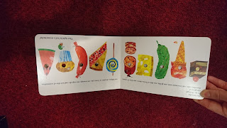
A final book we looked at was the Hungry Caterpillar which reminded us of how rough, hand made textures can add to the simple block colours of a child's book. We decided that a juxtaposition of experimental textures with vector drawings would work well for the student guide. It would specifically be relevant as the techniques we use to create the textures might inspire new students to use experimental processes.
This was quickly mocked up as a concept and the flat black and white tone contrasts really well with the print pattern and is something we want to develop.


No comments:
Post a Comment