

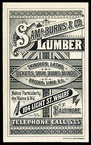

I particularly liked this 'Sam Burns Lumber' advert as it showed a variation of tone and type and was extremely exciting to look at, yet it only used two tones. For the screen printing process I wanted to use a minimal set of colours since there would be so much text and illustration that would need to be aligned.
This design appears to have been split into thirds, with a border around the edge to frame it. This is a classic approach and is something I would like to replicate.The S especially feels bold and exciting, it was common for Victorians to embellish their lettering and the shapes behind them. I hope to find shapes and details in my Victorian research which I could use for my own design.
No comments:
Post a Comment