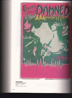
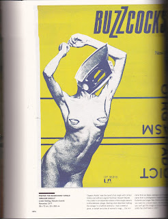
I
attended this exhibition in order to gain some knowledge and ideas
about the screen printing process. The designs were all very DIY,
with bright colours and rough shapes; all indicators of the punk era.
This made me want to develop the Queen Victoria print in a punk
style, similar to the Sex Pistols 'God Save the Queen' album print.
The designs were
usually black and white, with handwritten text. The band members were
usually chopped and cut to look vivid and wild. I wanted to create
something similar for a punk style Victoria print. By having the
youthful, rebellious style juxtaposed with the old, classic Victorian
imagery I thought the print would become something more unique.
This is what led me to
develop the 'Queen Vic' print which involved bright colours and text
with a thick stroke in order for it to seem bold and within the 70s
style. In the end this design wasn't developed further as it felt too
constructed. The idea of these prints is to be spontaneous and rash,
I felt this would be difficult to achieve with this print. By just
using an image of Queen Victoria it also didn't reflect the research
into city hall I wanted to convey.


No comments:
Post a Comment