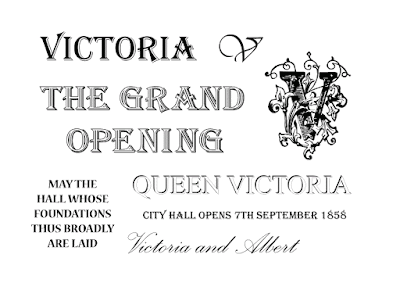
One of the main things I wanted to include in this design was 'May the hall whose foundations
thus broadly are laid, stand a trophy to freedom, to peace and to trade.' This was found in the book Victorian Cities by Asa Briggs. When the first stone of the city hall was laid in 1853, a choir from the Madrigal and Motet Society sung these lines. Which felt like a good contextual reference to place in the poster.
After looking at the Victorian designs there was several typographic experiments, largely using Times Roman and Algerian. There needed to be variation of display and size but also type, all of which being serif. Although the script face seemed to be the most vintage, I felt that this would be the least appropriate for a poster design for its poor legibility. The design needed to be bold and the information clear.
The design was constructed using different elements from the design books found and then type was added from the experiments. The yellow
flower tiles from the tile design were used as the border in order to
reference the building's original architecture. This was the most
successful design as it used the most research and content, but also
fitted the A3 page precisely, with an organised and balanced
aesthetic.


No comments:
Post a Comment