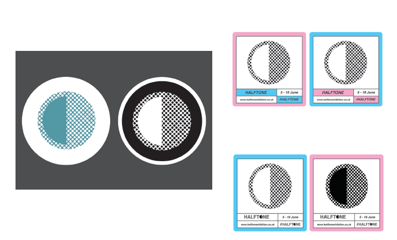
Fortunately, once the logotype was created the work began to follow this aesthetic further. The entire text was made bold and the inside was halftoned. We also split the O to reference the half aspect of the work.

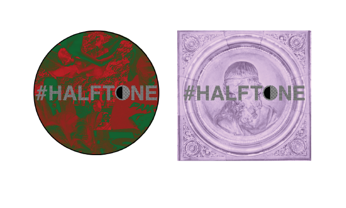
The initial invites followed this aesthetic too. Our plan was to use the circle at the opening for the invite and the catalogue so it is halved when the item is opened. Another idea was to cut out one half of the circle so a element of bright print could be seen underneath. We wanted to maintain this theme of halves throughout- it could even be how we arrange the exhibition into categories.

No comments:
Post a Comment