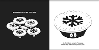
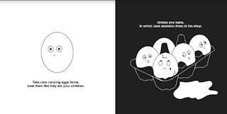
I then set about creating the designs using the stories we developed and discussed from the student survey. At this point we decided the exact measurements of the book in order for the designs to be accurate so they wouldn't have to be scaled up or down.
It was important to make sure that each design had a space in it that could be cut out in order for a texture to be visible underneath. The last design we decided to make the content more adult in order to enforce the mature side of this piece, without risk of becoming too patronising.


No comments:
Post a Comment