Friday 19 May 2017

End of Module Evaluation

Throughout design practice I have learnt key aspects of production and organisation in design.

In the first module I have learnt the importance of experimentation and research in order to get a developed response. The In Cold Blood design was successful because it there was deep research into the book's history and context meaning that the design's concept was its biggest strength.

In the second module the practice of printing techniques became a lot more clear and the process of mass production and it's necessity became apparent. I found that the design I had created was unnecessarily complex, sometimes it is better to invest in something simple and work on its refinement to create a bold and shocking design.

In the third brief skills in teamwork and collaboration grew. I found that I naturally enjoyed organisation and helping my group as much as possible. I learnt skills in delegation and compromise as well, which led to a full and consistent body of work.

In the final brief skills in fast paced organisation and production have been gained. It was exciting to work in a collaboration of two and the sharing of ideas and concepts. It often meant that the boundaries were pushed further as there was two of us questioning what the next step could be.

Something I have noticed is that I need to improve my time management skills. Whilst doing work throughout this process I found it hard to keep a steady pace of blogposts, although I have improved since the last module. In future I hope to do the blogposts immediately after the work is produced and balance my time more effectively across the modules.  

Final Piece and Class Critique

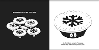
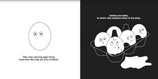
The overall aesthetic of the piece matches our rationale. The illustrations are clear and simple, but use an adult approach containing funny content. The red, white and black colour scheme has worked, especially with the elements being cut out.


Feedback:

The feedback suggested that we had taken a very friendly approach that uses humour well to give advice. Through this positive feedback it suggests that the style was not too patronising, despite its fairly ridiculous concept.

Some people even suggested that this design follows a more contemporary aesthetic and the minimalism is bold and professional. This is something we especially wanted to achieve as first years are often interested in bright, bold conceptual design, not work that is purely practical. The textures in the book can give examples of experimentation and elements like the condom texture mark conceptual inspiration.

People found the googly eye concept 'interesting', it intrigued the viewer and added another layer to the design. In some respects it might be consider too 'goofy', if what we wanted to achieve is contemporary perhaps the googly eyes counteract this. However I believe the element is interactive and is something millennial students will particularly enjoy, there is often a trend for students of this generation to enjoy random, cute humour, rather than a humour that might be more subtle.

Production

To make the piece the pages were initially trimmed along the bleedline, however doing this I made sure to leave a little room around the edge that could be trimmed down latter. The specific shapes were then cut from the pages with a craft knife, careful to be accurate and precise.

Once the pages were prepared they were stitched together using a pamphlet stitch using cotton thread. I found that once I had done this and trimmed the edges the thread was too weak. I needed stronger thread in order to keep the pages secured, so this part was redone.


Pagination

With the pagination of this document we faced several issues. One of which was that when printing the document in Indesign it stopped half way through the process because some of the images used we too high resolution. This meant that the document had to be pdfed in its booklet layout so that it could then be printed accurately. This went wrong once again as we printed on a 'long edge bind' which meant that the pages printed on the backs were upside down.

Parts of the document was trialled before we did the entire thing and a smaller page was made in order to get the order of numbers right.


Stock

We research several different stocks to produce the book to make it authentic as possible.

Initially the plan was to print the design onto mount board in order for it to be bulky and resemble the thick pages of some small children's books which we'd seen in Waterstones. However this wasn't taken forward as it would have difficult to produce and make it look professional. There is no way to print directly onto mount board so if paper designs were pasted onto it it might look unprofessional. Another consideration was the shapes we planned to cut out of the pages, which would have been a lot more difficult and inaccurate on mount board.

We then looked at bulky newsprint for the pages. This was to resemble the glossy pages of children's books but also the cream tone to nod to a more adult aesthetic. These worked well in their aesthetic and allowed shapes to be cut from the pages fairly easily.

We discussed mounting the cover to be hardback using skills in bookbinding however we wanted to use a pamphlet stitch which would have been difficult if this was the case. The hardback also would have been harder to produce as a mass production since we have to make 6 books as part of the brief. Instead we made sure to make the shiny side of the bulky newsprint the cover of the book, giving it a gleam.

'Chums' A Guide to Student Shopping

There was some debate over the name of the book. The initial concept was to call it 'The Very Hungry Student Guide to Shopping,' however once we had created the illustrations it felt as if the designs didn't address food or being hungry. Not only this but the play on the 'The Very Hungry Caterpillar' was less relevant at this point, the illustrations were very different and it was important to give the book it's own identity.

Another idea for the name was to use alliteration- 'bag buddies' or 'Sociable Shopping.' However these weren't taken forward as it didn't feel like they represented the content of the book, it needed to be some funny, short and sweet. This is when we landed on 'Chums', this was to link to the fact we'd asked our friends for stories, influencing the content of the book. 'Chums' typifies their influence but also is quite a fun reference to the personified shopping that students might find amusing. The short title also means that it doesn't take much space on the cover, allowing for the main focus to be the bag design.


Arial was used throughout the book to give a minimal, precise effect. The shape of Arial is all about accentuating the negative space around the letters which worked perfectly for our black and white theme.

Thursday 18 May 2017

Texture Creation

After we had decided on the illustrations, textures needed to be create that reflected the items on the page. So the details and shapes cut out from the designs are filled with a texture behind them that is relevant.

We wanted these to be very experimental yet quite objective in the sense that the objects themselves should be used to create the textures. This was fairly simple for most of the objects, toilet roll for example, but for objects like the condom we had to find ways of making textures using the item. To do this we used printing ink and a roller to transfer the ink to the condom which was then pressed onto the paper.


Not only are these applicable but they will also inspire experimentation, especially with their minimalist style.


A similar approach was taken to create the egg texture by smashing the egg and rolling out this effect with ink and a roller; which created quite a fluid, mottled effect, perfect to represent the insides of an egg.


All of these textures were scanned in and then edited to improve their appearance. Some of the textures were even modified to have a red hue in order for them to be consistent with the book's colour scheme. The texture below was create by applying bleach onto coloured card which dyed some of its pigment. This process was applicable to the hair dye cartoon and again shows an experimental approach which uses the content of the illustrations to create the texture.

Final Inside Pages

I then set about creating the designs using the stories we developed and discussed from the student survey. At this point we decided the exact measurements of the book in order for the designs to be accurate so they wouldn't have to be scaled up or down.


It was important to make sure that each design had a space in it that could be cut out in order for a texture to be visible underneath. The last design we decided to make the content more adult in order to enforce the mature side of this piece, without risk of becoming too patronising.


 After this we needed to create textures that would work underneath the designs and reflect the content of the pictures. Because red has been used at little points within the piece we discussed also adding a red hue to some of the textures to make sure the colour scheme was present throughout.

Survey Monkey Research

We then set about compiling interesting shopping stories and content for our quirky illustrations. To do this we create a survey for students to fill out.

Working out what questions to ask
We got a varied set of responses all of have inspired illustrations ideas and concepts. It has also been a key indication of the kind of stories that students find funny/interesting.


From this we wrote down all the most interesting piece of inspiration and discussed ways we could personify these objects/situation. We then narrowed these down to the most clear and interesting concepts and starred them to be later developed.

Bunny Suicide Aesthetic

Another design I looked at was the Bunny Suicides by Andy Riley in order to be inspired for older cartoon content that has the initial innocent appearance.

These shared our red, white and black aesthetic which confirms its strength in appealing to an older audience. The block outlined text in uppercase also feels a little more harsh, or 'unsoftened' which you wouldn't usually see in a children's book. This is something we should consider for our book cover's title.

Brosmind Illustrations

Barcelona based design studio Brosmind creates wacky yet adorable characters that are similar to the style of cartoon we wanted to communicate. They use a punky, colourful aesthetic for their often personified characters. They have their own distinctive colour pallet used throughout their work, often finished with a brown outline, maintaining a warm aesthetic- reminiscent of Barcelona itself.

Although we will be using a different colour scheme it was important to look at these designs and how they have specifically created such cute characters that are appealing and amusing to adults. Often it is the context of the character that indicates the maturity and not the characters themselves, which is something we should bare in mind. It is also clear that the complexity of the designs adds to the interest from adult audiences, however we're taking a more minimal approach so this technique doesn't apply to our book.

Waterstones Research

We began by doing research in Waterstones, looking a the aesthetic, colours and techniques used by children's illustrators. Just by looking at the shelves it is apparent bright colours are used in big blocks on the books, their is rarely patterns or gradients. The books are also usually square shaped and edges are rounded, which is something we could consider for our book. Another element is that many of the most successful books are hardback so it is important to consider if we should use a similar technique for our book.


One the first books we looked at was 'Baby's very first touchy-feely book' by Usborne which gave examples of how textures can be seen placed on shapes. The inside pages uses an interesting colour scheme of black and white which I think looks a bit more mature and could be something we consider for our own student illustrations. The red especially works well underneath the black and white design for the strawberry, its vibrant colour is allowed to peak through at just the right amount. 


Although these books are aimed at children, the same techniques of capturing interest and composition apply to adults. The centred designs and lowercase typeface work well in order for the designs to be the main focus. Whilst the black and white divide is very bold and is something that accentuates the designs even more.

Another book we analysed was the 'Guess Who?' Elma book which was a good example of how shapes cut outs in pages works well in an illustrative composition and can add layers to a design. 


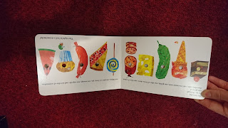
A final book we looked at was the Hungry Caterpillar which reminded us of how rough, hand made textures can add to the simple block colours of a child's book. We decided that a juxtaposition of experimental textures with vector drawings would work well for the student guide. It would specifically be relevant as the techniques we use to create the textures might inspire new students to use experimental processes.


This was quickly mocked up as a concept and the flat black and white tone contrasts really well with the print pattern and is something we want to develop. 

Interim Critique

People responded well to our cartoon designs which was a good sign as we considered that they could be seen as patronising. A main response was that the black and white designs worked best, possibly because they appeared more 'adult' than the others.

Advice:
  • Include googly eyes in the composition to emphasise the cute aesthetic.
  • Trial a dark blue instead of the black to appear more contemporary.
  • A receipt or bookmark could be developed to write serious advice to parallel the random illustrations in the book.
  • Use survey monkey to find other funny stories from students which can be used from the illustrations.
It became clear that the aesthetic of children's book was how we should present this book. So the next step was to have a look at current and classic children's books and the techniques they use.

Initial Illustrations

We began by creating designs to show examples of illustrative style and concept. As part of our original idea we were going to create strange student meals on plates in a basic cartoon style, however this was developed so the images had faces to maintain a more story/cartoon aesthetic.


I initially began sketching ideas for this to give examples of how the pages could be arranged to show these strange shopping creatures. 


The designs were then developed into a black and white aesthetic with quirky captions, this felt like it would be appreciated by students more. I designed this using reference to some of our own quirky shopping stories to give something interesting for the viewer to imagine, it is also good advice to buy your mince pies in February! 

The red hue in the heart felt like it would work in the composition as it added another layer and drew the eye.


Rationale for Speaking from Experience

Rationale:

A soft cartoon design in the style of children's books was taken as the approach to give advice to students shopping. It essentially had funny and quirky illustrations that contained nuggets of advice or recommendations from feedback our class produced. The colour scheme being red, white and black in order to convey adult content but with cut outs from this to still refer back to the children's book influence, using textures specifically inspired by the Hungry Caterpillar.

Initial Ideas:

Myself and Megan teamed up initially to make a student guide to shopping. Some of our initial ideas included making an book similar to an Instagram layout that presented student meals. Some of which would be serious but others would be funny or ridiculous (e.g. a few mince pies and some McDonalds fries) which would be based on real experiences from students in our class.


However this still felt too complicated and could be taken too seriously. We wanted to make this quirky and funny, so an illustrative cartoon style was explored. We kept the square book shape idea but began trying to develop concepts for this that could still contain nuggets of useful advice or reminders.

After our first critique a lot of the suggestions were about food guides or issues people have had with cooking. Although this would have been interesting to produce we wanted something that was a bit more quirky and random, almost like a small story or cartoon strip. This led to another suggestion which was to make the publication look like a children's book, with ultra basic cartoon designs. This was intriguing, especially once pop ups/tear outs were suggested for the design. This seemed to fit well with the quirky and creative aesthetic we wanted to get across.

Wednesday 17 May 2017

Peer Review and RAUM Work

After watching all the presentations I realised that I needed to focus on the costing of our exhibition production. The most successful which was chosen to curate was RAUM, the pitch that accounted for cost. Ours used acetate which immediately racks up the cost at 30p a sheet, this should have been considered and broken down. We also should have considered the cost of printing the posters, as the colour again speeds up the cost. RAUM chose to screenprint their work which was definitely cost effective and something that we could have considered. However, having worked on screen printing for RAUM, I think it may have been simpler for our Halftone group to do a black and white A3 digital print at 4p per sheet, saving manpower and time in a period of pressure.

It has been a useful experience being involved in the set up of this exhibition. I have been able to appreciate RAUMs design work and is obvious why it has been successful. The entire set of items are cohesive and simple and the prints descend in order of the event date making it organised in it's catalogue layout and the display in Room 700.

If the design had not been simple there may have been many more issues in the production. There has been some miscommunication during the wider process, however I believe this is due to the fact we have so many on running projects. I helped set up for screen printing and organised the prints in date order for the curation. The intricacies of mass production have become clearer and I have seen and been part of great teamwork and perseverance.

Final Presentation Feedback

To make the presentation I had to cut down a lot of our content, there was so many different strands of ideas it appeared confusing to the viewer. So the map concept was removed and the floor wayfinding so I could create a presentation that ran a little more smoothly. I experimented with the order, making sure that there was a form of journey throughout.

Positive Feedback:
  • Strong artist research, indicating our reference to neabua meant that our aims became clearer.
  • The social media, particularly on Instagram works really well. The layout appears considered and aesthetically pleasing, which the modern audience will take interest in.
  • The concept of the projector and acetate is really good, shows consistency and innovation.
  • The strongest part is the interactive element, this will generate interest.
Design Suggestions:
  • On Instagram dots could be used to count down instead of numbers. This could be linked to the motorway countdown, but with dots instead of dashes.
  • The dots used in the ceiling of room 700 could be used within the design, taking inspiration from their layout. 
  • The acetate invites could build on the selfie aspect and ask people to take a picture with their invite, again generating further interest.
Overall Constructive Feedback:
  • The branding shows the print aspect well but it ought to represent the space more extensively.
  • The content is heavy, which in turn distracts from the prints. It may have benefited from being simpler.
  • The overall cost needs to be considered. The catalogue specifically needs to be stripped back in order to allow for more prints. 

Final Posters

Following advice from the critique I changed the poster designs so they included full colour halftoned images inside the circles of prints. This meant that our branding, made monochrome to frame the prints, was in full action. The simple background allowed the design in the centre to seem vibrant and exciting. By only showing an element of it, it also encourages people to go to the exhibition to see the full display.