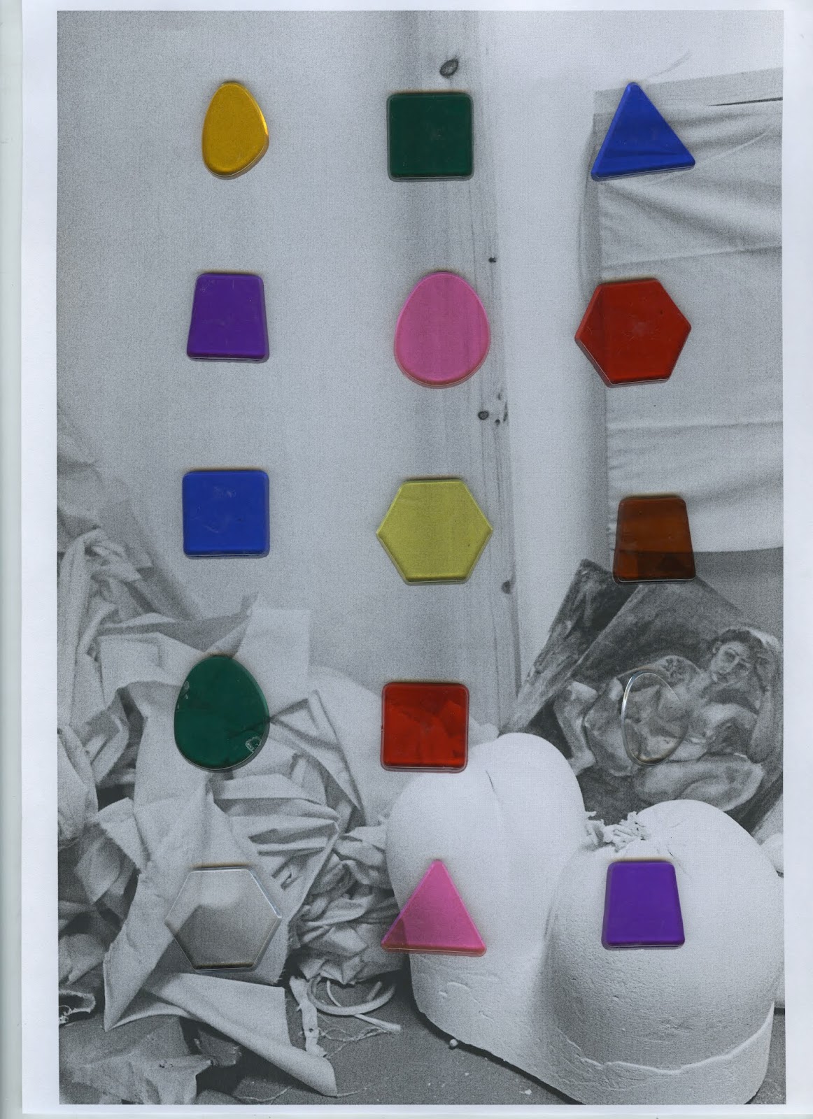
For example, the red and blue experiments are far more distinctive than the green. The full colour experiments also have quite high impact, but for this idea we planned to have one colour per course. This became quite a restrictive idea which we started discussing moving away from. By having full colour in our compositions it better reflects our aim to express diversity. The clear tile experiments we originally thought would be appropriate to represent photography, these worked quite well and distorted the image behind in interesting ways. However, these stood out less and would have needed highly colourful type overlaid to make it distinctive.
The tiles were also arranged in several different ways to experiment with composition. I found that the ordered ones were most successful - appearing refined and bold in their arrangement. The more scattered ones, although appealing, appeared too similar to the previous 'Made Here' branding in 2016. By having them in curated, organised lines they become individual and bold and not lost in the scatter.
Although these scans have an interesting effect, the print quality isn't very good. If this style was to be adopted the tiles would have to be photographed or they could be digitally produced. Although digitally producing might mean the specific light reflecting effect may be lost.


No comments:
Post a Comment