
I thought I would create a similar collaged design, with the blurb of the piece placed inside the stone circle. I created several different variations of these, some with shading and some with further detailed weeds and plants around the apostles. These were made using an inked pattern which was then used as a texture to cut the shapes from. In order to create the stone shapes I used stone circles seen throughout history as reference - in particular Stonehenge and the 12 Apostles found on Ilkley Moor


Once inverted the image had a more sinister and eerie effect, which matched the themes of the book perfectly. However, although the same techniques have been used - the details vary slightly from the cover and therefore create two conflicting styles. I continued to experiment with the design to see how it might work with the cover with some editing.

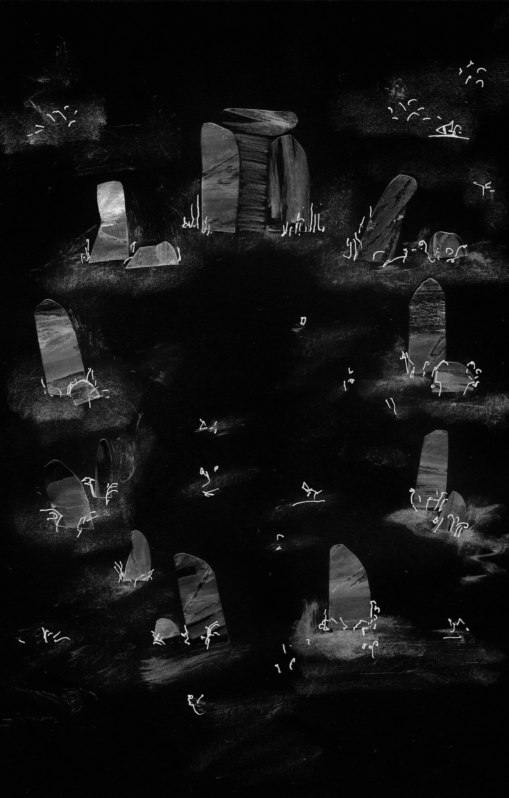
The blurb was added to the center of the piece but did not quite fit the allotted space. Some of the text was running onto the apostles and obscured by the smaller cracked details. This didn't quite work, even with some editing of the text box shape and with the text shrank to a smaller size - the information had to be prioritised and would not be legible if made too small.


I then experimented with adding a bar at the top of the design that would follow along with the bar on the front cover. This still felt out of place on the design and prioritising the information was difficult, I did not want to replicate the cover text but I also wanted the blurb to have some organised information. By having 'The Shadowland Hexology' centered just didn't work and again seemed too different to the decided layout of the cover.


It was suggested that imagery was so strong it could be used as the cover instead, creating a strong circle for the text to stand inside. But using this would mean disregarding the previous layouts which offer a more classic and considered aesthetic. This illustration also may have other more mystical connotations which doesn't link to the book's genre so well.

No comments:
Post a Comment