


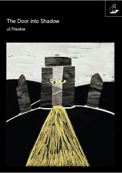
The design was then edited to have the Laptop Cat logo in the top right-hand corner of the design, cordoned off with a line, adding a more sectional approach to the piece - similar to the Marber grid. Collaged yellow eyes were also added to this design, to create a sinister yet playful effect. However, from feedback it was suggested that these alterations were too childish and didn't reflect the sinister presence 'The Alchemist' has.


I also created a variation where the bar was placed at the bottom of the design, which I previously experimented with in sketches. However, I was unsure about this as the block underneath the design seemed to cut off the beam of light - rather than suggesting it was continuing past the book. Adding the yellow bar seemed to be an interesting addition however, and since the book is in a series of 6, I figured that each book could have a different colour paired with a black and white collage.


Then, in more of a contemporary approach, I placed the images on a framed background, which I thought created quite a modern and fresh effect. Especially on the white, it made the image stand out and alluded to the more spiritual and supernatural themes of the book.


From my sketches I had also looked at having a bar along the left hand side, however this created quite an unusual effect and decreased the impact the text had in previous designs. It also might create conflict with the blurb.


I then began experimenting with having 'Shadow' written upside down, to emphasise more of an experimental approach and to visually represent how the shadow world is an opposite or reflection of our world. I then played with having the whole background in yellow, which didn't work well and then having the Laptop Cat logo in yellow, which ended up sticking out, rather than adding to the design.


Finally I looked at ways of not framing the image and having the text written on top of the design. This seemed to clutter the cover rather than adding to it, and took away some of the classic feel to the design.


No comments:
Post a Comment