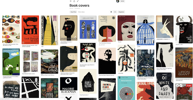
I began be looking into the aesthetic of dark fantasy novels and how they are typically composed. Having read 'The Door into Shadow', none of these playful teen fantasies styles seemed to match the way that the book is written in. The story is very traditional and is set in the 1980s, it is rich in detail and isn't about romance or magical powers. It's got a lot of focus on dark and symbolic imagery, the characters are classic and it is written like a traditional story - not typical YA.
So I decided to approach it by looking at much more classic styles, using bold shapes and aged colours. The imagery within the book focuses on real life vs the shadowland, which could definitely be explored further within this shaped theme.
I particularly liked the cover image which shows a beam of light flooding a scene on the stairs, it isn't realistic but it is bold and powerful and this is something I would like to replicate. I have also noticed that these classic books often use the Marber grid, separating the title and author above the images. This is something I would like to explore further, maybe developing a similar hierarchy of information.
I also thought the Iron Giant illustration is particularly relevant as it shows how shadows can be conveyed through simple shapes. A shadowed effect could definitely be experimented with since it is one of the books most key themes.
A lot of the designs I am interested by also seem to use layers of paper shapes, such as the eyes, the collage and the depiction of a man falling on the right. This simplistic approach is definitely something I want to examine further - as it creates something that is raw and classical - unlike the typical digital illustrations/edits seen in most modern dark fantasy.


No comments:
Post a Comment