Research
began into representing the aesthetic of a videotape in text editing
software. Some of the outcomes were to communicate how videos are
intricately processed and the 'fuzzy' aesthetic of old video footage.
The constraint of having to align the text perfecting became an
incentive to produce an accurate, formulaic result.

This
design was unsuccessful because in the word document certain
characters had been made bolder to stand out, yet in the print out
they did not appear. Despite this, looking at the page creates a
slight optical blur which reminds me of the static on old
televisions. Also, by using a home printer it has created a slightly
faded effect which adds to the retro style.
There
was use of word art as it's bright colours and experimental style
remind me of 70s graphics, which was when videotapes became
popularised. Because it is so hideous it feels as if it is breaking
the rules, however I don't think I will be developing this further.

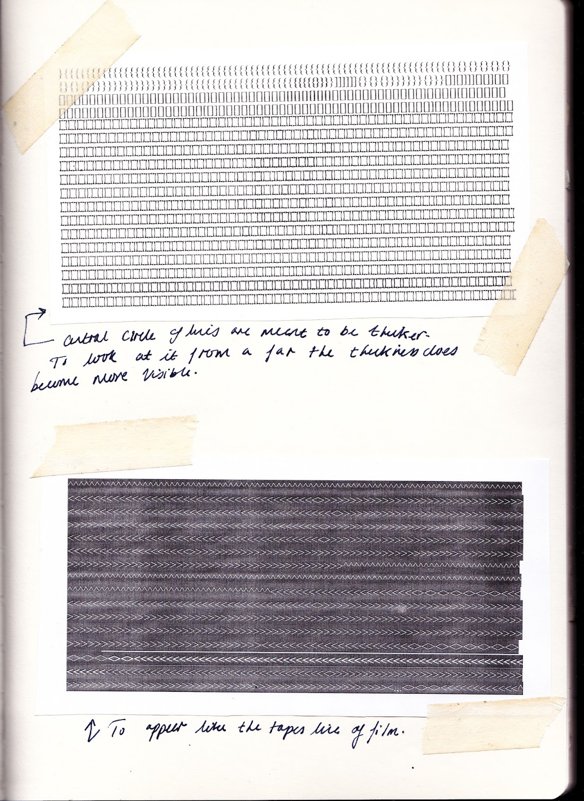
I
also looked at developing the research task work I discovered about
the magnetic strip in videotapes. The lettering was to communicate
the the layers of programming on the channels and video information.
Although the outcome was a bit random, it did show how type could
work in rows of production. I wanted to produce something that used a
basic formula to create an objective outcome.

Finally,
I looked at David Carson's work from the “grunge typography” era.
Carson proposes a theory that “what
gives unity and coherence to intuition is truth”,
which suggests that rather than a formulaic response to type- it
should be spontaneous. After looking at his work, I created some of
my own and layered them with his work, experimenting with photocopy.
This created a patchwork effect which felt like it had a similar
energy and obscurity. However, I still wanted to pursue something
more formulaic to represent the video.

No comments:
Post a Comment