Sunday, 26 February 2017

Edition reviews:

1966 first edition, designed by S. Neil Fujita

For this design Fujita proposed to Capote that the hatpin at the top of this austere jacket should have a red bulb at one end to appear like a swollen drop of blood. However, Capote objected to this because the crime was old, so the blood would no longer be bright red. As a result the colour was made burgundy and a funeral black border was added to the outside of the jacket. This suggests that the jacket should show some history, bright colours might make it too fresh and out of character. However, boundaries could be broken to make it so electric and bright, the story is reinvented.


1994 edition, Vintage Books USA

This edition uses one faded photograph for its cover. The cover communicates a sense of the bleak, loneliness that runs throughout the killers in the book. The soft colours indicate its age once again, yet the type is more modern this time. The sans serif creates a contemporary effect, however it also makes it too 'clean'; the typeface should be more classic and vintage to represent the book's content. The clouds also appear very unrelated to the content and are not really enough to surmise the dark and twisted nature of the book.


Published 2000 by Penguin Classics by Andy Bridge

This is an illustrations of the riffle used to kill the Clutter family. The design uses quite dulled colours even though the contrast is high. Although this grabs attention, perhaps it is still too bright to communicate the dark and dreary feeling created by the murders. Although it is certainly dramatic and conveys the style of the 60s. The bird in the centre could link to the freedom that the two men are desperately trying to reach, which does give the cover further subtle meaning. Again they have have used a dull red instead of a bright red, possibly linking back to the original design (the blood is old.)


2004 edition- Soğukkanlılıkla by Gülay Tunç (Turkish design)

This is quite a unique jacket and it is characterised by it's Turkish design. The colours are bright and the red contrasts dramatically with the black. The silhouettes are sharp and crisp, they are very stylised, opposed to a more natural approach. This creates a more artificial aesthetic, which in some ways works to represent the forced, unnatural aspect of murder. Although this is quite a modern response it helps to freshen the story and make it more accessible.

Clutter Family

Perhaps images of the family could be used on the cover, as often the books are about the killers and not the family. It could be percieved as a tribute to them.

Nancy Cutter in the 1960 Holcomb High School yearbook

Clutter family photo
10 adjectives linked to the feeling of the book:

Melancholy
Trepidation
Conniving
Cunning
Sorrowful
Shocking
Nightmarish
Ghostly
Horrific
Gloomy 

In Cold Blood by Truman Capote

In Cold Blood- by Truman Capote

Is a none fiction novel published in 1966 about the murder of 4 people in the in the Herbert Clutter family in the small farming community of Holcomb, Kansas. A former cellmate of Hickock's, Floyd Wells, had once worked as a farmhand for Mr. Clutter, and had told Hickock about a safe at the farmhouse where he claimed Herb Clutter kept large amounts of cash.
(An empty safe could be used as an illustration for the book cover.)

Before the killers were captured Capote and his good friend Harper Lee traveled to Kansas to record and investigate the case- together they interviewed the local residents and collected vast research.

The killers, Richard "Dick" Hickock and Perry Smith, were arrested six weeks after the murders and later executed by hanging at the Kansas State Penitentiary on April 14, 1965.

Richard Hickock

Richard Eugene Hickock was born in Kansas City, Kansas, to farmworker parents, Walter Sr. and Eunice Hickock. He was a popular student with great intelligence and was an athlete at Olathe High School before head injuries from a serious automobile accident in 1950 left him disfigured, and resulted in his face being slightly lopsided and his eyes asymmetrical.

Although he had wanted to attend college, his family lacked the means to provide this, so he went to work as a mechanic. He married, but then became involved in an extramarital affair, eventually leading to the conception of his first child. He then decided to end his marriage to marry his mistress; that marriage also ended in divorce after two more children. He turned to petty crime, such as cheating and using fraudulent checks, to help make ends meet. He eventually landed in prison, where he met Smith and hatched a plan for robbery and murder.

Hickock’s injuries could be communicated in the cover of the book, as they may have been the route of his problems.

Hickock donated his eyes for corneal transplants, and they were used on two patients in Kansas City later that day.

https://en.wikipedia.org/wiki/Richard_Hickock

Perry Smith

The Smith family moved to Juneau, Alaska, in 1929, where the elder Smith distilled bootleg whisky for a living. Smith's father abused his wife and four children, and in 1935 his wife left him, taking the children with her to San Francisco. Smith and his siblings were raised initially with their alcoholic mother. After Smith's mother committed suicide when he was thirteen, he and his siblings were placed in a Catholic orphanage, where nuns allegedly abused him physically and emotionally for his lifelong problem of chronic bed wetting, a result of malnutrition. He was also placed in a Salvation Army orphanage, where one of the caretakers allegedly tried to drown him. In his adolescence, Smith reunited with his father and together they lived an itinerant existence across much of the western United States. He also spent time in different juvenile detention homes after joining a street gang and becoming involved in petty crime. 

Perry Smith appears to have had much horror and abuse in his childhood, this led to his distorted view of reality- ‘hate breeds hate.’ Which could be used for the cover.

While riding a motorbike he lost control of the bike due to adverse weather conditions. Smith nearly died in the accident and spent six months in a Bellingham hospital. Because of the severe injuries, his legs were permanently disabled and he suffered chronic leg pains for the rest of his life. (both have suffered serious injuries which could be communicated through design.

He read extensively, and during his time on death row, wrote poems and painted pictures for other inmates from photos of their family members.

Eternal Hope:


But he who thinks man is bare
Discarded of pride by force.
Has not the depth of soul to share
Emotions at its source
Perhaps my eyes shall never reach
The light of freedom's skies
But forever my hopes will span the breach
To keep my human ties.


Painting of Jesus by Perry Smith- could be used in design.

Book Research- In Cold Blood

Judge- Jim Stoddart:

Jim Stoddart has worked in the design industry ever since he graduated from Sheffield university. He did some work briefly for Penguin and then returned in 2001 as Art Director of Penguin Press, where he has overseen the redesign and rebranding of Penguin Classics, Penguin Modern Classics and Pelican Books. He was also designed covers and art directed Penguin’s Allen Lane hardback imprint, the Particular Books imprint and Penguin non-fiction paperbacks.

These means he has vast experience in the industry and has knowledge of successful non-fiction designs. His style tends to be fairly minimal, often using dramatic photography. Most have been cropped to reveal elements of scene, which is reserved but adds intrigue and a glimpse of insight.
He has also used grids for cover designs, as show bellow. These show how there is a strict layout that means the designs are ordered, professional and classic. There will be experimentation with grid design in order to make sure my designs are considered and balanced.
Youth- example of grid usage.
Dangling man- example of grid usage. Strong use of type.

The Penguin Random House Student Design Award

Students may enter a maximum of one design in each of the categories:
  • Adult Fiction Cover AwardTo Kill A Mockingbird (Harper Lee)
  • Adult Non-Fiction Cover AwardIn Cold Blood (Truman Capote)
  • Children's Cover AwardThe Secret Diary of Adrian Mole Aged 13 3/4 (Sue Townsend)
The design must:
  • have an imaginative concept and original interpretation of the brief
  • be competently executed with strong use of typography
  • appeal to a contemporary readership
  • show a good understanding of the marketplace
  • have a point of difference from the many other book covers it is competing against


Often with book designs the adult’s books will be built on a strong concept; something that shows intelligence and originality. Whereas for the children's fiction, there is often an illustration theme of a key scene or character. It is important for these designs that they are either minimal or maximal in their aesthetic, this is to show confidence and belief in the design (there can be no in between.) Often with these books they have been written in a different period of design and they have to be made modern by contextualising the book's issues. 

Friday, 17 February 2017

Exhibition Poster Folding Experimentation

The experimentation for the fold down from A1 to A4 began thinking simply. I was going to fold it in half repeatedly and then glue a design on the back once it reached A4. This design was using a diagonal grid based on some research. The angles were determined by the angles of the origami piece in the centre and the typefaces were also those used on the original poster. However, I thought it would look less professional if I printed out the design and glued it on, so I looked into new methods of folding that could emphasise the main design instead of having to glue on a cover like this.

There was then some experimentation with a Turkish map fold, which I thought fitted with the alien theme for its jagged appearance. However, once tried on a larger scale it was difficult to manoeuvre and it was less clear how to fold it back down.  


It was then simplified to a simple fold, the only complex part being one section had to be folded into 3 sections, rather than in half (to two.) This was in order to have the location and date of the poster visible before it was unfolded.


 This became the fold I used for the final design, it was uncomplicated and worked well. The only issue was that folding into three at one point wasn't entirely accurate, however this could be refined on mass production.

Thursday, 16 February 2017

Poster Material

The paper I used for the A1 poster was recycled paper, in order to give it ethical validity and strength. 

The paper itself is incredibly durable due to the coating on the back, which means even when it is folded and pocketed in an exhibition situation it will not wear quickly. It was also chosen because many of the strong coated card that the poster could have been printed on, was too thick to be folded down to A4. Whereas this paper is thin enough to be folded down without damaging the design or causing ripples in the paper.

Another reason recycled paper was used was because there has been an increasing pressure for designers to make their work ethically viable and good for the planet. It is 'morally incumbent' that we should make our designs better for the environment. It also has a contemporary application as a lot of the people attending exhibitions might be in favour of an environmentally friendly print and it makes it more evolved and modern.   


A final reason the paper was used is because of the veined texture it reveals when a light is shone behind it. This creates a webbed, 'alien' feeling which matches the content nicely. It adds an extra layer to the production and could even be hung in front of lights if it was actually displayed in an exhibition situation. 

Wednesday, 15 February 2017

Final Poster Design

Type Consideration

For the final poster design I have used an eccentric typeface, Cinema Gothic BTN Inline, which immediately makes the sci-fi genre of the posters apparent. It is sometimes important that a typeface portrays an identity; in this poster the typeface is a key component to the aesthetic and composition. However, 'type egotism' (deliberately drawing attention to type) is often unwelcome in design, people believe type should never alter a design's overall appearance. I however think it has been successful here, it balances the composition. Combat Ready BTN has been used to balance this, as it is cleaner and more precise, it is better for getting information across. One issue could be that the text listing the events is too small to read. However, since the poster is A1 it is more legible in its physical copy, but only if the viewer goes towards it to read the information. I think this is important, not only should a poster be exciting and intriguing, it should also be informative on occasion and 'draw in' the viewer. 

Tuesday, 14 February 2017

Grid Research and Examples

I began researching grid terminology and layout before I constructed a system for the poster. I began with '100 Design Principles for Using Grids' which contained these useful pages:


Josef Muller Brockmann suggests that grids are important as they 'create a sense of compact planning, intelligibility and clarity and suggests orderliness of design. This orderliness adds credibility to information and induces confidence.' This is necessary for the poster design to give the exhibition integrity and admiration, people need to believe it is an organised and ambitious institution. 

I was influenced by his grid used in this 'Stadttheater' poster. 


This layout involves leaving a wider margin on the left, in order to give it some emphasis with an indent. It also splits he text into three equal modules, placed either side of a subheading. The hierarchy in the poster layout is organised and precise, it gives some satisfaction to look at. I wanted the poster to have a similar professional layout, but also consider space for the imagery.

Alien Culture Exhibit Space Ship

For the exhibition branding project I wanted to theme mine on alien culture in the media. This meant I wanted the content of the poster to feature a space ship abducting figures. The main part of this brief was the origami element, so I followed a tutorial to create a space ship which would be photographed for the poster. For this I used an A2 page in order for it to condense down to something fairly big and I bought tiny plastic figures that could be placed underneath.


I wanted the light to fall on the bottom half of the page in order to fill two thirds of it, leaving the top third free to use white text without there being confusion. Due to the camera's light exposure settings the pictures made the rocket appear dark, however this was intentional for it to appear atmospheric. One issue that I did have was the background, for a white backdrop I had to use sheets of paper which could be considered distracting. However, I kept this in as it continued the paper aesthetic and the feeling of 'handmade.'

Friday, 10 February 2017

Personal Evaluation

Throughout this project I have learnt the importance of experimentation and producing a range of ideas in order to reach the best possible conclusion. I have found it easier to propose ideas that may be considered strange, like a wayfinding system for a zombie apocalypse, and interesting to hear people's responses. Crits have been extremely useful in the experimentation process as the range of responses and ideas meant that many different approaches could be trialled. By looking at other people's work I have also broadened my mind and gained new ideas. Being constantly amongst designers I have found it inspiring and motivating.

Something that I have particularly developed in this project is using designer's theories in order to influence my work. Not only has there been direct analysis of designers like Aicher, Frutiger and Carlson, but there has also been references to theorists like Hoffman throughout. These people have shaped my use of subjectivity and objectivity in the design work, and also my technique in designing symbols. The importance of using a grid became apparent, the Aicher grid especially helped to create a consistent set of symbols. In addition to this, the use of a grid for the design boards meant they became a lot more ordered and aesthetically pleasing. In future I hope to do more research into different types of grid layout.

I have been able to explore both projects from a range of angles and different types of mediums. The wayfinding project especially involved a series of approaches for the final outcome of the zone symbols. Designing using spray paint and with graphic vectors meant that the project was explored using two mediums and it was interesting to explore these and have them correspond with each other. Superimposing images is a skill I have particularly developed through the use of tutorials and exploration of Photoshop. Although the end result was not entirely authentic, throughout the project the designs have made massive improvement.

Something I have noticed is that I need to improve my time management skills. Whilst doing work throughout this process I found it hard to keep a steady pace of blogposts, although I have improved since the last module. In future I hope to do the blogposts immediately after the work is produced and balance my time more effectively across the modules. I will also try to condense the content of the future posts so they are more refined and straight forward. It is important to have personal work that is separate to the course in order to develop new passions within design. So I will hopefully be developing my own zines alongside the work of the next module, through time management.

Finally, although there was a lot of experimentation in the object work, I found it extremely difficult to refine. This was because the ideas were so broad and diverse that there was nothing to align the ideas and it was hard to pin point an aspect to develop. It is important to explore widely but also to have self imposed constraints, to elevate the work and to make sure it is constantly improving. In the object work by only using a spreadsheet to produce the work, it meant it became a lot more refined and original. In future I hope to use more self imposed constraints.

Object Evaluation

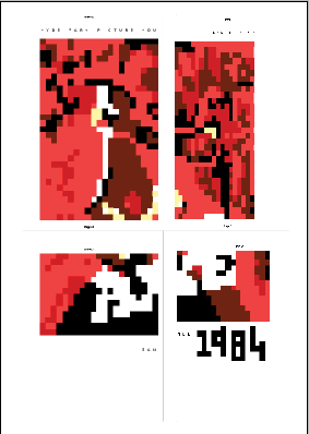
The intention was to communicate the fact the posters had been censored by the government. Peer feedback has suggested that the pieces represent this well through their ambiguity and pixelation.

Throughout the project Carson’s theory about intuition has been followed successfully, the colours were placed in the cells spontaneously and layered in ways that ‘felt’ right- rather than using a systematic approach. This meant they had energy and looked sharp, which added to the horror film aesthetic. However, by using reinterpretations of pre-existing movie posters it meant that they could have been more originally developed using elements from the films instead. The originals were used because they would be recognisable among fanatics, otherwise this could have been something to develop.
The most effective part of this project was using the spreadsheet program solely to create the designs. Although some of my other developing designs were successful and could have been moved further, without a constraint they lacked direction. During a lecture by Michael C Place, he discussed his passion for experimentation and breaking boundaries, which is partially the cause for his success. He suggested that even when given a very open brief by a client, it is important that you give yourself ‘self imposed rules and constraints’ to elevate your work and to make sure you are constantly improving. By using only a spreadsheet to produce the work, it meant it became a lot more refined and original. Through peer feedback it was noted that the titles of the films might be difficult to read, however the time spent looking at the titles generates interest in the posters. After all, the aim was to make the work ambiguous. 

Absurd
Axe
Madhouse

Wednesday, 8 February 2017

Spreadsheet Software Print

As part of the development I also tried to print the pieces from the spreadsheet software. This only worked in fragments but when they were pieced together it became more effective. I decided to vary their sizes at this stage in order to give a patchwork effect, linking to the distortion and craziness that would be in the 'Nasty' videos. However I decided not to use this for my final posters as they were already distorted enough, without the introduction of another confusing component to the compositions. 


Pixel Design Development

Here I experimented with text size, layout and colour. I successfully integrated the titles into the designs and made sure they were more legible. I also settle on a layout that was a long panel of design with moderate information along a strip at the top. The '1984' was also pixilated yet the numbers were not too formulaic to maintain the illustrative style.

I experimented with replicating 'Toxic Zombie,' however I didn't take it further as the text was too small to be legible and the background design was too constructed. I found the most successful designs were the ones with figures and elements in the background that could be subjectively interpreted, whereas in 'Toxic Zombies' the background was clouds and sky.


Final Crit Feedback:

  • People realised that conceptually the vague image reflects the banned aspect of the work and it shows its from a different era. They consistently liked how ambiguous the content was, however this meant that the type was so unclear it wasn't immediately understood.
  • Try posters in A3 and A2, need to consider print cost.
  • Colour may be more engaging, try the work in various tones. Although it may be important to be consistent with the orginal poster colours so it is more discernible.
  • Edit the image and heading together in each in order for it to be more consistent with the composition.

Contextual Research: Jaebum Joo and Waldemar Swierzy

Jaebum Joo

Jaebum Joo is known for doing pixel art based of classic pieces of art. However this piece (one down) is far more ambiguous than his others. It shows a gradient of colour and communicates the image through different shade and order. The way he has manipulated the tone through the layering of blocks is very effect and I hope to replicate such a fluid motion throughout such static content. A particular element that has worked well in the direction of light and how this is rippled throughout the piece, the use of light is especially important as it effects how objects stand out.

Jaebum Joo

Jaebum Joo's interpretation of The Papal Palace, Avignon (Paul Signac)

Waldemar Swierzy

From looking in the book 'sixties design' by Philippe Garner, I took inspiration for the 'retro' style of the poster designs. This piece in particular by Swierzy inspired me to consider how shade and tone is created through the layering of colours. He has created direction and movement in the painting with large dots in a fairly ordered grid. It is how the colours interact that have caused the the dots to resemble a women's face. It is also the absence of colour that plays a large role. For my own work I hope to create a similar sort of depth with layered colour and the careful use of the darkest hue to direct the change in tone.

Poster for 'Blow Up' by Waldemar Swierzy

Initial Pixel Design

The poster designs were developed from the original posters designs. Minimal colours were used to make the piece more succinct and consistent. I experimented with the size of the first design and how much of the outside cells to include. I also tested adding text through illustrator however I thought it was more successfully input through the spreadsheet program, as it appeared more authentic. By putting the text inside the cells it becomes more like a composition, entirely adhering to the constraints of the program. 

Illustrator text experimentation- abandoned.
Text created using the spreadsheet

Final Design Idea 3- Video Nasties

"Video nasty" was a colloquial term coined in the United Kingdom by 1982 for a number of films
distributed on videotape that were criticized for their violent content.

Because there had been such relaxed censorship of video distribution up to this point there was a fear that any of these disturbing films could be seen by children. This created a public debate about which films should be considered inappropriate. The "video nasties" were usually low-budget horror films produced in Italy and the United States.
The response created by the video nasties led to the introduction of the Video Recordings Act 1984. This imposed a stricter code of censorship on videos than was required for cinema release. Several major studio productions ended up being banned on video.


This idea linked with the work previously produced for horror films involving disturbing and weird scenes; but poster designs could be made for several of the original 'Video Nasties.'

From all the previous experimentation however, it was most appropriate to communicate these in the pixillated spreadsheet aesthetic. Because they were banned it was a case of censorship by the government, which was similar to the race crime I previously explored. Pixelation has a way of communicating something to be broken up and disguised. Also the shift of layers and colours can be vibrant and aggressive in some way, certainly not softened, which is perfect to represent such gruesome and outlandish horror.

Titles to Explore:


Final Design Idea 2- David Lynch Film Branding

David Lynch's films often have a “surrealist ethos” and very prominent dreamlike imagery. I thought it would be interesting to communicate the video I had produced as a David Lynch film to be branded. 


After looking at some of the poster designs for his films I decided to recreate them with a scene from the film in which the video looks like its burning. This used a quick combination of editing, printing and scanning. The title was cut apart and placed back together to suggest how ambiguous and faulty a tape can be. 

'The obsolete' - because the video tape is no longer used. The background uses a sections of the video when light hit the pond, making it look like fire.
Although the aesthetic appearance did resemble a David Lynch poster, I thought it would be hard to drive this idea forward as the success of the work was in video form. In this project we needed to have a printed outcome.

However, from this experiment I realised that the layers and shift of type and editing into blocks worked well and linked back to my initial experiments of layering type and cells to create shapes. This had more potential as it had a natural order and constraint.

Video Experimentation

A video was then developed to explore the project, which built off from the photographs. It involving sinking the videotape in a pond to create a dark and mysterious film aesthetic. The shots were successfully bleak and highlighted how videotapes can be considered ominous and haunting- with the two eye-like shapes running through the video.