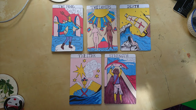
The cards have used a specific colour scheme that has been inspired by the Pamela Colman Smith designs, but these shades are far brighter. This is to make the stand out in the exhibition and to modernise the dull tones she chose for her lithography. Each uses a different colour for the background, this is to make each different and unique. All however use the same blue tone to make the sea theme seem consistent - unifying the cards. Each also has an element of the design that isn't coloured, this is again to show some consistency and to create some contrast with the brighter elements.
The handwritten type isn't very precise, however it has been directly influence by the Pamela Colman Smith cards, using similar serifs and shapes. These replications are more messy however, this is to again add to the handmade style. If the text had been digitalised or too neat, it would have clashed with the illustrations below.
The designs show particular influence from the original tarot style, using curled lines to represent water, strips of sun rays, curly clouds and lined detail for shading. This makes the designs seem more evident that they are tarot cards. I have also used references to 1800 Portuguese sailing, the two ships are based off original illustrations from the time - the clothing also uses direct references.
The backs of the cards are black with the raised designs, this is too contrast with the bright illustrations on the front. Because these parts on the back are designed to be felt it will mean there can be some interaction with the work in the exhibition. It could also be that people are asked to create stories for their future using the cards to mean significant things.


No comments:
Post a Comment