Tuesday 20 March 2018

OUGD503 Evaluation

Throughout this module I have become more practised in balancing lots of live briefs simultaneously, which has given me a taste of the professional world. The importance of organising time and making plans became clear. By doing live briefs it has also made me consider the client more. The requirements for every brief have meant that I have always pushed myself to make sure I meets them in an interesting way.

On reflection, for the badge design, I would have liked to spend longer developing the final designs, however I didn't allot enough time to do this – not anticipating how much I would enjoy it. However being picked for the final badge pack was really exciting and gratifying, encouraging me to enter more competitions in future.

In the Penguin book designs it became clear that the success came from researching the books and having concepts that were grounded in reasoning and knowledge. These designs became far more interesting to the viewer and naturally appeared more considered in appearance when they were linked to an unusual aspect of the book.

The Norwich Beer Festival logo I looked at was really interesting for me as I rarely do logo work. Although it was illustrative, which is more one of strengths, it made me consider the key features of logo design and how logos have to be incredibly considered and grounded. I hope to do more branding and logo work in future to develop my skills in this area.

In the storybook brief skills in fast paced organisation and production have been gained. It was exciting to work in a collaboration of two and share ideas and concepts. It often meant that the boundaries were pushed further as there was two of us questioning what the next step could be and encouraging the 'weirder' ideas. With this brief we took on more work than the brief specified, which meant we achieved a lot but spent quite a bit of energy. In this case it felt worth pushing the boundaries for as it was something that improved our skills and created a satisfying end result that can be used in portfolios.

Pan Macmillan Storybook - Evaluation

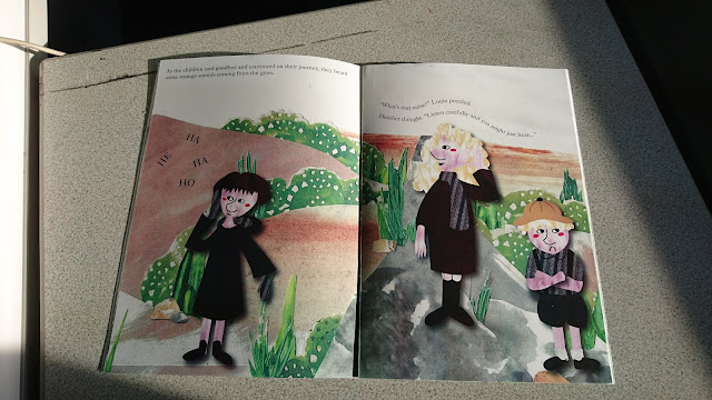
The drop shadow on the illustrations has made them pop from the page, this was added as an effect to make the illustrations seem like pieces of collagee. Each page also has a varied layout which was something the brief specifically suggested.

I wanted to add subtle points of diversity, such as ‘Mrs and Mrs Grouse’ without making it an aspect of plot or attention. This adds slight layers to the story as the judges recommended. Something that didn’t go so well was the scary ending we had planned, this was meant to cause a deeper sensation of fear at the end of the book which would quickly be resolved. Unfortunately, there wasn’t enough time to work on the page with the shadow ‘moor monster’, which ended up looking cute more than anything else. We also planned to change the colour of the setting to make it more frightening, but again weren't able to within the time. Besides it may not have looked so consistent if we had done that to one page and not any of the others.


Feedback has suggested that the book looks professional and high quality, possibly because of the matte stock we used and the consistency throughout the book. Someone suggested that the typeface used for the cover’s title looked like an afterthought. However this was heavily experimented with in order to create something consistent and bold in the best possible place on the cover. Perhaps a more illustrative title should have been experimented with, although this would have not linked so well with the content of the book.


Finally, the brief only asked for 4 double page spreads of fully illustrated work with the rest being sketched outlines. To make the entire book was a huge amount of work and required a lot of attention and planning. I am incredibly pleased with the end result and have come out with far more skills because of it, but perhaps it would have been better to stick to the requirements to strike a better work balance. Yet by producing the entire book, it shows commitment and passion for the project and by aiming so high it should stand out in the competition. Some advice from a tutor was to always try do more than they ask, which is what we have attempted here.

Pan Macmillan Storybook - Production

We spent a while discussing which stock would be best for the book. Eventually the book was printed on matte stock, with the inner pages being a slightly lower gsm than the outer cover. This was so the pages would fold easily, yet the subtle thickness would still seem luxurious. Glossy stock was looked at as this would have been best for colour quality, however it was only one-sided and didn’t feel as nice to touch. It was bound using staples as this felt most realistic for a storybook, although it would have been interesting to experiment with a perfect bind given more time as this may have been more authentic. 

Pan Macmillan Storybook - Typeography developments

Typography experiments began with quite and illustrative 'child-like' typeface which was chosen to compliment the artwork's soft style. However, it seemed too basic and rounded, it didn't quite match the contemporary style we had been aiming to achieve. After looking at books like Nutmeg and Charlie and Lola, and even the previous winners, it became clear they all used serif typefaces.


By using the serif typeface 'Caslon' it makes the design seem classic and contemporary, with a traditional storybook aesthetic coming through. The text has been editied in places, similar to the Charlie and Lola books, which contributes to a flow and movement across the page. Megan composed these whilst I would occasionally offered ideas. It was definitely a good decision to use this typeface. 

Sunday 18 March 2018

Pan Macmillan Storybook - Mock-up

For part of the production we made a quick mock-up of the book, this was to make sure the story flowed well and compositions worked. We also wanted to see the physical copy in order to write over it and arrange where the text should go and how it should look. It took several tries to get the right print settings and layouts for bleed and crop marks so it was good we did this before printing the final outcome.

Pan Macmillan Storybook - Planning and Time Management

Megan and I planned to make the entire storybook which required a lot of time, consideration and planning. This meant we had to be very efficient with time and make detailed plans about what needed to be done by when. There were so many character designs that needed to be done, with different positions for each scene, it became important to plan this and track what had been done. In hindsight, the brief specification asked for less than the whole book and it may have been over-ambitious to attempt completing the entire thing in the time given.


Pan Macmillan Storybook - Story Text

  1. Hurry up and get your boots on, Heather. And come on, Louie, we can’t keep Grandma waiting. It’s a long way across the moors” called Mabel.
  2. As the children left the house and started their journey, Louie began rushing up the rocky steps.  “Would you slow down, Louie, the rocks are very dangerous”.
    “But I’m an explorer. Look how high I am!” replied Louie.
  3. After climbing the rocks, the children came across some stone piles. Louie ran ahead. “Don’t push those over, Louie!” “Why not? It’s just a pile of old stones” exclaimed Louie. “But it’s not just a pile of old stones…” told Heather.
  4. ... It’s a village, home to the moor fairies”.
    Oooh, hello fairies!
  5. As the children said goodbye and continued on their journey, they heard some strange sounds coming from the grass.
    hehaujhdjushika
    “What’s that noise?” Louie puzzled.
    Heather thought. “Listen carefully and you might just hear…”
  6. ... It’s Mrs and Mrs Grouse. They’re having a tea party”.
    (funny dialogue)
    “Oh yeaah. Look at all that yummy food!”
  7. As the children quietly left the birds and continued on their journey, they came across a rushing stream.
    “Here take my hand, Heather” called Mabel “Wait there, Louie, we don’t want you falling in…”
  8. SPLASHHH
    “Oh no!” the girls cried.
    Help!
    “Don’t worry, Son. Here, take my hand” said a unusual voice. Louie reached out and the hand pulled him to safety.
  9. The stranger left and the children wondered who the man could be.
    “Didn’t you see his coat?” said Heather “He’s obviously a sailor”.
    “I bet he’s lived many years at sea, battling that giant octopus”.
  10. As the children thanked the sailor and continued on their journey, the path became very muddy. Louie began to jump.
    SPLAT.
    Mud splattered all over the girl’s dresses.
    “Louieee!” the girls grumbled.
    Suddenly, Mabel smiled. “Be careful, Louie, that isn’t really mud…”
  11. ... It’s quicksand! Quick, come here before your feet get stuck”.
    Eeeyuk!
  12. As the children climbed out of the quicksand and continued on their journey, the path became cold and dark.
    “What’s that up ahead?” said Mabel with a quiver in her voice. Suddenly, a shadow had appeared.
  13. The children wondered. “I think I can see claws” cried Heather.
    “And a terrible trunk” called Mabel.
    “Don’t worry” exclaimed Louie “It’s not a monster…”
  14. ... IT’S GRANDMA!”

Pan Macmillan Storybook - Inputting Characters into Backgrounds

The designs then had to be inputted into the backgrounds, this was sometimes difficult as we had to consider the center crease of the double page spreads and ensure no character's faces would get caught in the middle. We also had to make sure the characters were still in proportion with each other and interacted realistically within the scenes. Below are the scenes that I composed.


Pan Macmillan Storybook - Pose developments

The characters had to be dropped into all of the scenes in different poses, often interacting with the backgrounds Megan was designing. These poses were often based on images of us on the moors, or images I'd found from research. Each one was sketched out first, often several times to get the right angles and then redrawn in illustrator. Something I found particularly difficult was making the character consistent over each page, they always had to have the same facial structure and hair cut at every angle. This is something I would like to develop further on my own, to improve skills in character profiling.

Pan Macmillan Storybook - Characters in Context

Whilst Megan did the backgrounds it was important to communicate often about how the characters were going to be place in the scenes. The two components of background and characters worked well together, we made sure to use similar tones and the textures worked well overlaid. The drop shadow on the characters particularly worked to make them seem more like they were flat elements being placed on the design like paper.


Pan Macmillan Storybook - Development of Sub Characters

Grandma/the Moor Moster

For the grandma it was important that the style still be consistent with the children, but with a notable age difference. To do this I raised the shoulders, made the face rounder, added age marks and made the nose rounder. At the end of the story a shadow is seen and the children imagine a monster which turns out to be the Grandma. The shape had to resemble the Grandma, so having designed her I then used the outline to create something scary - 'a moor monster'. It was difficult designing something scary whilst not being too scary - I looked at the Gruffalo for reference here. In the end the result in some ways seemed too 'cute', if we had more time I could have gone further with this to create something more meaningful.


The Old Man/Sailor

I did similar work for the sailor character to make them seem aged. It was particularly difficult to draw him in the position bending down, which I eventually had to pose in a reference image for.


The yellow colour for the coat particularly worked as it is something often worn by fishermen. This was a texture made beforehand that gives a nice worn effect, especially with bits of white in amongst this.


The Fairies

The fairies needed to keep the same style of the other characters but seem even more mythical and pixie like. To do this I made their faces rounder, with round blush and pointier noses. I only made several designs that could be repeated as they were going to be placed very small on the page. They use very natural colours, without any patterns or accessories - keeping them simple but bold.