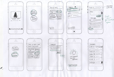
However, in a critique it was pointed out that only answering one question could be quite fruitless, as only one specific issue is being addressed per day and thousands of other questions are being ignored. Another issue with this is that people may not want to have their personal question broadcast for the whole school to see, even if it is listed as anonymous. So I then developed a way of there being multiple categories of question, allowing users to privately message responses to a multitude of people.
Yet, I still wanted to incorporate a way of having a massive screen projection that allowed the school to collectively interact with. Going back to the idea that teenagers aren't alone in their issues, even if they feel like they are. So I decided to create an aspect of the app where you enter and it asks you to rate how your day is going from 1-5. These ratings will then form into coloured blocks and as part of the projection will constantly move down the screen, showing how happy individuals are throughout the day. If there was lots of blue, level 1 ratings, it would become clear that people weren't happy - indicating more help needs to be given. It also means that the people in the halls aren't as faceless as they were before, as people realise not everyone is happier than they are.


No comments:
Post a Comment