

So to develop this I undid the design and studied the rough net I had made. Certain changes needed to be made, including the width of the sides in order to hold the pictures compactly. This involved printing the inside pages, stacking them and then measuring the width to correspond with the envelope. I also made sure to shorten the centre fold, allowing the camera design of the first page to be fully visible.

After drawing out a concise, accurate net, I then began developing designs for the main cover fold. This was in fact one of the most important elements as its what the consumer will use to decide if they're going to pick up the guide.
Initially the designs used large jagged arrangements of the Franklin Gothic text, overlayed to give bold impact and linking to the blocky design on the inside. This was done by drastically changing the leading. However I found that the design was too similar to the first page of the book and I wanted to created some variation.


I tried an burnt orange/yellow tone to connote the colour used by Kodak disposable packaging. Despite the fact that these designs looked interesting, I found that the colour was too out of place compared to the inside pages, and would eventually clash.


I then looked at the third colour used on the inside pages, the red. Having a cover that uses this would then make it even more defined on the inside, especially as the only use of the red before was just the arrows. For one of the elements I tried interlinking the type, however these curves felt too organic and inconsistent with the rest of the blocky design. I did change the kerning of the letters below, thus allowing the N and the M and the As to line up aesthetically.


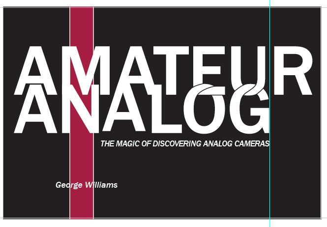
I then began adding simple circles to the cover, referncing the circles used in many cameras. This minimalism also links to the functional designs inside. This still felt too aggressive and crowded as a design, so I then reverted the text back to a more reserved approach. This felt more controlled and relevant to the rest of the guidebook design. The red circle is to signify the red light of the flash and the white is showing the reflection on any camera lens.


No comments:
Post a Comment