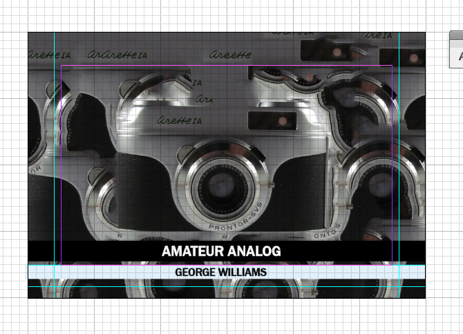
A really useful piece of advice was to hand write on the back of each photograph the text required. Although this can't really be applied on the diagram pages, which will need a typeface of their own, it would be a really authentic technique for the full bleed example images to have handwriting on the backs. This would mean they would no longer need little strips of text at the bottom, which currently aren't very legible and distract from the images (as shown below.)

The problem with having handwritten text on the back, is that this would go against the clean, precise style I have chosen for the diagram pages. This is when I conceived the idea of having stickers on the back of each page that can be had written in, giving them a uniqueness but also a rigid layout. After some searching I found a photographer's sticker that I thought conveyed information about the photographs precisely. The contrast between the handwritten and the digital type works well in conjunction and I have designed something similar so the images can be kept track of.


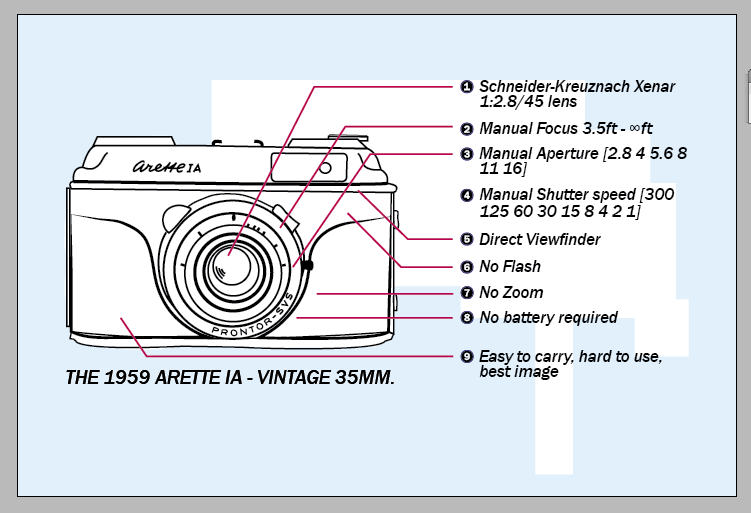
2. Another aspect of the crit was asking people about the colours I should use for the guide. Much of the feedback suggested I should use subtle colours or actually just leave the designs black and white. One suggestion was to use toned down colours to reflect the style of old film. I decided eventually to introduce a light blue to the designs similar to a style of an old Kodak guide I'd researched. I also included a deep red for the smaller lines connecting the information to the designs, this was to pop out from the otherwise flat design and add another layer to the image. The information linking to the camera had a specific format, e.g. point 2 for every camera was focus, so if George hadn't supplied any information for focus on that camera, I would research it so the format could be adhered to.
The blocky background is to indicate a technicality to the design, without using organic shapes this maintains the clinical effect. It also subtly indicates a hirarchy of how the design should be read, from left to right, leading down. This happens throughout all of the illustrated pages in some form, in order to again make the designs less flat and communicate a feeling of motion.
3. Finally, I asked if the cover was effective in communicating the concept and the rest of the design. The cover design at that point was the design shown below. Although this collage does hark to the idea of 'happy mistakes' and spontaneity within film photography, it no longer reflected the clinical illustrative style shown throughout the pages. People suggested making the cover have a Polaroid picture feel or have a band of real film shown down the side. This would link to film photography again, but would not reflect the contents! Instead I chose something far more simple, with a black band to have a suggestion of the film strip link. Hopefully this more refined approach will seem far more considered.

No comments:
Post a Comment