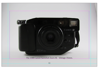
George sent me a guide he had used for one of the camera's and it had a minimalist style, focused on function, which I thought I could interpret for some of the guide pages. The designs are very minimal in their aesthetic yet are functional and clean, they have a precision that you often find in photographs. This leads on from the 'form follows function' principle, each design is primarily very effective at communicating information, and is optimal for the image's quality. Yet this type of bare, balanced design is often considered bold in its clinical approach.
This initial designs for this were incredibly similar, the illustrations aiming to be detailed but without colour, with only little elements (like camera reflection) showing them to have personal interpretation. It's clear that the designer for Canon Supershot guide was regarded for the pictures drawn as some are signed at the centre of the illustrations in faint blue. This shows that technical illustrations like this do involve some form of artistry and personal interpretation. This work is similar to the drawings shown in 'the 35 mm photographers handbook' explored earlier, which also involve a style, aiming to be invisible to the reader yet not bland within the book.
The aim for the illustrations is to have lines drawing from them, with the text George has written about each element. Hopefully this will then balance the simplicity of the full bleed images. There still need to be much development on the underlying grid and typeface.


No comments:
Post a Comment