Sunday 19 November 2017

OUGD504 - End of Module Evaluation

During this module I have learnt several technical skills and have developed my ability to make a full body production.

In the first brief I learnt skills in binding and composition, even though I didn't carry binding forward it was important to develop my understanding of this. In fact a big aspect of this brief was learning to break the boundaries and not do a bind, despite what the brief specified. This was to take a unique approach and do what would create the best design. The collaboration in this project also when well, I found it a good challenge to be asked to design something different from my usual style or interest. We worked well as partners too, giving advice and providing any necessary elements to improve the other's work. Collaboration is something I would like to do more of in the future.

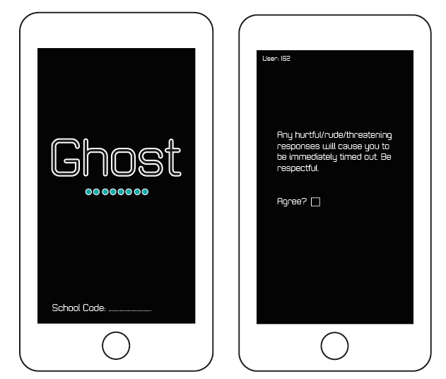
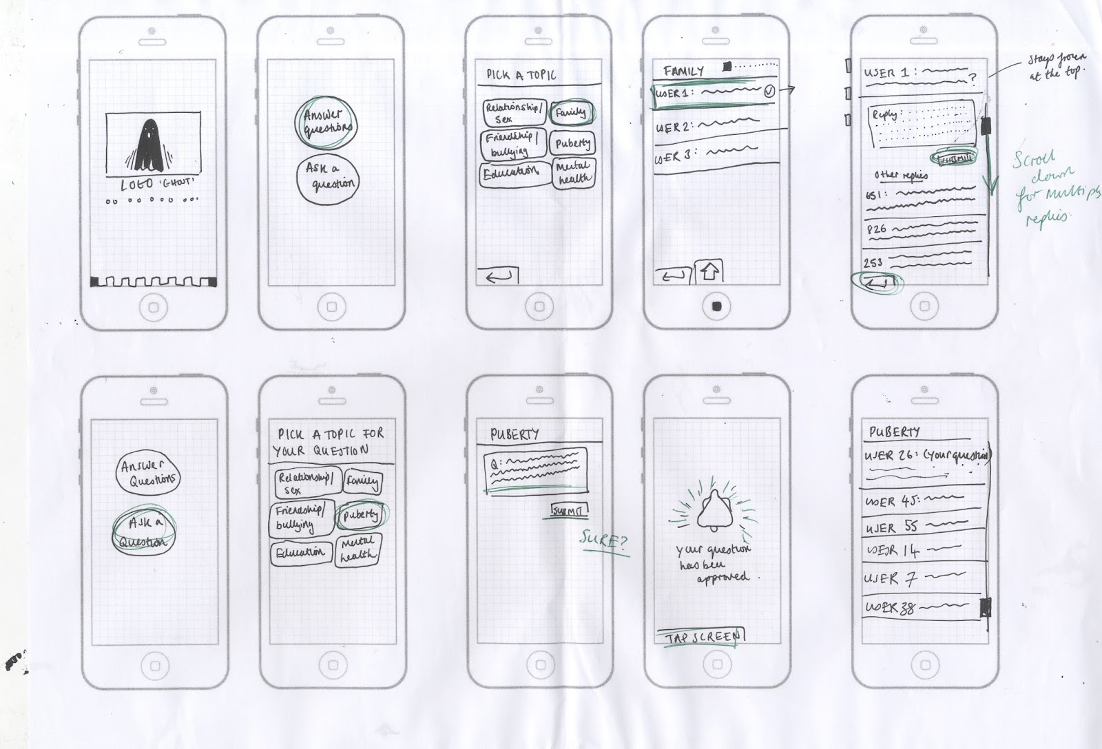
The second brief was something I had never done before, which made it a completely new experience. I really enjoyed it though, despite my initial reservations. By learning how to animate the app in Photoshop I will be able to carry those skills forward in limitless ways. Something I've wanted to do for a while is start making animations so hopefully this will be the beginning of many more to come. With this brief I also took quite an usual approach, involving a projection and an ambitious dystopian aesthetic. This however is something I've truly enjoyed and find it much more satisfying then making something that would be used sensibly and traditionally. This is something I may need to think about though as after this degree it's important to have skills in 'real world' design, that is in some respects focused around commerce and popularity.

Something that has been particularly important and influential in this module is the visiting speakers, which have really inspired my design and aided my growth as a designer. By seeing work that is clean, fresh and the peak of that field it can be incredibly motivating. The Village Bookstore talk was definitely one of the most inspiring lectures I've seen, and has encouraged me further to work on my own zines and to approach them from fresh perspectives.

Finally it is important to consider that I have not been entirely organised on time management throughout this project. However it has improved dramatically since last year and I hope to continue improving this work ethic.

Brief 2 - Evaluation

Overall this project has gone well, it works effectively and is bold and exciting enough to appeal to the younger generation. The idea takes an experimental approach which isn't a logical solution but is a fresh perspective.

From feedback it has become apparent that black, angular design could be intimidating for some students, which is goes against the rationale and means the app might not entirely be effective. However, there has been many responses that also suggest it works well - it's bold and intriguing and would definitely create some excitement in a high school. One of the biggest reasons for this design was so it doesn't patronise and it doesn't do that. 

Although it doesn't patronise it might be seen as too rebellious and outside of the norm. High school management may be uncomfortable with it's futuristic appearance and it's emphasis on openly displaying how unhappy students are. Is the app too anarchist because of this? It certainly had influence from the 'cyberpunk' style which is a from of design that rebels against fantasy authority. This creates interesting design but has not entirely satisfied the high school client. In future it is important to consider how a compromise needs to be made between what all the users expect. This is why I have done some quick developments for an app that would also appeal to high school management, these designs are much softer and friendlier - the design no longer appears like it is pushing against the authority for a chance to honestly address the emotions of the students.

It was suggested that the orginal app could be used as a 'social experiment' in highly progressive high schools. It's purpose is to boost awareness for the health of the students and it could still be effective in this; it could even uncover major issues that often establishments ignore. The projection is quite immersive and exciting, so perhaps it could even be seen as an installation on a wider scale, addressing issues about how as a society we aren't always honest about how we're feeling. The point of these interfaces was to change how we perceive teenagers and the problems they face, it would certainly do this if installed in a high school, it might just have uncontrollable results.

Saturday 18 November 2017

Final Feedback Crit

People seemed to respond well to the app and particularly liked the way it wasn't too babyish and respected high schoolers as young adults. Being fairly close to high school age it was good to here positive responses to the retro style of the app. They also suggested the concept was good and had hit a gap in the market with such an alternative approach.

However some of the people suggested that the black could be too intimidating for high schoolers, although some thought this worked well for the serious nature of the app. Of course the app is trying to help all issues in high school, not just serious problems but embarrassing ones too. So we discussed perhaps altering the app design so it could eventually change in accordance to the category of the issue. For example if the user dipped into the 'mental health' section, the colours could get a bit darker in order for it to remain serious. I think this could in fact be counter intuitive as the user doesn't want things to seem darker at this point, maybe the colours should turn softer in order to show compassion. The colours could also be respondent to the emotion rating given at the beginning of the app. E.g. once you've rated yourself as a 1, the rest of the app screens are shown in a dark blue colour. Not only does this add more colour to the app but it also incorporates the projection concept further with the rest of the features, making the program cohesive. Similar to this, someone asked if maybe the falling blocks of the projection could be animated within the app, giving another connection to the projection aspect.


There may be an issue with the app where many more people ask questions than answer them. Perhaps there could be an algorithm that means you have to answer a question if you've already asked one.

One major issue that was raised was that the app itself might not be popular with the schools. It doesn't show the traditional school aesthetic of bright colours and soft illustrations, in fact it actively fights against that. It is important that I show a considered alternative that schools will happily endorse too. Even though the app avoids seeming 'scary' or intimidating', it doesn't specifically show an overtly 'child friendly' approach. In fact it was also suggested that I rethink the name as 'Ghost' doesn't reflect the help service nature of it. I disagree with this as I think it still reflects the mature, young adult, 'edgy' aesthetic I set out to communicate. However it was still important to trial an approach from a different angle, with the school regime in mind.

Quick design experiment for 'school' aesthetic.
This shows a brighter, friendlier approach, which could be taken forward if the app was unsuccessful in gaining support from schools.

Friday 17 November 2017

The Art of Experimental Interaction Design - By Andy Cameron

 For part of the projection I researched some interaction design for inspiration. The first designs I looked at were by Bigspace, a design consultancy based in Milan. These designs are projections made by using heat sensors above a well and then translating them into circles patterns. This was something that was actually projected above an ancient Roman well. The colours used for the circles helped inspire the colours for the Ghost projection, the relationship with hot and cold is comparative to that of happy and sad; the deep orange and soft blue work well. The fact this projection reacts to the temperature of its surroundings is also interesting, as the Ghost projection should constantly be reacting to its surrounding too; the surroundings being the high school and the emotions of the students.


Something else I wanted to consider for the projection was a piece similar to this of Rafael Lozano-Hemmer's, called 'Body Movies'. This uses an arc light to form these huge silhouettes of the public in the Rotterdam public square. I thought this could be quite interesting to experiment with for the Ghost projection, as students could then physically interact with it as well as digitally. Perhaps this would be adding too many elements to the concept though. Either way, it would only be an idea for the project's future. I have experimented by having a silhouette in front of the video and seeing what effect this had. It did create a more stylised effect, adding further layers and connoting the anonymity theme.


Interactive Projection

After my research into the LUST infographic that involved visually representing people's emotions of a single day using colour, I decided to create something similar that would go with my app. The purpose of this would be so that individuals feel like they're less alone if others in the school are feeling a similar emotion to them. It would build a sense of unity in the students and may also encourage them to use the app so they can be involved. 

Upon entering the app, the user would be presented with the screen below, asking them to rate how they feel today from 1-5. Each number has an assigned colour from dark blue to bright orange. Once the user picks and submits a number, it is then cast on a huge projection as block falling down the screen. This well then hopefully create a serge of blocks falling at certain times, when the users are coming into school for example.


To show how this would appear I have made a short animation that has been projected to test the effects. The grainy effect is quite dystopian and furturistic, yet I think this goes with the app's aesthetic and would be incredibly popular in a current millennial high school. One concern is that although it may be popular with students, it may seem too 'strange' for schools to endorse. Especially as it may not reflect the school in the most positive light if many students are selecting the dark blue block and this is being shown across the school. I will need to consider a way of making this more school friendly so that school management will promote Ghost too.

App Animation Walkthrough


Made using Photoshop this was made to visually represent the relationship between the different aspects of the app. A key feature of this is the colour changes when pressing buttons, this is slowed in order to show how this would work.

App Design

I began making the enter screen with the large Ghost logotype and a small circle illustrations, this is to connote the retro game vibe and make it appear quite clean and bold. The thin outline for 'Ghost' is also to seem a bit futuristic/cyber punk, making it sharp, instantaneous and well fitting with the rest of the design, which contains illustrations using thin white line too.

This then fades out, seeming quite subtle and mature, leading up to an agreement about showing respect to other users. This uses the same Zolano typeface to seem consistent with the design and to reference the blocky face computers once used for programming. This isn't held in a textbox so it seems like the foundation of the apps introductions, rather than an annoying pop-up.

The section after this is the two options for 'answer question' and 'ask question'. I designed two different variations for this, one with the opacity changed so the turquoise can be seen through the black and the other (design 2) with a white background and a grey tick. I eventually decided to go with the white design as it is more consistent with the colour scheme and the meaning is more apparent with the tick signifying that section is complete. 


For the keyboard there was several different experiments for the design. I first looked at the layout of the text entry aspect of apps and studied how the keyboard arrived on screen. This was a swift sliding motion which caused the text book to be raised as well. As a result I began editing my own version as seen in the dark grey box, but this became complicated as there were many different features I needed to consider and fit within a simple space. Eventually I decided to screenshot the keyboard used within my phone, as within the app it would conjure the phone's inbuilt keyboard anyway.


Another aspect I experimented with was the category section, which initially was very large and filled the screen. However I found that this was obnoxious in some ways and it took away from the minimalist effect which was the aesthetic aim. So I made the boxes smaller and lowered the text above them so it was in line with the rest of the screens, making it more consistent.

Above this you can see the textbox for the question and the textbox for the response received. These use rounded edges to keep with the 'retro' game feeling, making it still seem friendly despite the dark aesthetic of the app. It also allows the writing to be 'framed' so it is clear what has been composed, allowing you to check your response before you send. I have considered that some of the responses may


Additionally, one of the key features of this app is the illustrations, which I have made fine and white to fit with the app's aesthetic. They are minimalist but still involve the angular style and quickly communicate the message's intentions. I didn't want the illustrations to seem too patronising or over-complicated; more functional and cheerful.


Finally there was some design for the app icon, in the end I went with the simple G outline in order to be consistent with the logotype but not force the entire word into the icon. It's important the design can stand alone, like the 'F' of the facebook app.

Initial Failed Concept and Design

Initial Ideas Not Carried Forward:
  1. The initial designs for the app were made so people had a username 'Haz_' and a concealed profile which they had to set upon opening. This was designed in order to allow the moderators to find out who is submitting questions/answers if they need to. For example if the user displayed content that suggested they might hurt themselves or is particular harmful to others, then the moderator would then be able to find the user's identity. However, this was eventually disregarded as an idea because it may discourage people from using the app. By being completely anonymous it may encourage honesty greatly, anonymity is the entire purpose of the app. Of course this would mean there needs to be other settings in place to make sure the users displaying 'worrying content' can seek help.
  2. Having 'one question' per day. This was going to be so that individuals could submit potential questions all day and only one would be picked for the rest of the school to reply to the next day. This question was going to be beamed onto a projection and so were the answers. The problem with this is that many many students would not have their questions unanswered, and the question that was picked might generate lots of similar advice. It might even embarrass the author to have so much attention on them for it, even though they are anonymous (potential gossip, making the situation worse for them). This would also cause issues for the algorithm, as a notice board full of replies for one question could get messy and disordered.
  3. Part of the idea was to have a section of the app that included past questions and past answers, including star ratings of these answers. Although this would be an interesting feature, in a crit it was suggested that this over-complicated the app, making the interface cluttered.

Cyberpunk - '100 Ideas that Changed the Web' by Jim Boulton

For the aesthetic of my design I hoped to connote a 'cyberpunk' aesthetic, which relates to a sort of 'information-age' dystopia. This will allow the design to seem exciting and 'cool' but also serious in some ways - far from childish.

Jim Boulton talks about the Matrix as an example of this, it 'has its roots in primitive arcade games' which is exactly the kind of aesthetic I want to replicate. By making it quite blocky and angular, it seems sharper and more defined. It's almost like the app could use this style as if it is in its barest form and isn't trying to be something 'child friendly' with curved corners. After all, it's aimed at young adults and should therefore be treating them with respect. This style could be the perfect way to show this. 'Cyberpunk is a critique of postmodern culture', it suggests the world we live in is fake; which is almost what this teen app is trying to fight against. The way high school's are run can be seen as very corporate and about the bigger picture - not the individual students and their issues. Students aren't drones!

In some ways this app is a bit anarchist, yet the problem with this is that the high school should be on board with it to become a popular shared interface. I could consider changing the concept behind and suggest that students run the app and projection in retaliation to the school system; making it an 'underground' app. However, there may also need to be another alternative for something that high schools would happily back, a simpler, sweeter approach.

'Don't Make Me Think' - Steve Krug

After having researched some of the key features of web interface and user experience I found some useful advice in Steve Krug's book 'Don't Make Me Think'.

Firstly, although it may seem obvious, the interface needs to be so easy that the user no longer has to think while using it. It really emphasises the importance of this, so I hope to make my app as simplified and concise as possible, with easy user flows and clear layout.

Another thing that the book made clear was that the information has to have a clear 'visual hierarchy', with the most important held evidently at the top. This could even involve the illustrations I intend to include, which should be obvious in their meaning and the given priority on the screen.

Thursday 16 November 2017

Experimenting With Colour Scheme

After deciding on the logotype, I then began experimenting with the colours that could be used for the app. Bearing in mind that I wanted something that would seem 'mature' and 'cool', that young people would feel proud to use. But also something that will seem approachable if they are vulnerable and will be appropriate in the school setting. Finally it is important that the colours chosen keep up with the retro theme I have been developing.


I tried several different colour experiments, mostly going for darker tones in order to seem subtle. I think these worked better than the light blue and soft orange, which seems a bit too much like a 'friendly educational app'. I also trialed some more pixelated designs to give a more futuristic effect; almost linking to 'Cyber Punk'. Although this created quite a groovy effect, it seemed too flashy and bright, the design needs to seem welcoming and calming.

I was looking for something more exciting and outlandish which the black seemed to convey. It also represented the sense of anonymity that is the app's main concept - being lost in the dark but there also being help there too. Finally, it links to the work I have studied of LUST, which I love as a futuristic representation of technology. Black represents something enigmatic.

The use of turquoise with this counteracts something that could seem intimidating. It represents a more calming/tranquil side to the design. By only using this minimally it will give the design small overtones of colour, adding further layers to the design.

Branding the App: Ghost

To decide on the name of the app I ended up doing a mindmap of ideas, all featuring different words for questions, talking, anonymity etc. I wanted the name to be something that teenagers will feel connected to and will happily recommend to their friends. There's definitely the potential to make this too school orientated, which I wanted to avoid. For example the 'After School' app I researched has quite a wholesome name, which doesn't always reflect the lives of high schoolers.


Eventually I decided to go with the name 'Ghost', which I thought connoted the anonymous factor well and goes with the current cool 'retro' generation. There is even almost a link to the Pac Man ghosts which I have mentioned before as a possible design influence.


Here I have trialed several different typefaces for the App, maintaining a keen interest in the retro theme.
  1. The first trial, 'Kalinga', takes a more neutral approach and would need some changes in kerning to be more appropriate. This has softer edges and would work well in seeming approachable. However I felt this wasn't individual enough to work as a dynamic brand and is too simple to be a solitary logotype. 
  2. The second 'Folio XBd BT Extra Bold' and fith 'Verdana', take a far more bold approach - the second especially. This seems like they'd be more striking and the thickness appears friendly, compared to a thin, clinical approach. 
  3. I have decided to carry forward trials 3 and 4, which uses 'Zolano Sans BTN'. This feels like the most retro and has connotations with games like Pac Man because of its angular aesthetic. It will be perfect to go with designs that I hope will be similar to old computer programming. 
Potential Ghost Logo Design:

After several quick attempts at potential design for a logo, I found all seemed quite cliche. By focusing on the logotype instead I think this will make the app feel less crowded and will appear refined.

How to Moderate the App

One big concern for the app was that any rude or hurtful comments inventively said by high schoolers needs to be prevented or moderated. For example, Ask FM was an anonymous service for people to talk to each other and answer questions, yet this caused massive problems. There was even a case of suicide that was linked to the hurtful comments someone received because of this site. This means that my app needs to remove this sense of danger behind anonymity. Especially as it would be most frequented with vulnerable people, looking for help.

Saying that, it's still important that high schoolers should be given the opportunity of free speech. A massive problem in high schools is that students aren't respected for their words and are often disregarded for their issues. I want it to be possible to swear on this app as swearing is a part of life, similarly I want people to feel like they can be honest about the thoughts they're having.

Another concern with this is that students could confess particular issues that indicate they are in danger from self harm or from others around them. This leads me to think there should be further action if content like this is displayed. Maybe a link to a helpline, a personal message or their anonymity is unveiled.

Ways this could be resolved:
  • There could be buzz words that cause questions to be immediately be 'binned'. The problem with this is that its entirely possible for things to be hurtful without using specific words. Besides I still hope to include swear words too, just with asterixing. 
  • Having a 'time out' aspect involving kicking people off the server if they're reported. This could be on a tier system where eventually they would be banned from the app all together.
  • Having moderators or 'mods' which will be managed by older students of the school, allows their to be an approval section of the app. This means that I could design a section of the app for the moderators, allowing them to easily approve acceptable questions.
Moderator App Wireframes

LUST Design- Urbansensing and Infographics

A graphic design studio 'LUST' has done a similar concept of rating people's emotions through colour, then visually representing them to create a collective effect. These particular designs show the range of positive to negative emotions in the Netherlands, based on the content of a particular day's tweets. This gives an overarching summary of the country's happiness and creates quite a unique effect. It would be interesting to do something similar with the emotions of high schoolers as a collective, especially if shown as a daily projection.
I particularly love the black background in this, as it makes the limited colour bold and striking. Perhaps the app design could also contain a similar black to this.


Another part of the LUST's design work, is interactive big-screen infographics and live projections. This relates perfectly to my project as it shows how current events can be streamed live to create minimalist representations. For example, this poster project called 'Poster Wall for the 21st Century'  was a live stream of 600 posters from all over the world generated daily. One new poster is generated every 5 minutes, so the wall is never the same. The aspect of originality and constant alteration is something I want to replicate with my own 'emotion projection'. Every day students will hopefully cast a different emotion, at a different time, causing the screen to always be varied. A paticular feature of this poster wall is the interactive element, by walking past it causes alterations in the projection. This is something I could state as a potential aspect of the projection, past the project itself. Yet at the moment I want to keep the concept quite simple, and focus on how the projection will look with people standing in front of it.

Wednesday 15 November 2017

Wireframes and Concept Development

I began the designing for the project believing the app was only going to ask one question of all the students per day. And this question was ideally going to be 'beamed up' onto a massive projection in a central part of the school, in order for students to read all the varied responses and realise they are not alone in their problems. This meant there was a 'Answer question', 'Submit question,' feature running throughout the app design.


However, in a critique it was pointed out that only answering one question could be quite fruitless, as only one specific issue is being addressed per day and thousands of other questions are being ignored. Another issue with this is that people may not want to have their personal question broadcast for the whole school to see, even if it is listed as anonymous. So I then developed a way of there being multiple categories of question, allowing users to privately message responses to a multitude of people.


Yet, I still wanted to incorporate a way of having a massive screen projection that allowed the school to collectively interact with. Going back to the idea that teenagers aren't alone in their issues, even if they feel like they are. So I decided to create an aspect of the app where you enter and it asks you to rate how your day is going from 1-5. These ratings will then form into coloured blocks and as part of the projection will constantly move down the screen, showing how happy individuals are throughout the day. If there was lots of blue, level 1 ratings, it would become clear that people weren't happy - indicating more help needs to be given. It also means that the people in the halls aren't as faceless as they were before, as people realise not everyone is happier than they are.

Teenage Demographic

 After doing some research into the key struggles that high schoolers face, it became immediately apparent that there is a lot of supporting sites for academic problems. A lot of the immediate articles seemed to be aimed at the parents of high schoolers, or were incredibly patronising. They appeared to state a big importance on grades and productivity, rather than acknowledging that high school can be an extremely mentally strained for other reasons.

Researched issues:
  • Academic Pressure
  • Puberty
  • Fitting in 'being accepted'
  • Family troubles
  • Preparing for the future 
  • Finding the right identity
  • Sexual pressure 
  • Friendship troubles
http://classroom.synonym.com/common-struggles-high-shcool-6892511.html

Its important that the algorithm of the app I create responds to this issues accordingly.

Teenagers appear to most frequent apps like 'Snapchat', 'Instagram', 'Twitter' and 'Messenger.' All of these are about fast paced communication and are rooted in socialising. Another app I found that is particularly relevant and is a favorite of American teens is 'After School'. This allows teens to speak their mind, connect with classmates, participate in social change, volunteer for community projects and apply for scholarships, all within the school's forum. I found the design of this incredibly geared towards teens. It uses emojis, soft illustrations, video responces from teens and still manages to appear mature. I will need to make sure my own app has these considerations in order to fully connect to teens.


However, I do not want to make this app entirely based on what teens will instantaneously respond to, design isn't a formula. I hope to take a more unique approach, perhaps something that is almost retro. With this generation there is a growing appreciation for things of the past, so I'm considering making the design in the style of old computer programming/games.

High School Problem Program Research

Initial Concept: The initial concept for this project is to aid high schoolers in their struggles by getting answers to their problems anonymously from other students. At the moment this could be done as an app, website or school projection. There could even be a combination of approaches.

Pre-existing programs like this:

The Student Room:

The Student Room could be used as an example of ways that the question system could be laid out. Not only is this a base for academic support, but it is also used for relationship and health advice which is what I want the main focus of my project to be. This relies on quite a complex set of threads to find a relevant topic, which is something I want to steer away from. The complexity means that the website is fully functional and can be used to its best potential, but the format is quite 'klunky' and dated.

Not only this but the actual design is fairly childish. For something that is meant to be for young adults - looking to find answers about their future/their lives - it appears to be patronising on the outset. With bright blues and a blocky typeface the audience isn't respected, although perhaps this is purposeful in order for them to be approachable and not seem intimidating. Either way the aesthetic could be altered to seem 'safe' and 'approachable' but also mature and appropriate for the age demographic.


Vent:

Vent is an app for android and ios which is themed on anonymously posting messages onto your feed about how you're feeling. One of the apps biggest features is to list a feeling to go with your post, e.g. 'sad', 'disappointed', 'excited' etc. This is quite handy as it allows shy people to find simpler ways of telling people what they're feeling without having to construct something too complicated to someone they know in real life. I want to replicate this simplicity and also use the anonymous theme. I think when something becomes anonymous people are a lot more likely to confess worries/weaknesses and could lead to them getting some considerate advice. Although feedback is an aspect of vent, its main purpose is almost to throw your emotions 'into the void' rather than letting them consume you. I want my app to be centred around getting good/considered responses to issues. 

It also takes a more stylised approach than the Student Room does. The bright orange/pink gradient works to seem vibrant and youthful. It is reminiscent of the Instagram app design which is incredibly current at the moment. The fact it's logo is the inside of a mouth makes it quite unique and takes a more 'cool' approach too. This is definitely something I want to follow for the design of my own app.


Whisper (app):

Whisper is an app that allows people to confess secrets to the wider world and start chatting to strangers as a result. This works based on distance around the user and conjures people to a similar location. Although I like the concept of this, I think it is very flawed in some ways as it could be quite dangerous to be chatting to strangers about deep concerns. I want to limit the ability to chat in my app to focus on the advice being given to issues, rather than a relationship being formed between the two users.

The bright purple design is also quite youthful and is unique within the current popular apps - not many are this colour. However in some respects I find the bright colour a bit tacky and too bright, it feels like it lacks taste in some ways. Especially as this design is aimed at people who need to feel safe when using this app, I don't find it particularly approachable. My own app needs to use a mature colour but also one that isn't too invasive to the eyes! 


Only Design Studio Visit 23/10/17

Only design is a branding agency based in Manchester consisting of 6 members which have rotated in the past. Some of their clients include Goldsmiths, Lost Village Festival and the University of Suffolk.


Design for Screen:
  • Design for screen is constantly evolving, its fast paced and offers a lot of opportunity.
  • It's here to stay as its a primary means of consuming a brand.
Only's Process:
  • Research - Competitors, audiences, personas, principles.
  • Wireframing - Test assumptions, idea generation, heavy involvement.
  • Design 
  • Front End 
You don't need to know how to code, most company's work with developers who understand the process.

Advice:
  • Important to have mass communication.
  • Work hard and thoroughly on pitches, focus on modern aspects such as social media and evidence that you have adhered to guidelines for digital design. 
  • Can use InVision or Axare for prototypes.

User Experience - UX

UX- User Experience: Everything that effects the user's interaction with the product.

It's important when designing something digital that the guidelines for the screen are followed and considered. 'This was designed because of this guideline...' These can be found on Human Interface Guidelines; it may also be beneficial to look at Design.Google too.

  • The user needs and the business needs should be satisfied equally when the product is made.
  • Needs to be socially enhancing.
  • It will either be used to fulfill a task digitally or to aid the user's social identity/communication with others OR both.
User experience design should proceed ordinary aesthetic design as its functionality is vital for it to be successful. It should be based on an informed, conceptual approach.

Analyse/Research - Design - Prototypes - Evaluation

Key features of the design process:

Personas: 
  • Character of the archetypal user.
  • Their life/routine.
  • Has to be realistic - not idealistic.
  • Consider a particularly challenging target user.
  • Social life/attitudes explored.
Task Flow/User Flow
  • The journey the user takes through the system and the series of actions.
  • 3 steps of task flow is the aim for programs produced by companies like Apple, so could be something to work towards.
Wireframes
  • Vital for the project.
  • Allows you to define the information hierarchy of the design.
  • Can plan the layout according to how the user will process the information.
  • A blueprint.
  • Can contain various states of button or menu behaviors.
  • Without being distracted by colors, typeface choices or even the copy.
Reference:
https://webdesign.tutsplus.com/articles/a-beginners-guide-to-wireframing--webdesign-7399

Studio Brief 2 - Design for Screen

The brief: Create an immersive and engaging screen based user experience for a media of your choice, this could include; website, app, streaming service, etc.

It will be important to consider:
  • The client
  • The problem
  • The target audience 
  • Overarching aim of the project  
What kind of digital experiences engage the viewer?
Must be global.
Could consider including image, audio, video.
Will need to have stills of the sight and could include animated elements.

Initial Ideas:
  1. To do an app or system where students can ask anonymous questions in class if they feel embarrassed about struggling with the lesson.
  2. Similarly there could be a online platform for high schools to set up for students to give anonymous questions to each other. This could be in app or an online platform with threads/discussion. Or the questions could be posted on projections within the schools. 
Process for developing ideas:
  • Start with the problem.
  • Consider the UI - User Interface (the main design.)
  •  User Experience - How quickly and easily you can navigate, the enjoyment of the social aspects.

This is not always about it being clean/easy, but it is very much about it being functional and serving a purpose well.