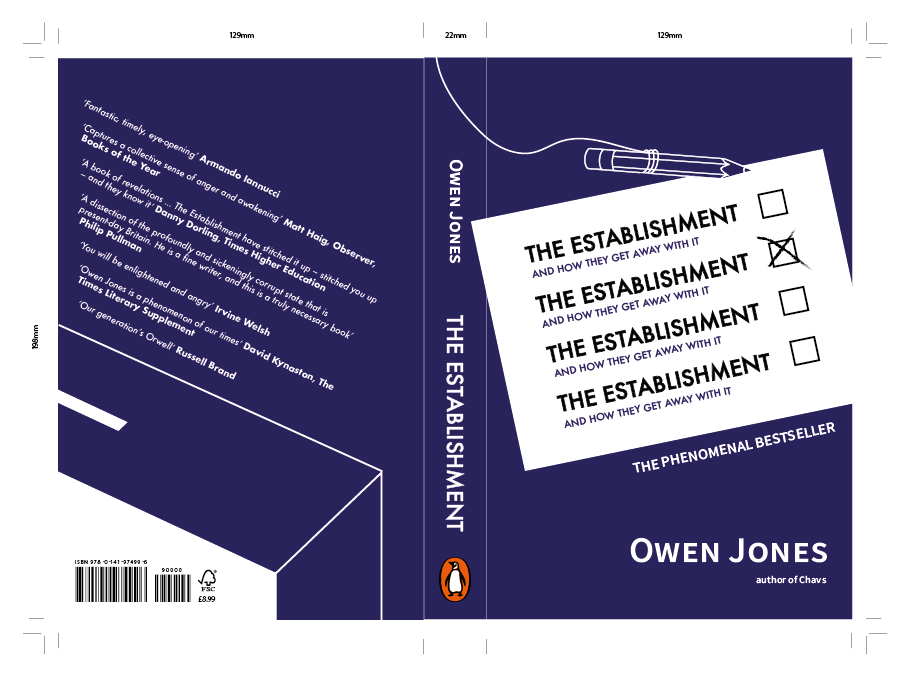
Once I developed a cover I was confident with, I began developing a design for the back cover which would relate to the content and aesthetic of the front. I wanted to develop a ballot box which I explored briefly in my initial sketches. This style I designed was informed by the shapes and illustrations used on the front cover, with quite an angular ballot box giving it a stylised effect. I thought this worked quite well, especially after having looked at the stylised designs that the Penguin judges usually select. I struggled with how to arrange the blurb on the back, thinking that it should follow the angle of the ballot box but still be legible. Eventually I edited the text so that it would follow the direct angle of the ballot box, almost so it looked like the words were being placed inside the box itself. This followed the flow the design much better and took a slightly more experimental approach which the Penguin judges usually tend to look for.


Then, something which made the design stand out far better was having the three unticked titles faded into a lighter grey. This meant that the main title was emphasised and the others didn't detract away from it.
I also tried the design in red considering that by having the whole design in a darker blue may give Owen Jones conservative connotations rather than the idea of him trying to remark that the conservatives are The Establishment. By using a red it might indicate more clearly his left and liberal views because of its links to Labour. However, I found the red less effective and meant there was less contrast with the white elements of the design. I decided that the blue would work far better, and most will understand the reasoning for using the blue colour.


No comments:
Post a Comment