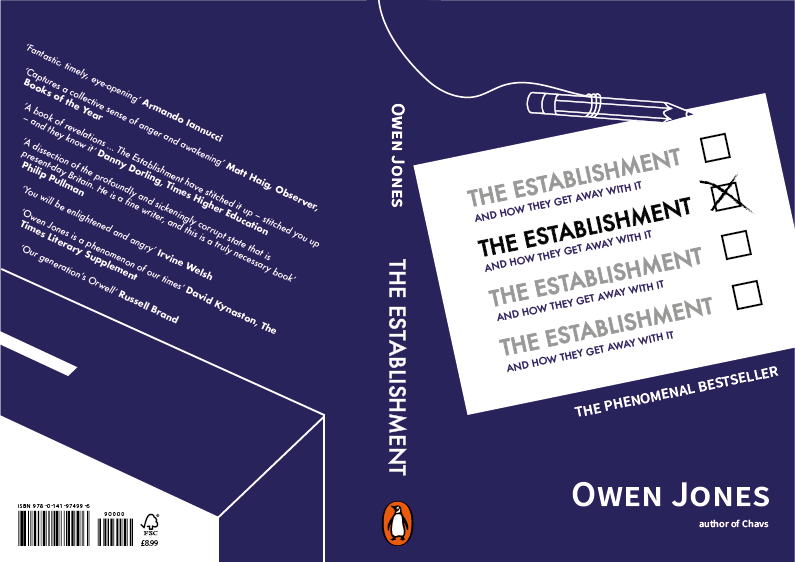
Overall, the final book design has come out well. By having the ballot paper diagonal it allows more of the design to be seen, it also makes the composition appear more authentic, as if the viewer has actually turned the paper to write on it. Having only one of 'The Establishment' titles highlighted has also worked well, it means that the design is not too chaotic but the concept is still able to shine through. Not including 'The Phenomenal Bestseller' within the ballot paper has also worked better than the original experiments - it means the paper isn't crowded and allows the statement to stand out but also be read separately from the core information. The pencil illustration also works well to offset the block shape aspects of the design, creating more of a detailed, stylised composition.
The back of the design shows a simplistic but considered approach. Having the text on an angle offers a slightly unusual take on the blurb, which could stand out in a marketplace. The ballot box has been designed to follow the line illustration was has been used for the pencil, this creates consistency. The white face of the box also balances the white used for the ballot paper on the cover.

No comments:
Post a Comment