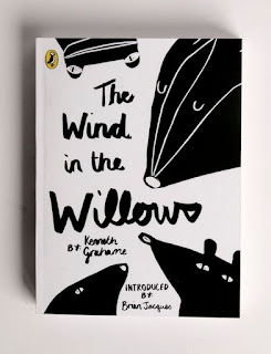
This is the initial design for the illustrated silhouette design, it was made by drawing out the design then scanning it in and heightening the contrast. This meant that the design seemed bolder and every detail could stand out from the page. This included dust from the scanner, which actually worked well to give the background a 'worn' textured effect.
It was suggested in the crit that there should be a spike of colour in the design, perhaps in the title, on the sleeves or even the spine. This could be red, to connote themes of fascism; however I have already talked about how this is already quite a used and tired colour scheme for the themes of this book. It could have hints of yellow instead, to suggest there is a light shining on the piece to create the shadow.
Another idea was to make the type handwritten with ink - similar to a Wind in the Willows cover I'd looked at - this would make the design far more consistent and stylised. Someone suggested that this could be done in spray paint to build on the idea that the flecked textured looks like a wall. One thing I need to be careful with when scanning is that the mistakes on the page (e.g. old pencil marks) become clearer, especially when the contrast was heightened.


No comments:
Post a Comment