Saturday 16 December 2017

Noughts and Crosses - Final Design and Evaluation

Before submitting the Noughts and Crosses cover, I made several more changes in order to ensure the design seemed consistent and professional. I firstly neatened the title letters, making sure the spacing was more even so it appeared less 'random'. I also reduced the thickness of the line, making it seem better detailed. The changes were small and generally just tidied up the design; I edited the girl in the centre so she seemed more precise; I also changed the colour of the nails on the left design to be black rather than white. The people running on the back of the design were removed after much experimentation - they seemed too random and misplaced. After this, the design seemed ready to submit.

After a small critique it was suggested that perhaps the style of design was too basic: details on the hands for example or the shape of the girl in the centre. A more intricate approach could have perhaps looked more professional. This is a valid consideration, however since the design is for children it needs to be viewable and easily understood by a younger audience. So by using minimal line and rounded shapes it can appear more friendly, balanced with the dark colours of the cover.

Another suggestions was that perhaps the design shouldn't have used black and white so heavily within the design, as this is something that a lot of the entrants might use. However with the accents of purple I think this balances out the appearance. It's also important to convey the nature of the book with the content being very black/white and night/day in nature. Some positive feedback was that the design flows quite well, with the eyes following down the direction of the arms to slowly intake the whole design.


Noughts and Crosses - Design Feedback and Modifications

Overall the feedback on this design is positive so far. People suggested it was bold enough to attract attention and the the angle of the arms offered a direction for the eyes to follow across the design, creating some flow. The hectic design reflects the nature of the book, showing how there is aggression and violence but also a softness - reflected by the rounded edges. There was some thought that the design might be better as a print - perhaps there is too much going on and design distracts from the literature. This design could be better as a dust jacket than a paperback design. 

However, there are still several improvements that could be made to make the design more precise and appropriate for the content of the book. For example it was suggested that the purple colour shown throughout needed to be used more on the front cover in order to be consistent with the back. Perhaps this could be changed so that there are clouds that are purple or there is flash of purple lighting. It was also suggested that the spine might not be quite consistent with the cover as the typeface used for 'Naughts and Crosses' doesn't match the hand drawn style. To improve this I will be experimenting with hand drawing the spine text. Finally it was also suggested that the colour and style of the authors name 'Malorie Blackman' makes it stand out more than the title 'Naughts and Crosses' which could cause some issues.

Friday 15 December 2017

Noughts and Crosses - Design Process

For design inspiration I looked at Patrice Killoffer's cover design for Karl Marx's communist manifesto. I thought he style took quite a playful approach yet also had a powerful, defined effect. It's important that Noughts and Crosses conveys something serious and important but also can still appeal to young adults/children.


To get a balanced design that fitted all the components well I went through several sketches/drafts. I new I wanted to have bold 60s bubble text, so this took several attempts to get the final result. This was to recreate the bold effect of Killoffer's work, but to also connote a 60s style, as the book shows some parallels with the racial tension of the 60s particularly.


After this, the design was drawn out in illustrator and colour was added. It was important that the pallet remain minimal. I decided purple would be best next to the black and white as one of Malorie Blackman's biggest inspirations for the book was The Colour Purple, which I thought should be honoured in some way.


Thursday 14 December 2017

Noughts and Crosses - Colour Pallet

For the colour pallet I decided to use black and white as the combination is bold, striking and goes well with the illustration style. It also signifies as a divide in the community of the story, which was import to relay in the outset. Deciding on the purple colour was more difficult; although I knew it would be purple because of my research into the author Malorie Blackman. 

I didn't want a purple that was too dark as this would have blended in with the black too much, causing there to be little difference. I also didn't want it to be too light as it may have seemed too childish, it was important the colour was strong and significant in the composition. After experimentation I chose the purple that was closest to a red tone, this meant it was vibrant and subtly hints at blood - key to the violence in the story, yet still maintaining the purple tone's significance.

Noughts and Crosses - Previous Covers

Two of the previous covers for Noughts and Crosses share an incredibly similar aesthetic and concept. They use the Noughts and Crosses as the main focal point, with black, white and orange being the colour scheme. It is important that this is steered away from as a style, the design is too cliched and needs remodeling. The first design in particular feels far too mature in its style, almost targeting adult readers in its simplistic approach. 


After researching Malorie Blackman I found out that one of the biggests influences of Noughts and Crosses was the book The Colour Purple by Alice Walker. This was something I researched further and eventually ended up looking into the covers of this classic. I particularly liked the two designs below that took illustrative approaches, this was a style I found I wanted to replicate. It also highlighted the significance of the colour purple itself to me, and I decided I wanted to connoted the roots of Naughts and Crosses with this colour.

Wednesday 13 December 2017

Noughts and Crosses - Burning Anger Experiment

From part of my research I found a quote that surmised the feelings of many characters throughout the story: Looking at our hovel, I could feel the usual burning, churning sensation begin to rise up inside me.' I burnt paper and edited the cover so the burns replaced the Os in the title, there is even the suggestion of a X in the bottom left.

I decided not to take this forward as the design might be considered more applicable for an adult fiction cover. Despite the fact I still want to respect the child audience, this cover is too bland to stand out among other YA novels - it looks more like a crime novel. I also think that although the book is about anger and passion, it is also about more than that - there are many themes. Like with the Romeo and Juliet idea, this cover only conveys an aspect of the story.

Noughts and Crosses - Romeo and Juliet Design Idea

One of the design ideas was to develop a Romeo and Juliet themed cover, that was particularly because of the forbidden nature of Sephy and Callum's romance. There is also a running theme of Callum dreaming of a 'palace with golden walls and silver turrets and marble floors', the turret specifically is something similar to the classic moment Romeo and Juliet have on Juliet's balcony which could be developed a visual. There is also a similarity with the unjust death, could there be a comparison with the poisoning and the hanging?


However, after one quick sketch of this design I decided not to take it forward. Noughts and Crosses is more than a story about romance, its got bigger themes about race, strength and indpendance. By painting it as similar to Romeo and Juliet, it immediately relates to love and romance, which leaves out so much of the story's depth.

Tuesday 12 December 2017

Noughts and Crosses - Conceptual Ideas

Ideas for the cover based on research:
  1. Image of two brown plasters placed in a cross over peachy skin. This could be a photograph or an illustration, symbolising a prejudice and a role reversal. However the problem with this is that it only represents the 'cross' in 'noughts and crosses'. The concept is also quite typical and could do with moving away from the 'noughts and crosses' symbols.
  2. A noughts and crosses game but the grid shows that no one can win.
  3. Could there be a chess board? With the white pieces somehow lower? Although this could be more appropriate for one of the later books 'checkmate'.
  4. One of the quotes, discusses Callum's 'burning anger', could this be visually represented? Figures on fire? Or would that be too intense. The militant organisation in the book leaves a bomb in a shopping centre so perhaps the explosion of this could be shown?
  5. Could the family's private beach be shown? With volcanic black sand?

Monday 11 December 2017

Noughts and Crosses - Research

Plot:
  • People of African decent have gained technological advantage over European people. Causing a social divide between the 'Noughts and Crosses'.
  • Persephone Hadley - cross, is friends with Callum McGregor who is a Nought. This is frowned upon and kept secretly. Especially as their feelings about each other are so strong.
  • Callums Dad and brother join a violent terror organisation (LM) against 'black supremacy'.
  • Callum's sister Lynette commits suicide by throwing herself in front of a bus.
  • Eventually the two friends part and a few years later they meet again when Callum helps abduct Persephone for the LM. This eventually leads to Sephy falling pregnant with Callum's child and Callum is eventually executed. 
Quotes/inspiration:

Looking at our hovel, I could feel the usual burning, churning sensation begin to rise up inside me.’- a lot of the novel reflects anger at injustices – is there a way to reflect 'burning' anger? Paper people burning??

The only thing that was worth a damn was the oaken table. Years before, Dad had cut and shaped it and carved the dragon’s leaf pattern into it, put it together and polished it himself.' - could there be a dragon leaf pattern in the background?

Blackman is able to ‘use Romeo and Juliet style romance to show the complexity of relationships between two different cultures’ (Book Reviews, 2004, pp.227). - perhaps the cover could be a parallel to Romeo and Juliet but with a more sinister edge to it? Especially as there is section towards the end of the novel where because of a misunderstanding the characters are separated. However is this comparison ignoring the socio economic decide to the noughts/crosses divide. Could Sephy be in the golden tower that Callum dreams of living in? 'I live in a palace with golden walls and silver turrets and marble floors...’ I opened my eyes and looked again at my house. My heart sank. I closed my eyes again.’


Noughts and Crosses - Penguin Random House Brief

Brief: 'We are looking for a striking cover design that is well executed, has an imaginative concept and clearly places the book for its market. The cover should encourage children to pick up the book and buy it for themselves and should also engage adults to want to buy it for them.
While all elements of the cover (front, back and spine) need to work together, remember that the front cover has to be able to work on its own, and to be eye-catching within a crowded bookshop setting as well as on screen at a reduced size for digital retailers.'

The winning design will need to:
  • have an imaginative concept
  • be an original interpretation of the brief
  • be competently executed with strong use of typography
  • appeal to the broadest possible audience for the book
  • show a good understanding of the marketplace
  • have a point of difference from other books that it will be competing against in the market
  • be able to sit on the shelves of a supermarket or ebook store as easily as it sits on those of more traditional bookshops
Personal Spec:
  1. The concept needs to be unique, rather than playing to cliches. I especially want to avoid the use of 'noughts and crosses' as it is an obvious approach.
  2. The typography needs to be incredibly considered and experimented with.
  3. The book needs to appeal to an audience of children and adults. It needs to seem exciting but also mature enough that an adult could comfortably read it.
  4. The book needs to fit amongst other books of the 'young adult' genre and pop against competition.
  5. The cover needs to be approached sensitively. One of the key themes of the novel is race and although this should be explored on the cover, it shouldn't be 'over done'. Malorie Blackman has said herself that she wanted the race of characters to be an aspect, but not the definition of their personalities or actions.

Sunday 19 November 2017

OUGD504 - End of Module Evaluation

During this module I have learnt several technical skills and have developed my ability to make a full body production.

In the first brief I learnt skills in binding and composition, even though I didn't carry binding forward it was important to develop my understanding of this. In fact a big aspect of this brief was learning to break the boundaries and not do a bind, despite what the brief specified. This was to take a unique approach and do what would create the best design. The collaboration in this project also when well, I found it a good challenge to be asked to design something different from my usual style or interest. We worked well as partners too, giving advice and providing any necessary elements to improve the other's work. Collaboration is something I would like to do more of in the future.

The second brief was something I had never done before, which made it a completely new experience. I really enjoyed it though, despite my initial reservations. By learning how to animate the app in Photoshop I will be able to carry those skills forward in limitless ways. Something I've wanted to do for a while is start making animations so hopefully this will be the beginning of many more to come. With this brief I also took quite an usual approach, involving a projection and an ambitious dystopian aesthetic. This however is something I've truly enjoyed and find it much more satisfying then making something that would be used sensibly and traditionally. This is something I may need to think about though as after this degree it's important to have skills in 'real world' design, that is in some respects focused around commerce and popularity.

Something that has been particularly important and influential in this module is the visiting speakers, which have really inspired my design and aided my growth as a designer. By seeing work that is clean, fresh and the peak of that field it can be incredibly motivating. The Village Bookstore talk was definitely one of the most inspiring lectures I've seen, and has encouraged me further to work on my own zines and to approach them from fresh perspectives.

Finally it is important to consider that I have not been entirely organised on time management throughout this project. However it has improved dramatically since last year and I hope to continue improving this work ethic.

Brief 2 - Evaluation

Overall this project has gone well, it works effectively and is bold and exciting enough to appeal to the younger generation. The idea takes an experimental approach which isn't a logical solution but is a fresh perspective.

From feedback it has become apparent that black, angular design could be intimidating for some students, which is goes against the rationale and means the app might not entirely be effective. However, there has been many responses that also suggest it works well - it's bold and intriguing and would definitely create some excitement in a high school. One of the biggest reasons for this design was so it doesn't patronise and it doesn't do that. 

Although it doesn't patronise it might be seen as too rebellious and outside of the norm. High school management may be uncomfortable with it's futuristic appearance and it's emphasis on openly displaying how unhappy students are. Is the app too anarchist because of this? It certainly had influence from the 'cyberpunk' style which is a from of design that rebels against fantasy authority. This creates interesting design but has not entirely satisfied the high school client. In future it is important to consider how a compromise needs to be made between what all the users expect. This is why I have done some quick developments for an app that would also appeal to high school management, these designs are much softer and friendlier - the design no longer appears like it is pushing against the authority for a chance to honestly address the emotions of the students.

It was suggested that the orginal app could be used as a 'social experiment' in highly progressive high schools. It's purpose is to boost awareness for the health of the students and it could still be effective in this; it could even uncover major issues that often establishments ignore. The projection is quite immersive and exciting, so perhaps it could even be seen as an installation on a wider scale, addressing issues about how as a society we aren't always honest about how we're feeling. The point of these interfaces was to change how we perceive teenagers and the problems they face, it would certainly do this if installed in a high school, it might just have uncontrollable results.

Saturday 18 November 2017

Final Feedback Crit

People seemed to respond well to the app and particularly liked the way it wasn't too babyish and respected high schoolers as young adults. Being fairly close to high school age it was good to here positive responses to the retro style of the app. They also suggested the concept was good and had hit a gap in the market with such an alternative approach.

However some of the people suggested that the black could be too intimidating for high schoolers, although some thought this worked well for the serious nature of the app. Of course the app is trying to help all issues in high school, not just serious problems but embarrassing ones too. So we discussed perhaps altering the app design so it could eventually change in accordance to the category of the issue. For example if the user dipped into the 'mental health' section, the colours could get a bit darker in order for it to remain serious. I think this could in fact be counter intuitive as the user doesn't want things to seem darker at this point, maybe the colours should turn softer in order to show compassion. The colours could also be respondent to the emotion rating given at the beginning of the app. E.g. once you've rated yourself as a 1, the rest of the app screens are shown in a dark blue colour. Not only does this add more colour to the app but it also incorporates the projection concept further with the rest of the features, making the program cohesive. Similar to this, someone asked if maybe the falling blocks of the projection could be animated within the app, giving another connection to the projection aspect.


There may be an issue with the app where many more people ask questions than answer them. Perhaps there could be an algorithm that means you have to answer a question if you've already asked one.

One major issue that was raised was that the app itself might not be popular with the schools. It doesn't show the traditional school aesthetic of bright colours and soft illustrations, in fact it actively fights against that. It is important that I show a considered alternative that schools will happily endorse too. Even though the app avoids seeming 'scary' or intimidating', it doesn't specifically show an overtly 'child friendly' approach. In fact it was also suggested that I rethink the name as 'Ghost' doesn't reflect the help service nature of it. I disagree with this as I think it still reflects the mature, young adult, 'edgy' aesthetic I set out to communicate. However it was still important to trial an approach from a different angle, with the school regime in mind.

Quick design experiment for 'school' aesthetic.
This shows a brighter, friendlier approach, which could be taken forward if the app was unsuccessful in gaining support from schools.

Friday 17 November 2017

The Art of Experimental Interaction Design - By Andy Cameron

 For part of the projection I researched some interaction design for inspiration. The first designs I looked at were by Bigspace, a design consultancy based in Milan. These designs are projections made by using heat sensors above a well and then translating them into circles patterns. This was something that was actually projected above an ancient Roman well. The colours used for the circles helped inspire the colours for the Ghost projection, the relationship with hot and cold is comparative to that of happy and sad; the deep orange and soft blue work well. The fact this projection reacts to the temperature of its surroundings is also interesting, as the Ghost projection should constantly be reacting to its surrounding too; the surroundings being the high school and the emotions of the students.


Something else I wanted to consider for the projection was a piece similar to this of Rafael Lozano-Hemmer's, called 'Body Movies'. This uses an arc light to form these huge silhouettes of the public in the Rotterdam public square. I thought this could be quite interesting to experiment with for the Ghost projection, as students could then physically interact with it as well as digitally. Perhaps this would be adding too many elements to the concept though. Either way, it would only be an idea for the project's future. I have experimented by having a silhouette in front of the video and seeing what effect this had. It did create a more stylised effect, adding further layers and connoting the anonymity theme.


Interactive Projection

After my research into the LUST infographic that involved visually representing people's emotions of a single day using colour, I decided to create something similar that would go with my app. The purpose of this would be so that individuals feel like they're less alone if others in the school are feeling a similar emotion to them. It would build a sense of unity in the students and may also encourage them to use the app so they can be involved. 

Upon entering the app, the user would be presented with the screen below, asking them to rate how they feel today from 1-5. Each number has an assigned colour from dark blue to bright orange. Once the user picks and submits a number, it is then cast on a huge projection as block falling down the screen. This well then hopefully create a serge of blocks falling at certain times, when the users are coming into school for example.


To show how this would appear I have made a short animation that has been projected to test the effects. The grainy effect is quite dystopian and furturistic, yet I think this goes with the app's aesthetic and would be incredibly popular in a current millennial high school. One concern is that although it may be popular with students, it may seem too 'strange' for schools to endorse. Especially as it may not reflect the school in the most positive light if many students are selecting the dark blue block and this is being shown across the school. I will need to consider a way of making this more school friendly so that school management will promote Ghost too.

App Animation Walkthrough


Made using Photoshop this was made to visually represent the relationship between the different aspects of the app. A key feature of this is the colour changes when pressing buttons, this is slowed in order to show how this would work.

App Design

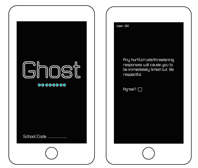
I began making the enter screen with the large Ghost logotype and a small circle illustrations, this is to connote the retro game vibe and make it appear quite clean and bold. The thin outline for 'Ghost' is also to seem a bit futuristic/cyber punk, making it sharp, instantaneous and well fitting with the rest of the design, which contains illustrations using thin white line too.

This then fades out, seeming quite subtle and mature, leading up to an agreement about showing respect to other users. This uses the same Zolano typeface to seem consistent with the design and to reference the blocky face computers once used for programming. This isn't held in a textbox so it seems like the foundation of the apps introductions, rather than an annoying pop-up.

The section after this is the two options for 'answer question' and 'ask question'. I designed two different variations for this, one with the opacity changed so the turquoise can be seen through the black and the other (design 2) with a white background and a grey tick. I eventually decided to go with the white design as it is more consistent with the colour scheme and the meaning is more apparent with the tick signifying that section is complete. 


For the keyboard there was several different experiments for the design. I first looked at the layout of the text entry aspect of apps and studied how the keyboard arrived on screen. This was a swift sliding motion which caused the text book to be raised as well. As a result I began editing my own version as seen in the dark grey box, but this became complicated as there were many different features I needed to consider and fit within a simple space. Eventually I decided to screenshot the keyboard used within my phone, as within the app it would conjure the phone's inbuilt keyboard anyway.


Another aspect I experimented with was the category section, which initially was very large and filled the screen. However I found that this was obnoxious in some ways and it took away from the minimalist effect which was the aesthetic aim. So I made the boxes smaller and lowered the text above them so it was in line with the rest of the screens, making it more consistent.

Above this you can see the textbox for the question and the textbox for the response received. These use rounded edges to keep with the 'retro' game feeling, making it still seem friendly despite the dark aesthetic of the app. It also allows the writing to be 'framed' so it is clear what has been composed, allowing you to check your response before you send. I have considered that some of the responses may


Additionally, one of the key features of this app is the illustrations, which I have made fine and white to fit with the app's aesthetic. They are minimalist but still involve the angular style and quickly communicate the message's intentions. I didn't want the illustrations to seem too patronising or over-complicated; more functional and cheerful.


Finally there was some design for the app icon, in the end I went with the simple G outline in order to be consistent with the logotype but not force the entire word into the icon. It's important the design can stand alone, like the 'F' of the facebook app.

Initial Failed Concept and Design

Initial Ideas Not Carried Forward:
  1. The initial designs for the app were made so people had a username 'Haz_' and a concealed profile which they had to set upon opening. This was designed in order to allow the moderators to find out who is submitting questions/answers if they need to. For example if the user displayed content that suggested they might hurt themselves or is particular harmful to others, then the moderator would then be able to find the user's identity. However, this was eventually disregarded as an idea because it may discourage people from using the app. By being completely anonymous it may encourage honesty greatly, anonymity is the entire purpose of the app. Of course this would mean there needs to be other settings in place to make sure the users displaying 'worrying content' can seek help.
  2. Having 'one question' per day. This was going to be so that individuals could submit potential questions all day and only one would be picked for the rest of the school to reply to the next day. This question was going to be beamed onto a projection and so were the answers. The problem with this is that many many students would not have their questions unanswered, and the question that was picked might generate lots of similar advice. It might even embarrass the author to have so much attention on them for it, even though they are anonymous (potential gossip, making the situation worse for them). This would also cause issues for the algorithm, as a notice board full of replies for one question could get messy and disordered.
  3. Part of the idea was to have a section of the app that included past questions and past answers, including star ratings of these answers. Although this would be an interesting feature, in a crit it was suggested that this over-complicated the app, making the interface cluttered.