
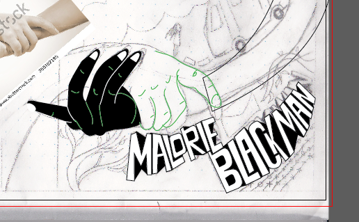
To get a balanced design that fitted all the components well I went through several sketches/drafts. I new I wanted to have bold 60s bubble text, so this took several attempts to get the final result. This was to recreate the bold effect of Killoffer's work, but to also connote a 60s style, as the book shows some parallels with the racial tension of the 60s particularly.


After this, the design was drawn out in illustrator and colour was added. It was important that the pallet remain minimal. I decided purple would be best next to the black and white as one of Malorie Blackman's biggest inspirations for the book was The Colour Purple, which I thought should be honoured in some way.


No comments:
Post a Comment