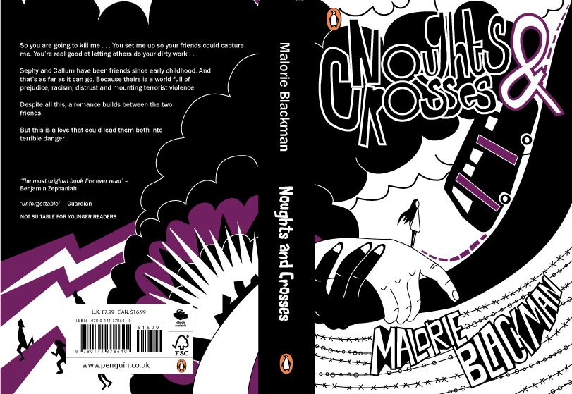
Overall the feedback on this design is positive so far. People suggested it was bold enough to attract attention and the the angle of the arms offered a direction for the eyes to follow across the design, creating some flow. The hectic design reflects the nature of the book, showing how there is aggression and violence but also a softness - reflected by the rounded edges. There was some thought that the design might be better as a print - perhaps there is too much going on and design distracts from the literature. This design could be better as a dust jacket than a paperback design.
However, there are still several improvements that could be made to make the design more precise and appropriate for the content of the book. For example it was suggested that the purple colour shown throughout needed to be used more on the front cover in order to be consistent with the back. Perhaps this could be changed so that there are clouds that are purple or there is flash of purple lighting. It was also suggested that the spine might not be quite consistent with the cover as the typeface used for 'Naughts and Crosses' doesn't match the hand drawn style. To improve this I will be experimenting with hand drawing the spine text. Finally it was also suggested that the colour and style of the authors name 'Malorie Blackman' makes it stand out more than the title 'Naughts and Crosses' which could cause some issues.
No comments:
Post a Comment