Word
Focus: Clandestine- "to keep secret or done secretively,
especially because illicit"
Garamond
- Modeled on Claude Garamond's type work.
- Has origins in the 1500s, yet is still widely used today.
- Has a detailed and complex history- could work for clandestine as its a word with an unclear backstory.
- When it was made, type was about making accurate replicas of handwriting. Yet this was the first to deviate from handwritten-style to make letters that would read better when printed.
- The letterforms were thinner and more delicate, which meant less ink needed to be used and allowed the ink to bleed on the page without overly distorting the words.
- Was used for the Harry Potter books, giving it charming fantasy association.
Source: http://www.meaningfultype.com/garamond.html
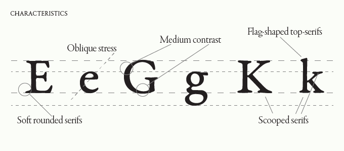
Caslon
- William Caslon, worked 1720–1766
- Characterised by short ascenders and descenders, bracketed serifs. There is also high contrast between the width and tension within the letters.
- Very classic “old world” look to it.
- Could work well for a thin, classic look for Clandestine.

Source: http://caseyprinting.com/blog/2013/typography/caslon-when-in-doubt-use-caslon/
Baskerville
- "Foundry" or "Fry" Baskerville is a typeface based on the original Baskerville.
- It's a transitional font and has a cross between modern and old style.
- High contrast in stroke weigh.
- Also uses bracketed serifs

Bodoni
- Created by Giambattista Bodoni (1740-1813), in late 18th-early 19th century.
- It is a series of serif typefaces following the ideas of John Baskerville. It had increased stroke contrast and it's uppercase is also more condensed.
- One of the first modern typefaces that grew within the 18th century, with a stronger contrast between the thick and thin line and uses unbracketed serifs.
- Used largely for high-end fashion labels, so perhaps not the most relevant for Clandestine.

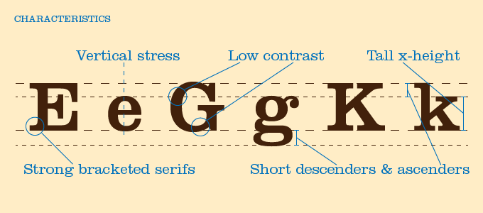
Clarendon
- Created by Robert Besley in 1845.
- It was inspired by the typeface Antique, one of the original slab serifs.
- Involves strong squared serifs but smooth curves connecting the serif to the body of the letter.
- There is little difference in width between thick and thin parts of letterform- making it bold and iconic.
- In fact it is warm typeface- often used for children's toys (which is too obvious for a word like Clandestine.
Source: http://www.meaningfultype.com/clarendon.html
No comments:
Post a Comment