Sunday, 30 October 2016

Typeface Project- Research into some of Joseph Muller Brockman's classic typefaces

Word Focus: Clandestine- "to keep secret or done secretively, especially because illicit"

Garamond
  • Modeled on Claude Garamond's type work.
  • Has origins in the 1500s, yet is still widely used today. 
  • Has a detailed and complex history- could work for clandestine as its a word with an unclear backstory.
  • When it was made, type was about making accurate replicas of handwriting. Yet this was the first to deviate from handwritten-style to make letters that would read better when printed.
  • The letterforms were thinner and more delicate, which meant less ink needed to be used and allowed the ink to bleed on the page without overly distorting the words.
  • Was used for the Harry Potter books, giving it charming fantasy association.
Garamond Characteristics

Source: http://www.meaningfultype.com/garamond.html


Caslon
  • William Caslon, worked 1720–1766 
  • Characterised by short ascenders and descenders, bracketed serifs. There is also high contrast between the width and tension within the letters.
  • Very classic “old world” look to it.
  • Could work well for a thin, classic look for Clandestine.
Image result for caslon characteristics

Source: http://caseyprinting.com/blog/2013/typography/caslon-when-in-doubt-use-caslon/

Baskerville
  • "Foundry" or "Fry" Baskerville is a typeface based on the original Baskerville. 
  • It's a transitional font and has a cross between modern and old style. 
  • High contrast in stroke weigh. 
  • Also uses bracketed serifs
Image result for baskerville

Bodoni
  • Created by Giambattista Bodoni (1740-1813), in late 18th-early 19th century. 
  • It is a series of serif typefaces following the ideas of John Baskerville. It had increased stroke contrast and it's uppercase is also more condensed.  
  • One of the first modern typefaces that grew within the 18th century, with a stronger contrast between the thick and thin line and uses unbracketed serifs. 
  • Used largely for high-end fashion labels, so perhaps not the most relevant for Clandestine.
 Image result for bodoni characteristics


Clarendon
  • Created by Robert Besley in 1845. 
  • It was inspired by the typeface Antique, one of the original slab serifs.
  • Involves strong squared serifs but smooth curves connecting the serif to the body of the letter.
  • There is little difference in width between thick and thin parts of letterform- making it bold and iconic.
  • In fact it is warm typeface- often used for children's toys (which is too obvious for a word like Clandestine.

Clarendon Characteristics 

Source: http://www.meaningfultype.com/clarendon.html

Wednesday, 26 October 2016

INEX Final Crit and Evaluation

The main response during this discussion was that the circle encompassing the design wasn't necessary; by adding the circle it overcrowded and restricted the design. Instead I suggested that I keep the white logotype but place it on black card and black backgrounds, keeping the contrast but no longer needing the circle.
There was a positive response towards the shape of the X as it was compared to cogs and spanners, giving it a technological association. It was also suggested it looked old fashioned, but in a way that suited the history of space exploration. The arrow between the E and the X also was recieved well, as it gave the design direction and felt modern. The arrow also links back to my initial research, as most of the space agencies involved arrows in their own insignias.
Overall it was deemed that the most simple black design was most effective, as it was bold enough on its own.


Final INEX Designs

After my developmental sketches I created 5 finalised designs. Each has been made to cover an aspect of my development and are variations of the simple design at the top. Despite the feedback, I decided to develop two circular designs- I wanted push forward something that could look like a seal or insignia. 
I designed the rectangular frame because I wanted to link back to the sign on the moon that inspired this project. As a result the border, curved edge and colours have parallels with the plaque they used. Finally, I decided to develop the rocket shape further as I thought it was an aspect that needed to be explored as it held so much potential. Unfortunately the overall effect was childish and meant it lacked some of the modernism I wanted to capture. 

 
I also put the second design into context, it felt the most memorable, professional and contemporary. I decided to incorporate it onto a black cap as I thought this would show how it would fit within the current space fad that NASA has capitalised on. I've also introduced a shadow onto the logo to make it stand out on the business card, but I feel this perhaps takes away the nice finish it could potentially have. In fact if this was developed further I would introduce an emboss or a silver finish to give the impression of vast funding for the space agency.


Tuesday, 25 October 2016

NASA's Brand

In it's current state, NASA has become a popularised, 'cool' brand that has a wide following throughout the world. However it hasn't always been like this, in fact before John Yembrick, NASA’s social media manager since 2012, it was considered quite old fashioned.
Yembrick creatively used a small budget to form identities on Twitter, Instagram and Facebook for NASA and it's key characters. This led to a swelling in support which coincided with each post being designed to tell a story. Not only was it documentation, it was creative presentation.
You can now find NASA t-shirts in Primark because it is such a current part of pop culture.

This indicates to me that if I want to compete with an agency like NASA, my logotype needs to have plenty of character. It needs to be universally friendly and it needs to work well on clothing. It should also feel modern and fashionable. NASA has a lot of historic design work which has gone into its current insignia, including the original NASA Seal below. Because my company has no history- it needs to be modern enough to break instantly into the market, without having the traditional style NASA has.


Research: http://88brandpartners.com/news/nasa-branding/

INEX Class Crit

The overwhelming response to my circular designs was that it was too similar to NASA's logo. This was understandable as in both designs there is a circle, a 4 letter form and an emphasis on the N. I believed it was important that my design fit the space agency outfit, however being among new and original designers I realised the importance of creating something unique and bold (where no man has gone before.) Because of this I planned to develop further without the circle.
There was also a consensus that the E and X were better separated as it was more legible and professional.
Additionally, the angular X was deemed old fashioned compared to the modern shape of the N. I've decided not to rectify this as I believe part of exploring space lies on past exploration, linking back to the sign on the moon that inspired me.
Finally, the colours people suggested I take forward for these designs were deep purples and reds and also blacks. These are opposit to the pale blue many space agencies have used, including NASA, which I will be glad to be separate from. 

Logotype INEX Development

To develop my logotype further, I drew out my design on grid paper so I could do some experimental sketches. By using an abbreviation it meant I could embellish the letters without it being crowded.

These began by connecting the E and the X and doing some manipulation of the X. I began by curving the letters, similar to NASA's original logo, however this did not have the cutting edge effect I wanted for my modern company. I then experimented by extending the N, to look sharp and directed- like the arrow shape other space agencies have used.

Additionally, once I had developed how I wanted the form of the letters to be, I began experimenting with circle shapes in the background. I found this to give the typeface more personality and context. Circular shapes can largely be linked to space, through planets, asteroids, atoms, rocket windows- so I found it important to include this.


I also incorporated a small arrow between the E and the X, this was so the arrow shape could be acknowledged in a professional way.

Space Agency Research

After studying the current space agencies from around the world, I realised there are common themes between most of the modern designs. Usually they are circular, involve tones of blue and encompass an arrow. To be involved within this market, my own design should share similar qualities, yet should still be unique. It's worth noting that the UK space agency opted to develop the Union Jack into their logo, I feel this to be unbearably patriotic and not a true reflection of a passion for astronomy. 
I made several designs there were circular, however I felt the designs appeared far too political and and were not bold enough. So I researched NASA's previous logo- "The Worm" which they promoted from 1975 to 1992.
I thought the softened edges and absence of crossbar on the As made the logo unique and distinguished. In fact the slanted S also is reminiscent of the Star Wars brand, which although fictional, still has strong links to space exploration and futurism.


So I made more designs using the dynamism of the original NASA logo. After having a crit, it was suggested I develop 'Inexistence' into the shortened phrase 'INEX' as it would give more potential for recreating this futuristic style. It was also suggested I focus on the X as its sharp angles can be used for new age design. I briefly focused on the arrow shape between the E and the X as seen on the left, I plan to develop this further also. Finally we discussed incorporating a small circle behind the logo as an atom or planet. So the logotype could shine through, without being encircled and restricted.

Tuesday, 18 October 2016

Logotype for Inexistence

The word I was given for my logotype was 'inexistence' which means an absence of existence or to not exist. My initial thoughts for this were to develop a gaming company that suspended reality, linking to the rising trend for products like the oculus rift.
However, after researching Vignelli's 5 typefaces, I discovered interestingly that Futura was the first type to be used on the moon.

This is understandable as the typeface is universal; the design is stripped of flair or serif, making it easy to understand. Plus it allows mankind to be presented in a way that isn't biased towards one style or personality. In fact the type has been described as "a rejection of the old and a celebration of the future," this type is likely to appear modern for years to come.

After reading further into this significant moment of Futura's history, it made me realise I could develop Inexistence into a space agency, using this moment as a foundation for the design.

Creating a Ligature

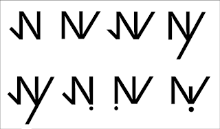
We began our project by looking at Latin symbols and their potential for ligatures (Fig.1.) We then looked at the Latin symbol for city, a triangle with 3 dashes within it.
 
Fig.1
I thought this had potential as by tilting the triangle we found it had direction, offering ‘do you want to go to the city’ as its meaning (Fig.2.) Similar to a 'play' button or arrow.
Fig.2
We then discussed adding the time of meeting next to it, to show how it would work within context. Additionally, we thought each dash could represent a mealtime (| breakfast, || lunch ||| dinner.) 
Yet, we moved on from this idea, as it did not resemble the original word ’city.’
I believe this was a mistake as although this was not yet a ligature, it had potential and plenty of visual meaning. Perhaps the 3 lines could have been bent into to curves to represent the C in city- (((. 

Instead we developed the phrases ‘cos’ (Fig.3) and ‘no way’ (Fig.4.) We found many ways of shortening and compressing these phrases into ligatures with added punctuation, including ! and ? (Fig.5.) This did become striking and obvious- however I think it lacked the symbolism and research that our original city ligature had. 

Fig.3
Fig.4

Fig.5
In future I think it would be best to avoid the obvious, even if it means making the design too vague- this can be refined later. Through the crit I also realised that the ligatures I would like to use myself, were not reconstructions of the original words, but were symbols with research and depth.

Kern Down- Studio Task

Kerning: to adjust the space between individual letters to usually achieve a pleasing effect or establish a specific style.
In this studio activity we were told to change kerning on words to represent a specific industry, two of which were a luxury car and an IT company.

To represent the luxury car company we decided to enlarge the spacing, so it would maintain a bold ‘stand alone’ effect, yet rotate the centre O in order to look like a wheel. By using this rotation the design was no longer as smooth, yet created more attention as the angle was abnormal.

For the IT company we decided to use close kerning to make the letters touch, this was to create a ‘direct’ and ‘instant’ feeling for the efficiency of the company. It was discussed afterwards that negative space should have been considered, as by making the letters touch the design becomes too friendly and personal for an IT company. This is true, yet despite what is usual for an IT company, I think connecting the letters makes them become more approachable to certain customers.

Manipulating Surroundings to Create Typography

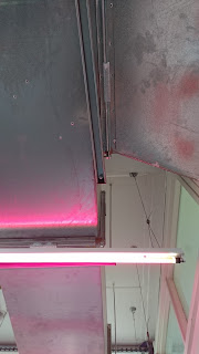
I began this project by observing my surroundings to find lettering. I generally looked at constructions for this, rather than random occurrences in nature. Lines often intersect usefully when they are artificially made.

One of the photographs I took was of an F, illuminated by the overhead light as its crossbar. This led me to explore how artificial light could be used to create lettering- playing on how things written can be temporary and fleeting- just like light. (Fig.1)

Fig 1.
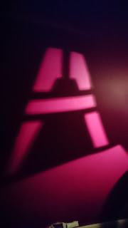
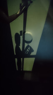
So I cut the shape of a capitol A from newspaper and shined direct light behind it. This was with a similar electric pink, maintaining the vivid manufactured feel. (Fig.2.) However the bright A was juxtaposed with the newspaper's shadow, which I consider to be a natural, organic object. (Fig.3.) From this I wanted to create more scenes that appeared natural but through using light, lettering could be subtly made to shine through.

Fig 2.
Fig.3
After this I experimented with shadow work, using hand shapes and angled legs to create an alphabet, yet I felt this no longer had the subtlety I wanted.

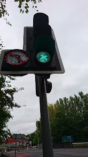
 So I decided to temporarily manipulate the artificial LED light created by traffic lights. By using masking tape over the light to create shapes, they suddenly became illuminated. This meant that the everyday traffic scene was changed by making an X occur for a fleeting moment. (Fig.4.)

Fig.4

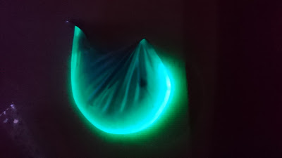
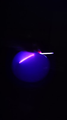
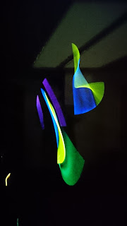
  The florescence of the traffic lights and signs surrounding it led me to explore how glow sticks could be used to make lettering. Using them within balloons allowed a glow and contrast of colours to occur. Their distorted nature led me to consider how distorting light drastically can create such natural, curved letter forms. (Fig.5-7.)

Fig.5

Fig.6


Fig.7


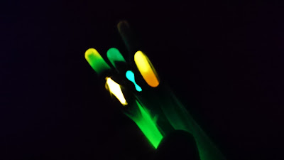
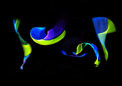
Also by naturally moving the body holding the glow sticks, it created momentary blurs of colour, which I then was able to make into words. Again this was the juxtaposition of natural human behavior and artificial placement (Fig.8.) So I edited the movement photographs to create a word- "Jump." (Fig.9.)

Fig.8
Fig.9
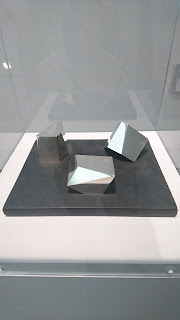
After visiting the Barbara Hepworth, a particular sculpture called "Group of three magic stones" captured my attention. This was a collection of glass stones chiseled to have reflections coming off every angled face. (Fig.10.) It appeared differently from every place it was viewed, making the experience feel unique. This made me consider how light could be bent in such a way to create several beams to collide for letters.

Fig.10 "Group of Three Magic Stones" Barbara Hepworth 1970

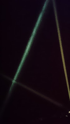
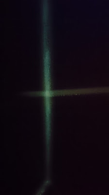
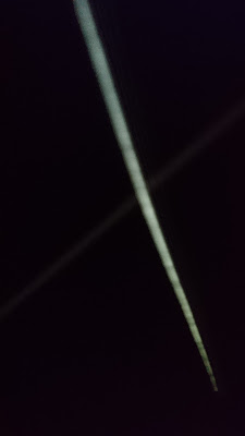
So I developed a box that could refine light to a pinpoint, allowing for it to directly come out in line within a dark room. Then using mirrors I bent the light. This angling and manipulation felt extremely artificial to perform, however the end result was something quite angelic and peaceful. The letters were fleeting and obscure, but the paths crossing felt special to view and added far more meaning to simple letters (Fig. 11-13.)

Fig.11 A

Fig.12 H

Fig 13 X