
Thursday, 1 November 2018
OUGD603 - Personal Specification
In order to make sure I meet the guidelines of the module I have made a spec which I can check against whilst completing a brief. This means that hopefully the work can be pushed to it's best potential.

Saturday, 13 October 2018
Tell a Lie Convincingly - Purpose and Ethics
The Point of this Experiment
We had to consider how this will play out ethically, given that many people were likely to get angry about this if it was believed as fact. Using the LAU branding to convey a policy is definitely unethical. For the purpose of the brief we chose to overstep this, but problems did arise because of it.
- One thing we wanted to draw attention to was that people are likely to believe anything from an authority figure, disregarding their logic and reason. Perhaps this experience will make people reconsider what they trust, encouraging them to think independently.
- Water is something we very much take for granted and the idea of paying for it unthinkable! But it many countries this is the expectation. Perhaps this will make people reconsider the value of a water fountain, making them less inclined to buy bottled water.
- Another point we wanted to make was that an outrageous statement, such as 'we will make you pay for water' is something entirely impossible, having tap water available a legal requirement. But because it is sensationalised people are likely to pick it up, discuss it, pass it on - this encourages agencies of information to 'up the ante' and exaggerate basic information, just to gain significant interest (i.e. Buzzfeed.) In reality we should value the factual information most, to have the most accurate perspective on life we can. Instead we choose to give into 'hot gossip' because it is unexpected and takes us away from 'day to day' life.
We had to consider how this will play out ethically, given that many people were likely to get angry about this if it was believed as fact. Using the LAU branding to convey a policy is definitely unethical. For the purpose of the brief we chose to overstep this, but problems did arise because of it.
- Assuming the identity of an institution can be problematic for its reputation. The 'Water Tax' was so outrageous we hoped that if anyone outside of the university became aware of it they would assume it wasn't real, but if they had believed it, the university would have been obliged to respond. In real life, if a controversial policy was being brought through, an intricate setup would have come before it to 'cushion' the introduction.
- Using their brand was also an infringement of copyright, and if this was applied in an outside setting, there could have been serious consequences.
- Another ethical consideration was how the students would respond to the news. Telling them something is truth and then revealing it as fake, can seem unfair. In somewhere like their university they don't expect to be weary of the legitimacy of what they're reading. Ethically it is wrong. Fortunately the topic was something that didn't involve anything personal, water is something of a necessity but I wouldn't say people are 'emotionally attached' to it. This meant their response was only that of annoyance and easily rectified once the experiment was over.
Tell a Lie Convincingly - The Responce
The People
By handing out the flyers within the university canteen and around the studios, it created an almost immediate buzz. This was unexpected as we assumed many would just see the water tax as an unfounded rumour. Once the official university posters came out, this created a more notably passionate response in people. They were talking about it in hallways and exchanging messages about it. This could possibly have been because our flyers touched on issues such as the new build and papercut credit, linking them both to the water crisis. In some ways this project may have channeled pre-existing problems.


The University
The university's response was fast acting and reasonable, significantly it didn't take long for them to find out about the issue. The administration first discovered it through social media, which is an interesting finding about the significance of an online presence. This was spreading news about the event and was for some reason giving it some legitimacy. It's interesting how an online presence can seem trustworthy, as to an extent it is easier to be held accountable.
Once it was discovered we immediately had to dismantle the project, the escalation went further than we imagined. Since the actual policy was so ridiculous it was shocking that so many people believed it. It shows that people have little faith in what is established as law, believing immediately the institution could force this through.
Friday, 12 October 2018
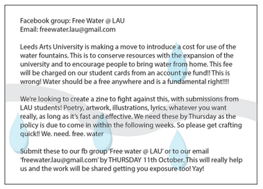
Tell a Lie Convincingly - The 'Water Tax'
For this brief we were asked to create a fake campaign or advertisement that would deceive people into believing it was real. Primarily the results of this will hopefully prove the powerful effect that a piece of design can have, although it should be quite good practice designing in the group setting too.
Our group decided to present the idea that the university is introducing a 'water tax', with posters advertising the policy and separate student flyers to suggest a movement against this. This involved two very separate campaigns and modes of design.
Planning

Student Response
The student flyers were designed to look quick and spontaneous, with simple backgrounds and rough cutting. This gives them a sense of urgency and importance, and a general authenticity. Something so basic allowed the information to be prevalent and bold. I wonder if the designs had been professional and clean cut, would they have had such a staggering response?

The Social Media
A Facebook group was also created in order to present a visual outcome of how many people were interested in the concept. This did build several followers, which evidences how seriously people took the campaign. It shows that if you are the first to respond to 'news' or polices, then you have a natural advantage.

Uni Notice
Whilst these look rough and simple, the LAU design appears professional and to the point. It is designed to fit in within the LAU branding effortlessly. We based the top header to be a variation of the pre-exhisting headers that they have on emails, but with a blue and grey theme to make its link to water clear. Some of the other groups also conducted experiments using LAU branding, but these appeared more considered with a focus on aesthetic, to appear 'appealing'. Ours was very simple, to portray a serious nature. However, its authenticity perhaps worked too well.

Our group decided to present the idea that the university is introducing a 'water tax', with posters advertising the policy and separate student flyers to suggest a movement against this. This involved two very separate campaigns and modes of design.
Planning
 |
| Initial Ideas |

Student Response
The student flyers were designed to look quick and spontaneous, with simple backgrounds and rough cutting. This gives them a sense of urgency and importance, and a general authenticity. Something so basic allowed the information to be prevalent and bold. I wonder if the designs had been professional and clean cut, would they have had such a staggering response?


The Social Media
A Facebook group was also created in order to present a visual outcome of how many people were interested in the concept. This did build several followers, which evidences how seriously people took the campaign. It shows that if you are the first to respond to 'news' or polices, then you have a natural advantage.

Uni Notice
Whilst these look rough and simple, the LAU design appears professional and to the point. It is designed to fit in within the LAU branding effortlessly. We based the top header to be a variation of the pre-exhisting headers that they have on emails, but with a blue and grey theme to make its link to water clear. Some of the other groups also conducted experiments using LAU branding, but these appeared more considered with a focus on aesthetic, to appear 'appealing'. Ours was very simple, to portray a serious nature. However, its authenticity perhaps worked too well.

Monday, 23 April 2018
OUGD505 End of Module Evaluation
Overall this module has gone well as I have outcomes that are grounded in research and each element of these outcomes has full reasoning. I learnt about the importance of deconstructing a project and analysing every relevant piece of research. It is easy to go down one direction yet by conducting thorough research, I realised the direction can change easily when something new and more exciting is discovered.
I particularly enjoyed studio brief 1 as exploring different genres of music is, in itself, something fun to undertake. I realised that when designing, it can be better if you're learning something in the process too. By discovering information it can drive the project much further than designing for topics you are an expert in. The tarot cards are bright, bold and considered - however their handmade aesthetic could be considered by some as unprofessional. Making the cards by hand is reasoned for with the research and as a result makes them look far more authentic than digital designs would have done.
The second project, studio brief 2, was also something I enjoyed because of the research. It is important to remember that making designs can change the way people view things, and this shouldn't be understated. By researching issues with the world it became very eye-opening, especially when viewing other people's presentations. Design is a tool for improving society and doing this project has given me the confidence to believe I can use design for this purpose. The outcomes of the project branding are simplistic and lack finer detail, however they are rooted in research and are all specifically made to improve reading experiences. In the future I hope to go into the book industry so researching the importance of reading was fascinating and useful.
One thing it is important to mention is that within this project I found I lacked motivation in the beginning. This could have been because of other projects taking precedent and a lack of direction. In the end it became clear that a solution would eventually present itself if enough research was carried out. In future I hope to do my work more consistently throughout the module, particularly focusing on research to inspire projects.
Sunday, 22 April 2018
Studio Brief 2 - Final Designs and Evaluation
Here is the selection of all the elements made to help brand book N' brew. The items are mostly coordinated and considered for the content. I am particularly happy with the flyer and the menu, which have kept the book aesthetic well and have been printed on interesting stock. The cup and stickers just use the logo so in turn are more simple - perhaps something more interesting could have been done with this given time. In fact, it would have been interesting to develop a fully illustrated cup.
Something that has particularly worked well from feedback is the book swap idea, getting customers to decorate the package creates a sociable and quirky atmosphere for the shop. Also by having a free service it should attract more students to the shop, encouraging them to read for the experience. I think perhaps though the tokens could have been further developed, although there simplicity means they would be easy to mass produce for a independent cafe.
The drawing of the shop has also been successful as it allows people to visualise how the cafe will look, with all the smaller considerations. In some ways the aesthetic of the shop is the most important aspect of the brand.
Overall however I think this project could have been developed further; the designs are simplistic which was intentional to seem minimalist and contemporary - however in some ways they appear slightly lacking. It is important to consider that the a cafe starting up like this might not have much money so it was vital that each aspect was doable and with a small team's means - for example the tokens have been made with stickers and the book packaging is dependent on customers. Yet even considering this, there should have been more variation within the design - especially within the stickers which need to advertise the business.

Studio Brief 2 - Concept Sketch of Cafe
Here is some concept art i've produce for book N brew, including all the attributes I plan for the cafe to have based on research. This involves:

- A big window for lots of natural light, this is something specified for good reading.
- A chalk board with readers events listed - for people who want social motivation to read and because chalk boards are often used as an aesthetic in book shops.
- Lots of plants, again something that people reported as a pleasant environment to read in.
- A 'Quiet Room' for quiet readers.
- Comfy chairs - to make it easy to sit for several hours reading.

Studio Brief 2 - Smaller Aspects of Design Based on Research
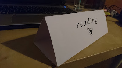
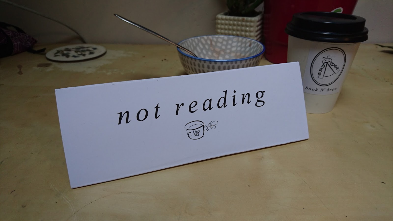
From part of my research I discovered that readers claimed the best environments for reading were ones that had minimal distractions. I decided to develop a way that readers could indicate if they were reading or not. This turned into a triangular sign that would state 'reading' or 'not reading', if 'reading' than the people surrounding the reader should be calm and respectful.


I also decided I would have one room for chatty readers and one room for quiet readers, where people can quietly read without being bothered or judged by anyone else. This was another thing I found from research, as some people said they needed silence to read and some people said they needed a busy environment to read.


I also decided I would have one room for chatty readers and one room for quiet readers, where people can quietly read without being bothered or judged by anyone else. This was another thing I found from research, as some people said they needed silence to read and some people said they needed a busy environment to read.

Studio Brief 2 - Menu Design
In making the menu I took inspiration from LS6 cafe's menu, which is also flat A4 landscape and organises their items into sections. The stock was the same choice as the flyers to show continuity and to keep the book texture going. The menu also contains several terrible book related puns for people to appreciate/cringe at.
There were several variations before the final design involving different ways of arranging the information. I eventually went for simple patterned divides rather than thick lines or shapes. The square in the corner is so I would avoid designing in the space to allow for it to be folded down.


There were several variations before the final design involving different ways of arranging the information. I eventually went for simple patterned divides rather than thick lines or shapes. The square in the corner is so I would avoid designing in the space to allow for it to be folded down.


Studio Brief 2 - Flyer Development
For the flyers for the cafe I wanted them to look like the pages of a book; with simple and flowing text. I looked at the flyer 'Pump n Grind' put out and they had a focus on greeting the customer and saying 'hello', this was something I wanted to recreate.
The first two below were ideas of how to lay out the cover, I thought it could be interesting to add a black shape on the cover with this seemed outside of the aesthetic developed and too random. By curving the text it looks far more animated and like the inside of a book. The background is made up insects shaped like coffee beans - this was a failed logo attempt but it was nice to incorporate it as an aspect anyway.


The first two below were ideas of how to lay out the cover, I thought it could be interesting to add a black shape on the cover with this seemed outside of the aesthetic developed and too random. By curving the text it looks far more animated and like the inside of a book. The background is made up insects shaped like coffee beans - this was a failed logo attempt but it was nice to incorporate it as an aspect anyway.


For the flyer I decided to use a stock that was rough in texture but yellowed like book pages, this worked with the detail well and gave it some authenticity. I also designed it so the corner of the page could be bent over, like marking the page of a book.


Studio Brief 2 - Book N' Brew Book Swap
For part of my research I looked into the idea of book swapping, this came as something students would love as it would be free! From a crit an idea was suggested that free books could be kept in packages and decorated by each person who borrows the book. This decoration would be drawings, messages and reviews of the book.
I hypothesised that this could work in the cafe where if you bring a book into the shop you are given a green token. This token means that you're allowed to borrow a book from the shop. From this you look at all the books and you can see which most appeals to you from the decoration on the packaging. Once read, the book is put back in the package, drawn on, and then handed back to the cafe - potentially in exchange for a token or for another book.
The tokens here are quite simple and could use further development. However I find the decorated packaging quite an interesting an aesthetic and works well to attract students to the concept.


Studio Brief 2 - Coffe Cup and Stickers
Firstly I printed the logo to see how it would work on a coffee cup, this had a simple but coordinated aesthetic - although I think this work better if it was directly printed onto the cup. By using a sticker it more or less just gives an idea of how the design might look on the cup.


Some stickers were also made of the logo to compliment the design and to be placed around the cafe. All the colours used are subtle and simple, this is to maintain the relaxed vibe in the cafe - nothing to bright which could stimulate the senses rather than allowing readers to focus. This are designed to be simple but I think they need detail to be effect. The stock has absorbed a lot of the colour, not allowing it to be as crisp as I would have liked.


Some stickers were also made of the logo to compliment the design and to be placed around the cafe. All the colours used are subtle and simple, this is to maintain the relaxed vibe in the cafe - nothing to bright which could stimulate the senses rather than allowing readers to focus. This are designed to be simple but I think they need detail to be effect. The stock has absorbed a lot of the colour, not allowing it to be as crisp as I would have liked.


Studio Brief 2 - Logo Developments
After doing the sketched designs it became clear that this lady bird design was on of the more successful illustrations. I began by doing a simple digital mock-up of this, focusing on the lines of the main body which were meant to resemble text.

I then experimented with the line thickness to make the illustration seem like it used brush marks. This was to create a more contemporary and soft aesthetic around the design.

There was some concern that the ladybird design didn't seem so mature and appealing to students, so some of the other bugs were scanned just to give an idea of how they could look. Eventually I went back to the original design as I though it had the most potential, these however were useful for other designs.

There was then some experimentation into type, there was some consideration that the type could be placed inside the body, making the design compact.

This uses Kalinga for the typeface and by varying the size and angles it has a playful aesthetic. In some ways the writing worked better in the circle and I received some feedback that this was the better choice - rather than using an illustration.

Eventually smaller details were made to the design, like the detail on the wings and the antenna, making sure everything was aligned and symmetrical. I wanted to develop the illustration further instead of the circle as I thought it seemed like it had the most potential for the cafe, giving it a theme that could be carried forward. Perhaps the circle direction would have created something more mature though.

Then colour variations were made using research into the least distracting colours. These colours were noted as the most easy to view and were less likely to distract in the cafe, the turquoise in particular was explored. However, at this point it became clear that the logo had become something slightly childish. It can be linked to reading but not for adults, it seems more like a kids event with its bright colours, playful type and simplistic illustration.

So then more development was made into ways of making the brand seem more contemporary, a dung beetle was even looked at in order to seem 'cooler' and less obvious. This however was also eventually left behind.

The next thing was some experimentation with using type on the main part of the body as if the wings are revealing the pages of a book. For the this I used a Romeo and Juliet monologue. This did seem a little more contemporary and age appropriate. After feedback there was also some interest in the oval design as it seemed mature and simple but also considered. This was then developed further as a result.

The oval was developed and so was the typeface. Eventually a Sans Serif typeface was chosen in order for it to seem more literary focused. The tracking was changed so it was far apart, making it clear and bold; Aparajita was used for this. Once this was done there some interest in the watercolour circle experimented with, this was taken forward briefly.

In some ways the watercolour effect looked like a coffee ring which was experimented with, this did link it further to the coffee shop aesthetic but I thought overall it crowded the design. By using this watercolour tone it also appeared to be less for students and more for an elderly audience.

This final logo was decided on because its simple lines and negative space appeared professional and contemporary. The illustrations also alluded to a friendly vibe, encouraging students that this cafe is somewhere welcoming.

Studio Brief 2 - Research into Colours that Don't Distract
The Fascinating Neuroscience of Colour
https://www.fastcodesign.com/3027740/the-fascinating-neuroscience-of-color
'Step back for a moment to one of Conway’s biggest findings, which came while examining how monkeys process color. Using a brain scanner, he and some collaborators found “globs” of specialized cells that detect distinct hues–suggesting that some areas of the primate brain are encoded for color. Interestingly, not all colors are given equal glob treatment. The largest neuron cluster was tuned to red, followed by green then blue; a small cell collection also cared about yellow.'

This shows to me that the cafe should avoid using reds, blues and greens as they seem to attract attention quite significantly. A colour that seems to have little to no reaction in the brain is turquoise, this should be used more for signs and detail so that whilst people are reading - their surrounding will only relax them.
Studio Brief 1 - Evaluation
In evaluation, there are certain things that could have gone better with this design. The coloured in effect has a nice tone but in some ways it can be considered slightly messy - perhaps a digitalisation might have allowed for more detail and precision. The titles also could perhaps have done with more experimentation and development.
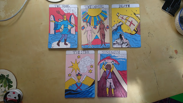
In orther ways though I am quite happy with the design, the main result being that it uses direct influence from research in fado and the history of tarot cards. The images of each card use original tarot scenes but are adapted to suite the a modern fado theme.
The backs of the cards are slightly messy and could have done with more consideration, the concept was good but the execution could have done with more time. It turns out its difficult to paint with glue!

Studio Brief 1 - Final Design
The cards have used a specific colour scheme that has been inspired by the Pamela Colman Smith designs, but these shades are far brighter. This is to make the stand out in the exhibition and to modernise the dull tones she chose for her lithography. Each uses a different colour for the background, this is to make each different and unique. All however use the same blue tone to make the sea theme seem consistent - unifying the cards. Each also has an element of the design that isn't coloured, this is again to show some consistency and to create some contrast with the brighter elements.
The handwritten type isn't very precise, however it has been directly influence by the Pamela Colman Smith cards, using similar serifs and shapes. These replications are more messy however, this is to again add to the handmade style. If the text had been digitalised or too neat, it would have clashed with the illustrations below.
The designs show particular influence from the original tarot style, using curled lines to represent water, strips of sun rays, curly clouds and lined detail for shading. This makes the designs seem more evident that they are tarot cards. I have also used references to 1800 Portuguese sailing, the two ships are based off original illustrations from the time - the clothing also uses direct references.
The backs of the cards are black with the raised designs, this is too contrast with the bright illustrations on the front. Because these parts on the back are designed to be felt it will mean there can be some interaction with the work in the exhibition. It could also be that people are asked to create stories for their future using the cards to mean significant things.


Studio Brief 1 - Production
To make the designs, I made initial sketches, then outlined the designs and finally coloured them in with pencils. This was to give them a more handmade aesthetic, with gentle shading that wasn't too 'digital'. I chose for the designs to be 10.5cm x 15.9cm, this was a measurement that many of the original cards used and I thought it would be most appropriate. Then the designs were scanned in and printed again so stronger stock could be used, several stocks were experimented with.


Several stocks were trialed. Two were variations of a light orange/yellow tone, this was to give the implciation of an aged look for the cards. However these meant that the colour of the designs were understated, they appeared too faded and weathered. Eventually thicker white card was chosen as the final stock in order to give the cards some vibrancy and strength.


Once printed the cards were cut using a craft knife, the corners needed to be curved to be authentic and smooth - playing to the sea theme. So I bought a corner puncher to achieve this.


Then the backs of the cards were painted with glue in order for the designs to be felt as well as seen. Once the glue had dried they were spray painted to be black, ideally making it easier for people to focus on the feel of the cards rather than what they can see on them. This links back to be research in fado and the fact that fado was usually played in near darkness in Portugal during the 1800s.


Subscribe to:
Comments (Atom)