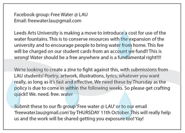
Our group decided to present the idea that the university is introducing a 'water tax', with posters advertising the policy and separate student flyers to suggest a movement against this. This involved two very separate campaigns and modes of design.
Planning
 |
| Initial Ideas |
Student Response
The student flyers were designed to look quick and spontaneous, with simple backgrounds and rough cutting. This gives them a sense of urgency and importance, and a general authenticity. Something so basic allowed the information to be prevalent and bold. I wonder if the designs had been professional and clean cut, would they have had such a staggering response?
The Social Media
A Facebook group was also created in order to present a visual outcome of how many people were interested in the concept. This did build several followers, which evidences how seriously people took the campaign. It shows that if you are the first to respond to 'news' or polices, then you have a natural advantage.
Uni Notice
Whilst these look rough and simple, the LAU design appears professional and to the point. It is designed to fit in within the LAU branding effortlessly. We based the top header to be a variation of the pre-exhisting headers that they have on emails, but with a blue and grey theme to make its link to water clear. Some of the other groups also conducted experiments using LAU branding, but these appeared more considered with a focus on aesthetic, to appear 'appealing'. Ours was very simple, to portray a serious nature. However, its authenticity perhaps worked too well.


No comments:
Post a Comment