Saturday 16 December 2017

Noughts and Crosses - Final Design and Evaluation

Before submitting the Noughts and Crosses cover, I made several more changes in order to ensure the design seemed consistent and professional. I firstly neatened the title letters, making sure the spacing was more even so it appeared less 'random'. I also reduced the thickness of the line, making it seem better detailed. The changes were small and generally just tidied up the design; I edited the girl in the centre so she seemed more precise; I also changed the colour of the nails on the left design to be black rather than white. The people running on the back of the design were removed after much experimentation - they seemed too random and misplaced. After this, the design seemed ready to submit.

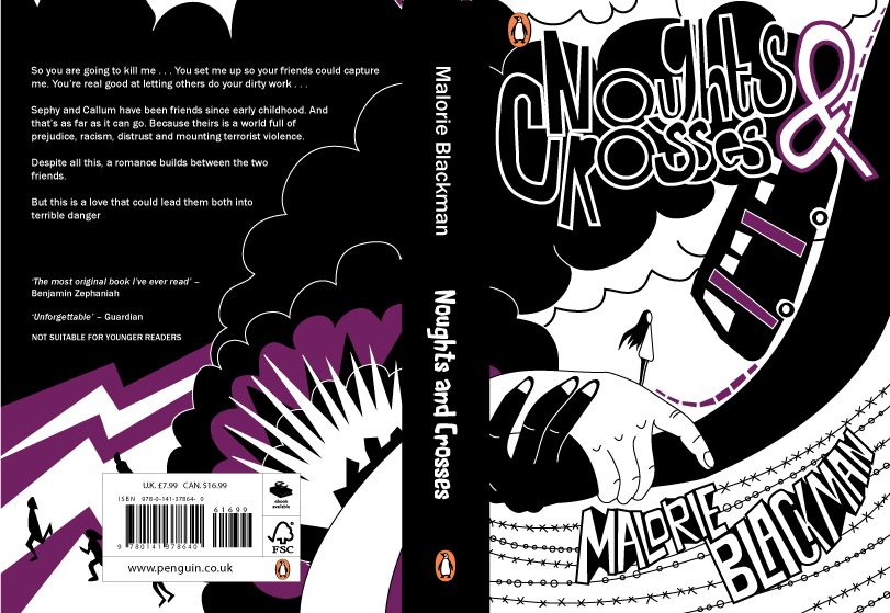
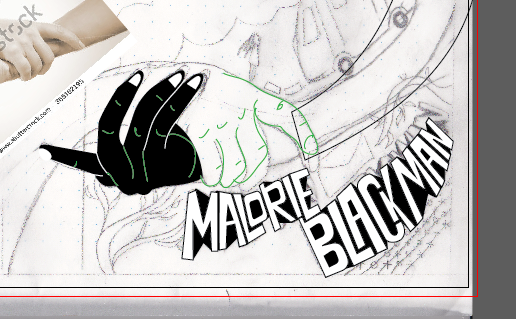
After a small critique it was suggested that perhaps the style of design was too basic: details on the hands for example or the shape of the girl in the centre. A more intricate approach could have perhaps looked more professional. This is a valid consideration, however since the design is for children it needs to be viewable and easily understood by a younger audience. So by using minimal line and rounded shapes it can appear more friendly, balanced with the dark colours of the cover.

Another suggestions was that perhaps the design shouldn't have used black and white so heavily within the design, as this is something that a lot of the entrants might use. However with the accents of purple I think this balances out the appearance. It's also important to convey the nature of the book with the content being very black/white and night/day in nature. Some positive feedback was that the design flows quite well, with the eyes following down the direction of the arms to slowly intake the whole design.


Noughts and Crosses - Design Feedback and Modifications

Overall the feedback on this design is positive so far. People suggested it was bold enough to attract attention and the the angle of the arms offered a direction for the eyes to follow across the design, creating some flow. The hectic design reflects the nature of the book, showing how there is aggression and violence but also a softness - reflected by the rounded edges. There was some thought that the design might be better as a print - perhaps there is too much going on and design distracts from the literature. This design could be better as a dust jacket than a paperback design. 

However, there are still several improvements that could be made to make the design more precise and appropriate for the content of the book. For example it was suggested that the purple colour shown throughout needed to be used more on the front cover in order to be consistent with the back. Perhaps this could be changed so that there are clouds that are purple or there is flash of purple lighting. It was also suggested that the spine might not be quite consistent with the cover as the typeface used for 'Naughts and Crosses' doesn't match the hand drawn style. To improve this I will be experimenting with hand drawing the spine text. Finally it was also suggested that the colour and style of the authors name 'Malorie Blackman' makes it stand out more than the title 'Naughts and Crosses' which could cause some issues.

Friday 15 December 2017

Noughts and Crosses - Design Process

For design inspiration I looked at Patrice Killoffer's cover design for Karl Marx's communist manifesto. I thought he style took quite a playful approach yet also had a powerful, defined effect. It's important that Noughts and Crosses conveys something serious and important but also can still appeal to young adults/children.


To get a balanced design that fitted all the components well I went through several sketches/drafts. I new I wanted to have bold 60s bubble text, so this took several attempts to get the final result. This was to recreate the bold effect of Killoffer's work, but to also connote a 60s style, as the book shows some parallels with the racial tension of the 60s particularly.


After this, the design was drawn out in illustrator and colour was added. It was important that the pallet remain minimal. I decided purple would be best next to the black and white as one of Malorie Blackman's biggest inspirations for the book was The Colour Purple, which I thought should be honoured in some way.


Thursday 14 December 2017

Noughts and Crosses - Colour Pallet

For the colour pallet I decided to use black and white as the combination is bold, striking and goes well with the illustration style. It also signifies as a divide in the community of the story, which was import to relay in the outset. Deciding on the purple colour was more difficult; although I knew it would be purple because of my research into the author Malorie Blackman. 

I didn't want a purple that was too dark as this would have blended in with the black too much, causing there to be little difference. I also didn't want it to be too light as it may have seemed too childish, it was important the colour was strong and significant in the composition. After experimentation I chose the purple that was closest to a red tone, this meant it was vibrant and subtly hints at blood - key to the violence in the story, yet still maintaining the purple tone's significance.

Noughts and Crosses - Previous Covers

Two of the previous covers for Noughts and Crosses share an incredibly similar aesthetic and concept. They use the Noughts and Crosses as the main focal point, with black, white and orange being the colour scheme. It is important that this is steered away from as a style, the design is too cliched and needs remodeling. The first design in particular feels far too mature in its style, almost targeting adult readers in its simplistic approach. 


After researching Malorie Blackman I found out that one of the biggests influences of Noughts and Crosses was the book The Colour Purple by Alice Walker. This was something I researched further and eventually ended up looking into the covers of this classic. I particularly liked the two designs below that took illustrative approaches, this was a style I found I wanted to replicate. It also highlighted the significance of the colour purple itself to me, and I decided I wanted to connoted the roots of Naughts and Crosses with this colour.

Wednesday 13 December 2017

Noughts and Crosses - Burning Anger Experiment

From part of my research I found a quote that surmised the feelings of many characters throughout the story: Looking at our hovel, I could feel the usual burning, churning sensation begin to rise up inside me.' I burnt paper and edited the cover so the burns replaced the Os in the title, there is even the suggestion of a X in the bottom left.

I decided not to take this forward as the design might be considered more applicable for an adult fiction cover. Despite the fact I still want to respect the child audience, this cover is too bland to stand out among other YA novels - it looks more like a crime novel. I also think that although the book is about anger and passion, it is also about more than that - there are many themes. Like with the Romeo and Juliet idea, this cover only conveys an aspect of the story.

Noughts and Crosses - Romeo and Juliet Design Idea

One of the design ideas was to develop a Romeo and Juliet themed cover, that was particularly because of the forbidden nature of Sephy and Callum's romance. There is also a running theme of Callum dreaming of a 'palace with golden walls and silver turrets and marble floors', the turret specifically is something similar to the classic moment Romeo and Juliet have on Juliet's balcony which could be developed a visual. There is also a similarity with the unjust death, could there be a comparison with the poisoning and the hanging?


However, after one quick sketch of this design I decided not to take it forward. Noughts and Crosses is more than a story about romance, its got bigger themes about race, strength and indpendance. By painting it as similar to Romeo and Juliet, it immediately relates to love and romance, which leaves out so much of the story's depth.

Tuesday 12 December 2017

Noughts and Crosses - Conceptual Ideas

Ideas for the cover based on research:
  1. Image of two brown plasters placed in a cross over peachy skin. This could be a photograph or an illustration, symbolising a prejudice and a role reversal. However the problem with this is that it only represents the 'cross' in 'noughts and crosses'. The concept is also quite typical and could do with moving away from the 'noughts and crosses' symbols.
  2. A noughts and crosses game but the grid shows that no one can win.
  3. Could there be a chess board? With the white pieces somehow lower? Although this could be more appropriate for one of the later books 'checkmate'.
  4. One of the quotes, discusses Callum's 'burning anger', could this be visually represented? Figures on fire? Or would that be too intense. The militant organisation in the book leaves a bomb in a shopping centre so perhaps the explosion of this could be shown?
  5. Could the family's private beach be shown? With volcanic black sand?

Monday 11 December 2017

Noughts and Crosses - Research

Plot:
  • People of African decent have gained technological advantage over European people. Causing a social divide between the 'Noughts and Crosses'.
  • Persephone Hadley - cross, is friends with Callum McGregor who is a Nought. This is frowned upon and kept secretly. Especially as their feelings about each other are so strong.
  • Callums Dad and brother join a violent terror organisation (LM) against 'black supremacy'.
  • Callum's sister Lynette commits suicide by throwing herself in front of a bus.
  • Eventually the two friends part and a few years later they meet again when Callum helps abduct Persephone for the LM. This eventually leads to Sephy falling pregnant with Callum's child and Callum is eventually executed. 
Quotes/inspiration:

Looking at our hovel, I could feel the usual burning, churning sensation begin to rise up inside me.’- a lot of the novel reflects anger at injustices – is there a way to reflect 'burning' anger? Paper people burning??

The only thing that was worth a damn was the oaken table. Years before, Dad had cut and shaped it and carved the dragon’s leaf pattern into it, put it together and polished it himself.' - could there be a dragon leaf pattern in the background?

Blackman is able to ‘use Romeo and Juliet style romance to show the complexity of relationships between two different cultures’ (Book Reviews, 2004, pp.227). - perhaps the cover could be a parallel to Romeo and Juliet but with a more sinister edge to it? Especially as there is section towards the end of the novel where because of a misunderstanding the characters are separated. However is this comparison ignoring the socio economic decide to the noughts/crosses divide. Could Sephy be in the golden tower that Callum dreams of living in? 'I live in a palace with golden walls and silver turrets and marble floors...’ I opened my eyes and looked again at my house. My heart sank. I closed my eyes again.’


Noughts and Crosses - Penguin Random House Brief

Brief: 'We are looking for a striking cover design that is well executed, has an imaginative concept and clearly places the book for its market. The cover should encourage children to pick up the book and buy it for themselves and should also engage adults to want to buy it for them.
While all elements of the cover (front, back and spine) need to work together, remember that the front cover has to be able to work on its own, and to be eye-catching within a crowded bookshop setting as well as on screen at a reduced size for digital retailers.'

The winning design will need to:
  • have an imaginative concept
  • be an original interpretation of the brief
  • be competently executed with strong use of typography
  • appeal to the broadest possible audience for the book
  • show a good understanding of the marketplace
  • have a point of difference from other books that it will be competing against in the market
  • be able to sit on the shelves of a supermarket or ebook store as easily as it sits on those of more traditional bookshops
Personal Spec:
  1. The concept needs to be unique, rather than playing to cliches. I especially want to avoid the use of 'noughts and crosses' as it is an obvious approach.
  2. The typography needs to be incredibly considered and experimented with.
  3. The book needs to appeal to an audience of children and adults. It needs to seem exciting but also mature enough that an adult could comfortably read it.
  4. The book needs to fit amongst other books of the 'young adult' genre and pop against competition.
  5. The cover needs to be approached sensitively. One of the key themes of the novel is race and although this should be explored on the cover, it shouldn't be 'over done'. Malorie Blackman has said herself that she wanted the race of characters to be an aspect, but not the definition of their personalities or actions.