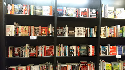
In order to gauge a full
view of the market for the book I looked at the crime section in
Waterstones. This was enlightening as I noticed many of the books has
a big focus on the colour red. They also often use sans serif
typefaces, in a bold, poster style aesthetic. I hope to branch away
from this in order to make the In Cold Blood cover original. The ones
that stand out most use more obscure colours, like yellow or cream
which I hope to implement into some of my designs.

No comments:
Post a Comment