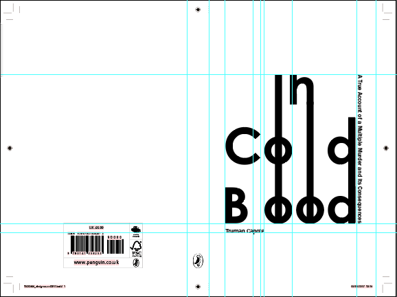
After looking at
previous designs for the book, I thought it would be interesting to
create a design that had the title filling the page, similar to the
first edition, but with a sans serif typeface.
It created quite a
modern, clinical effect. The judge Jim
Stoddart has in the past used a
similar large sans serif as the a main focal point of his book
designs, which suggests it can be considered a modern approach.
The type was then
experimented with so that connections could be made between the
letters. This meant it became more characterful and the need for
guides and alignment became more prominent. This could be
experimented further with to create shapes like binoculars or eyes
with the circular letters, or even with blood drips instead of
extended strips.
For the second
experiment a similar typeface was used, but this time with a circular
grid layout. This was to create a smoother, natural positioning for
the type. It is similar to the previous cover design with clouds and
minimal sans serif type.


This aesthetic is similar to the original
Marber designs for Penguin, the simplicity of the type allows a
humble feeling to be conveyed, plus the artwork can become the main
focus.
Finally, this was a
grid design inspired by the shotgun design, which used very minimal
text on a strip at the bottom of the design. This time I have used a
serif typeface in order to convey the serious nature of the story and
to explore a more classic approach to the design. Adobe Garamond Pro
is quite outspoken, however having it small and organised in a
hierarchy it becomes a balanced addition to the design.


No comments:
Post a Comment