Sunday 12 March 2017

DR ME - Collage experimentation

For the upcoming project we had a visit from DR ME so that we could develop skills in collage for our screen prints. In this we were given a word in pairs which we had to develop a 10 frame gif for.

The word we were given was 'ago' which we decided to suggest by having a women knocking a clock and causing time to go backwards. We were initially just going to use one frame and have time warped whilst the women stood next to the scene. However we thought it would have more progression if there was a narrative of three scenes. In the final scene I suggested we have the clock reappear for some continuity, linking it in a cycle. We included faces in some of the cogs in order to convey a surreal effect, working with the freedom that collage allows.

This has lead me to gain ideas for my Leeds screen print as I hope to create something equally weird and spontaneous.  

DR ME - Process

DR is made up of Ryan Doyle (DR) and Mark Edwards (ME) who met in design school and mutually didn't want to pursue a career in London advertising.

One of their biggest projects they completed was 365 Days of Collage which was a good way of networking and allowed their skills to be honed and driven.


Piece from 365 Days of Collage
They were inspired by Mike Perry who is a pattern based designer and books like Hand Drawn Type. They use many hand made, original methods of design that break away from the modern focus on digital solutions. Cargo Collective is a good website to discover artists and current design work.


Mike Perry pattern design
They suggest you should never be afraid to ask questions and always aim high. They send out a mailer every month so people are reminded of them and their skill set. It is important to build good relationships with a variety of people and those in the industry. In fact, many of their commissions come from online so it is important to have a good website and it is important to collaborate. One of their biggest pieces of advise was to be brave and see new things! You have to be inspired to progress within design.

Work out what you like and go with it.” 

Final Design

For the final design I refined the image of Jesus so that it became smaller and was lowered so that the text could be highlighted. This was a result of the crit feedback as people suggested that it could be more refined if it didn't fill the entire page.

However, because the image size was reduced and the blurb was made thinner, the barcode had to be raised in order for the elements to align. I found it was important that each element on the front, spine and back aligned, this meant that the design was structured and purposeful. This was also something that people responded to in the crit, often people were pleased to see the relationship between elements. 

Aligned elements.
   
Final design.

The Book. A History of The Bible

Because the final cover design had a large emphasis on religion, research was made into the style of old bible work in search of inspiration.

This book interestingly used a similar textured effect on the cover that has been used in the In Cold Blood cover designs developed, it has a rough texture that had been creased slightly to give it realistic wear. This has worked fairly well although it makes it fairly disappointing when you feel the smooth surface of the cover. For my own designs I would specify that the card used for the cover would need to be a matte card, not one that has been glossed.


Looking on the inside it is clear that the old scriptures are very focused on structuring the pages and making them consistent, through pencilled grids. This links to balance and emphasis I have balanced on making the cover and front balanced.


This deign also uses a similar colour pallet which confirms the link to the religious aesthetic. A common colour used throughout is a deep red tone, which I have replicated with a deep purple- adding an element of originality.

Crit Feedback

The design has good use of typeface which has kept the gothic, serious theme to match the content of the book. This could work better without the lines separating the text, or by using lines that could be the length of each title.

The limited use of colour also works effectively. By using a dark violet it has helped to keep the cover original rather than cliché (e.g. by using red.) If you look in the crime section in Waterstones many of the books use a bright red so it is important to have an original colour pallet.

People have said that the cover is eye catching, imaginative and original. The style appeals to a contemporary readership and it cause intrigue, people want to know why Jesus is on the cover. The back cover links back to the Clutter family which links the story together. Religion is also a key them in the book, which has been reflected by the design. It has also been suggested that the cover conveys a theme of 4 which is subtle but effective as it relates to the quadruple murder.

The back cover has been well laid out, but the blurb could be made tighter in the design, as it is close to the edge. The text on the spine could be directly next to each other as differences in colour and size defines them.

The main Jesus image could be slightly smaller and the mugshot sign needs to be placed better, with more contrast. The two images should be seamless and form into one.

Colour Pallet and Typeface

For the final design I used these colours:

This was to branch away from the common use of red, white and black and create a more classic aesthetic. The deep purple derives from the original Jesus painting and the cream comes from the scan of the watercolour paper, giving it a slightly aged look. I decided to make the painting black and white in order to convey how it was past events being documented (similar to how in the original cover the blood was deepened because it was old blood.) I also had to consider how the mugshot and the painting would interact with each other, by making them both black and white it meant they worked better together.

The typeface for the cover was Adobe Garamond Pro and blurb used Garamond in order to convey the serious nature of the book and maintain a classic aesthetic. By having it small and organised in a hierarchy it became balanced with the image and didn't detract too much attention away from the images.


Design Work

Design work began by creating a background that the image could be placed on. There was experiments with blank white and a tea stained effect, however I decided to use just watercolour paper to give it a slightly rough texture, also by bending it slightly it meant that there were areas of the background in shadow. During the photocopying a grey strip on the right was created by mistake, but I thought this worked more for the 60s retro appearance. Eventually however I thought this detracted from the design so did several more photocopies.

I knew I wanted to create a cross effect so I did experiments with just one strip, of Jesus' eyes, leaving the horizontal cross to be made out of the blurb. However this looked unnatural as the blurb was too big, so I swapped it for a strip with a quote written on it which was much more effective. 

Initial strip so blurb could be made into a cross.

Quote added so blurb could run along the side. Grey photocopy mistake included.

Final cross is place on an angle, bent texture of paper remains.
Finally I began by separating the spine from the rest of the design by having two white strips. Eventually I removed these as again they were another unnecessary element, plus in mass production is can be that they might misalign from the spine sometimes. 

Design Ideas

This was a design inspired by the Turkish silhouette cover. The two mean are looming shadows across the Clutter family home. The small addition of orange is to signify they were inside and completely unaware of the danger outside. Although this has worked fairly well in creating a modern approach to the story, the use of 'image trace' to create these designs seems lazy and a common approach. In order to create something original, each element of the figure/design needs to have been considered. These outlines appear ominous with their faces half in shadow, however that was just a fortunate result of editing. For this competition they are looking for clever, elemental responses that break the surface of each story.


This design was to use some research on Richard Hickock who had a head injury as a result of an automobile accident. Some suggest this was the cause of some of his mental health problems and this design explores the link between his facial disfigurement and his desire to murder. Of course this could be considered offensive in some ways, so I have tried to make it so extreme it cannot be linked with reality. The author's name has been placed upside down in order to the show how his story ran parallel to the killers and the project effected his own mental health. The red outline is to suggest Dick's original self is trapped in all these obscure identities.
One issue with it is that it only includes Dick and not Perry, so perhaps if I was to explore the back cover Perry could be placed on there. He also suffered injuries in his troubled past, including leg disfigurement which could have been illustrated as two legs standing next to the blurb. Although this design has potential, it is very similar to many other books on the market. The black, white and red aesthetic is common and the sharp vector illustrations accompanied with bold type has been done before. One thing that has been unexplored is the extreme distortion, many designs are usually not stretched or pulled in risk of looking careless, yet this deliberate approach might be more successful.


This collage uses a painting Perry Smith did on death row of Jesus, which has been spliced with an image of Perry Smith's mugshot. This is to create quite a new angle on Perry and give some insight into his complex personality. He was quite an artistic, thoughtful individual, who perhaps if he had been raised in different circumstances could have lived a very different life. In some respects the story focuses on his misfortune and how Dick is able to lead him into this situation. One of the last things he wrote was a poem about his search for human ties, including 'Perhaps my eyes shall never reach, The light of freedom's skies.' This shows his guilt, which I have highlighted by the juxtaposition with Jesus. Only Perry has been included as he was the killer and was more emotionally deluded and driven than Dick. I hope to develop this cover with a serious, bible-like aesthetic; with simplistic, sans serif type.


There was also an experiment with overlaying the image with Jesus, so they could create a new warped image. Although this did look creepy, the intent of the image was less clear and the hand produced work of the previous design felt more natural than the overly edited design here.


Whilst watching the 1967 film there was a monologue at one point about how tattoos are the equivalent of police badges and club patches, because they signify belonging to a group/ having an identity. I thought It would be interesting to convey this by having a row of arms, each linking to someone in the story, all containing a symbol. Tattoos for the killers, Kansas Police badge for the captors, a farm logo for the Clutter family and Capote's signature or pen brand. This has not been developed past sketches because it seemed like a complex task that would require extremely good editing skills. Within the time limit I don't think I could have produced this well without making it very illustrative and drawing based.


Another idea similar to this was to have a patch of tattooed skin look as if it was sewn onto a police officer's uniform. However this may have looked too grotesque, putting off some of the market.   

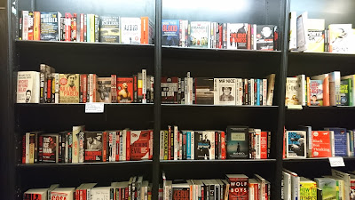
Waterstones Market Research

In order to gauge a full view of the market for the book I looked at the crime section in Waterstones. This was enlightening as I noticed many of the books has a big focus on the colour red. They also often use sans serif typefaces, in a bold, poster style aesthetic. I hope to branch away from this in order to make the In Cold Blood cover original. The ones that stand out most use more obscure colours, like yellow or cream which I hope to implement into some of my designs.

Grid Experimentation

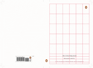
After looking at previous designs for the book, I thought it would be interesting to create a design that had the title filling the page, similar to the first edition, but with a sans serif typeface.
It created quite a modern, clinical effect. The judge Jim Stoddart has in the past used a similar large sans serif as the a main focal point of his book designs, which suggests it can be considered a modern approach.
The type was then experimented with so that connections could be made between the letters. This meant it became more characterful and the need for guides and alignment became more prominent. This could be experimented further with to create shapes like binoculars or eyes with the circular letters, or even with blood drips instead of extended strips.


For the second experiment a similar typeface was used, but this time with a circular grid layout. This was to create a smoother, natural positioning for the type. It is similar to the previous cover design with clouds and minimal sans serif type. 


This aesthetic is similar to the original Marber designs for Penguin, the simplicity of the type allows a humble feeling to be conveyed, plus the artwork can become the main focus.

Finally, this was a grid design inspired by the shotgun design, which used very minimal text on a strip at the bottom of the design. This time I have used a serif typeface in order to convey the serious nature of the story and to explore a more classic approach to the design. Adobe Garamond Pro is quite outspoken, however having it small and organised in a hierarchy it becomes a balanced addition to the design.   

Thursday 2 March 2017

Final Publication- 'Tooth'

The inside pages of the zine used a grid layout in order for the text to be consistent and ordered across the pages. The background imagery was placed anywhere on the page, this was to keep the rough 'punk' aesthetic going. The grid was simple, it was a box on each page that the text or main artwork had to stay within, this meant that as you flick through all the poems start at a similar point, but it doesn't look too ordered/rigid.


Caslon has been used as the text inside the poetry zine. This is because it is a classic type that has a high line contrast in width and tension which means it is elegant. It needed to reference the timeless nature of poetry and reflect the beautiful content people had written. In fact, Adrian Shaughnessy suggests that type 'provides a compelling alternative guide to our past cultural life.'


The cover used to the handmade aesthetic that I had researched, yet it still used a from of balanced layout in order for it to remain organised and collected. Skills in pagination were learnt from making this book and keeping a piece consistent in style and page layout. This is definitely something I want to pursue in future.

Wednesday 1 March 2017

Final Publication Research

For part of this project we were instructed to create a publication. I decided to create a poetry zine in the style of 1970s punk zines.

I looked at several zines for inspiration; they all used hand cut/hand written methods which I wanted to replicate to an extent on the cover. This would mean that the cover wouldn't use a grid as such, but would have pieces of paper cut to look organised on the page.


The illustrations were inspired by Mark Wigan's punk style in order to give the cover vibrancy and to fill the page fully. His designs are full of action and movement, which I felt if confined to a grid might ruin the random and energetic style.