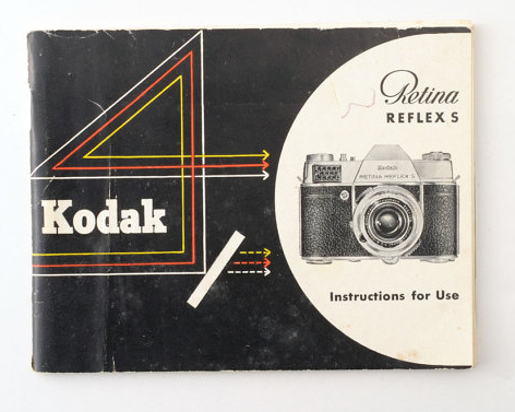
The camera illustration also works well in conjunction with the rest of the design, it appears seamless and there isn't a change in tone that might have been there if a photograph was used. One idea to replicate this would be to screen print the camera pictures or do detailed pencil sketches of them.
Additionally, the type has been successfully used on the cover, with a combination of brand typefaces the page still looks composed. I hope to find similar typefaces if I go down the analog manual route. Since this was made in the 50s I hope to research similar typefaces from the time.
In comparison to the front page, the back of this Kodak manual is plain white with minimal text. This works well to highlight the cover and only adds to the simple style. I understand that this will have been done to cut costs and only design what is necessary, however I like this 'objective' approach.

Another part of the book which I thought had interesting design was the inside pages, which had minimal strips of yellow, with similar edited images of the cameras. This is an interesting use of grid and if I was to replicate it I would experiment with how the page could be arranged like this. It reminds me of the 'Phi grid' used in photography.

No comments:
Post a Comment