Wednesday 18 October 2017

Cover Experiments - Vintage Manual Influence

Each experiment is 4" by 6"so it is the size of an average photograph. This seems like a good constraint to have to focus my design decisions on (for example: appropriate text size, displaying information without overcrowding.)

1. This was an experimental cover in the style of kodak manual I was previously researching. I trialed several different ways of including the camera image in this design and still the result seems a bit 'clunky.' In the original image the photograph is contained in a circle, yet this seemed out of place compared to the rest of the design when I experimented with it. Perhaps there needs to more editing of the photograph to make it blend with the rest of the design? The red strip at the bottom is also in the style of several camera manuals I've looked at, with the modernist approach of just having a practical statement tagged underneath. 


Experiment 1- Black
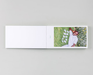
2. This experiment was an accidental result on photoshop, however I think it works well and truly reflects the idea of getting exciting imperfections from film photography. This is something I want to further explore as I can still tie-in the 50s manual aesthetic through elements like typography.

It even reminded me of a 70s punk publication made by The Secret Republic shown below, which follows a similar collage fusion- not focused on perfection but just making an impression; which is overall how film photographs tend to be?


Experiment 2- Aretteia
One thing that each of the example manuals I've looked at have had in common, is that each has aged. They look worn and wrinkled, well loved. This is something I wanted to the guide to also convey, however I didn't want to deliberately damage the publication once it was printed, so I roughed some paper and scanned it in to be a background. This has worked fairly well and could be something I do for all of the pages to give them an aged look.


Experiment 3- Blue
Something I looked at and found particularly inspiring was Surf magazine. This contained beautiful photography and was framed well, with a good use of text. Although my interpretation isn't very similar, it could be developed further to have a similar aesthetic. I particularly like the way the text has been arranged in the top left and right corners, this seems organised and perfect for a photography book.


Experiment 4- Amsterdam

Tuesday 17 October 2017

Amateur Analog 50s Typeface Title Experiments

In order to begin making a guide in the style of all camera manuals I started looking at different typefaces that were popular in the 50s.

  1. CentSchbook BT Roman
  2. Cooper Std
  3. Caslon Bd BT
  4. Bauhaus 93
  5. English157 BT
Century Schoolbook and Caslon have a similar aesthetic to them, look professional and sleek. Although classic, they do not appear dated or 'old', if they were accompanied with the right design they would still hark back to the 50s era without seeming too inaccessible.

Cooper if more famous for its use in the 60s and 70s, however the type was made in the 1920s and has been used throughout the century. Its important to reference the thick, bold style used in the 50s, this is probably the typeface most like the Kodak logotype shown in the manual. With further experiments this typeface could help capture the aesthetic of the Kodak design. Additionally the English157 typeface was tested as it appears similar to the 'Retina' part of the Kodak guide, it was still common to use cursive script in this period, so perhaps it should also be a considered.

Finally Bauhaus seems perfect to reference the film real style, because there are no serifs and the typeface is very streamlined. This will definitely need to be experimented with further.

Binding Techniques Explored

An important aspect of the design for Amateur Analog will be the bind used to hold the book together. The bind can indicate much about the book before its even been read so its important to get this right. I have already decided that the pages will be the size of photographs at 6"x4" in a landscape format, so it was mainly a matter of how best to showcase this.

I have experimented with several different types of bind before choosing to actually have the pages 'loose leaf.' This is in order to have the pages resemble a collection of photos held in a pouch. This would technically involve breaking the brief, which suggests it must use a bind, however this seems necessary to create the most authentic style for my book.


Bind Experiments:

Hardback:


The hardback trial worked in some respects as it gives the book a 'professional' aesthetic, making it feel clean and protected - almost like a camera case. However in other ways it seems to make the content too mature. In actuality the guide is fairly simple and informal, its targeted at amateurs and the information inside is far from definitive - making the hardback approach less appropriate. 

Pamphlet Stitch:


If I was to use pamphlet stitch it would be used landscape, in order for the pages to feel more like photographs. Although this would go better with the informal approach, it might appear too 'easy.' It would not be reflective of the technical designs that would lie on the inside pages. Pamphlet stitch is traditionally used for zines and I wanted this guide to have a more unique approach.

Coptic Stitch:


Coptic stitch was also trialed, which did capture the technicality of analog use. However it felt too exposed and didn't link to the Analog process particularly. I also was debating using glossy paper which would be particularly difficult with coptic stitch.

Loose Leaf Envelopes:


I wanted to create an envelope similar to the one you get given by Boots when you print images. So I made several nets testing different shapes that could be used to hold loose leaf pages. The first design was a fair replica of the one you'd usually be given by Boots, which has an authenticity to it (1). But after a few more trials I created a square, angular design (2) which can be opened to see images inside, involving a spine too which could then be easily place on a book shelf. This would eventually be made with card to maintain a box aesthetic.
This was the most successful as it took a more unique approach and applied the brief from an unexpected angle, that will hopefully suite the content most effectively too.

(1)
(2)

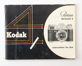
Kodak Retina Reflex Instruction Manual

 One concept idea was to create the guide in the style of a vintage manual, with old materials and a 70s design. One that I found particularly appealing was this Kodak Retina Reflex instruction manual, which has an exciting use of colour against the worn black background. I may experiment using these colours for my own guide as they work well with content, the appearance is stylish but also ideal for amateurs as its not too intimidating. If I want to recreate this angular line shapes I could also look at photo grids to see if there is a pattern I could follow.

The camera illustration also works well in conjunction with the rest of the design, it appears seamless and there isn't a change in tone that might have been there if a photograph was used. One idea to replicate this would be to screen print the camera pictures or do detailed pencil sketches of them.

Additionally, the type has been successfully used on the cover, with a combination of brand typefaces the page still looks composed. I hope to find similar typefaces if I go down the analog manual route. Since this was made in the 50s I hope to research similar typefaces from the time.


In comparison to the front page, the back of this Kodak manual is plain white with minimal text. This works well to highlight the cover and only adds to the simple style. I understand that this will have been done to cut costs and only design what is necessary, however I like this 'objective' approach. 


Another part of the book which I thought had interesting design was the inside pages, which had minimal strips of yellow, with similar edited images of the cameras. This is an interesting use of grid and if I was to replicate it I would experiment with how the page could be arranged like this. It reminds me of the 'Phi grid' used in photography. 

Collation of Ideas

After putting the main ideas into a mind map I have surmised three ideas that could be experimented with.

  • A guide in the style of an old camera manual.
  • A guide that is contained in a photo envelop with similar print elements.
  • A guide that has a lens cut from the cover that allows for better focus on the picture on the inside. 

Monday 16 October 2017

Key Initial Ideas and Critiques

Peer Lead Critique 9/10/17:

  • One of the main pieces of feedback from this was to question the price constraint that George has set me. Originally the set price was £1.50, in order to be a cheap, appealing item for young people. This is very constraining though so it's possible this will need to be discussed.
  • The function dial on a camera could be used- with different pictograms for the elements in the book.
  • The style of old camera instruction manuals, e.g. Kodak/Pentax.
  • Colours: mainly black, stock could even be thin and shiny like that of film negatives. There was also a consideration that red could be used in order to connote the red colour found in dark rooms. A yellowy paper could also be used in order to reference the old content, the paper could even be second hand?
  • The guidebook could be presented in a small folder like when you get photographs developed. Could canisters even be used?
  • Strip design- showing images lined in a diagonal on the page.
  • Reference modernism.

Tutor lead Critique 10/10/17:
  • Do some research into Stefan Sagmeister.
  • Could do a signature for each camera within coptic stitch.
  • The contents could be a contact sheet.
  • Could the guide have a strap to carry it around like a camera would.
  • Could it be held in a blackout bag?
  • Could the book have a view finder? So you have to look through a hole to see the designs in focus.


In order to get some visual reference I've been looking at concept examples on pinterest. Many of these follow a similar colour scheme of black, white and grey, its important to reference this in future designs but not necessarily follow it. Another thing I found particularly interesting was books with holes cut from them, the way it effects the view of the image behind is really effective, as it creates a lot more focus. Doing this board has allowed me to find examples of old camera instruction manuals and the styles that go with these. 

The 35mm Photographer's Handbook

A particular book that I found interesting was The 35 mm photographer's handbook made by Juilian Calder and John Garrett in the 70s.

The book has a black plastic cover which resembles leather in some ways, giving it an authentic feel, breaking away from the normal approach.  The idea of making the book like a film real may seem cliche but as a concept it keeps the book consistent and well stylised. I also like the serif type used as it gives a vintage effect. One thing I would say is that by the cover the viewer is unsure what to expect inside, the cover doesn't quite reflect the illustrative/photo pages found on the inside. Perhaps this is an issue for complete consistency- however I find that it makes the book more enigmatic and surprising, just as developing some photographs can be.


One thing that works really well is the stock on the inside, the yellowed pages feel more orginal and authentic, I am not intimidated by them. The problem with using clean white pages is that it can seem too 'clinical', using yellowed pages means it can appear aged and have a softness. This is something I definitely want to include in my own guide.


Something that particularly stood out about this guide was the illustrations inside. They are incredibly 70s and I imagine are purely intended to be functional, however to me they seem in a particular style. They're angular, with interesting perspectives, perhaps these kinds of illustrations could be used for the guide book.


Another thing it does well is the inclusion of camera illustrations, which is something I could also consider for the guidebook. I've noticed a lot of old guides and photography books contain camera illustrations which could be important to reflect an authentic product.

Sunday 15 October 2017

Analog Research


Key ideas provoked by research:
  • The idea that film photography creates 'permanent' outcomes, rather than digital shots/pixel replications. 
  • Film is about imperfections, how when you take a shot there could be a mistake that create a terrible outcome or something even better. The book could be about imperfections/surprises.
  • They're 'reflections of reality' and are something that can't be faked. Its not forced.
  • The entire process of using a film camera is to get the right exposure, so perhaps that could be the main them of the book- it could even be produced in a dark room.
  • A chemical process- how could chemicals be used within the design?
  • Often if the shutter speed is slow that the movement will be blurred. This could be a concept.
  • If a high rated ISO colour film is used then it can create a 'noisy', 'grainy' effect, this could be stylised.

Current Photography Books

After going to the library and researching current photography books, it became clear that many of them had a repetitive style. Clean white negative space, black and white photographs, minimal text...etc. This is something I need to strive against. After being giving the brief, I had an immediate vision of this minimal book in my head but after realising it is such a common approach I have decided to go against it. Although it meant the photography stood out, the book itself had no presence. This is the main question though- is a book there to purely serve a purpose? Or should it have bearing over the content and add to the reading experience?

A New History of Photography:
The World Outside and the Pictures in our Heads.
By  Ken Schels

Eighteen Days in June
By Robert Buelteman and Robert McDonald

Summer Nights, Walking.
By Harry Callahan

Price Point Change

After a crit with George it became clear that in order to develop this idea to its best potential then the price might have to be raised above £1.50. I still intend to make this is a simple production in order to keep costs down, but its important to not be too constrained with this. Especially as there are many students that are likely to spend more on photography books.

The Book is a Creative Form

Dom's Seminar:

One of the main things that became clear because of the this lecture was about how the concept of the book should drive the design. Little details need to be found in order to show care and consideration has been made over the research. In order to do this the designer should immerse themselves in the content to derive the design. It can be painfully obvious when something has been designed for the aesthetic and not for the concept.

In order to use this advice I am going to make sure I fully research analog photography and use particular elements like photo grids within the images.

Features of the Book:
Discussion with George over potential design ideas, considering each feature of the book.

  • Size: A4 and under, photographs should be large. Could even be same size as a photo.
  • Type: Serif titles/sans serif body text.
  • Colour: Loads of white colour? Colour match photos to pages. Minimalist accenting.
  • Photography: Retro, look at old camera guides.
  • Stock: Cheap- trial some newsprint .
  • Binding: Similar to camera guides, look at 70s books.
  • Finish: Photo paper, camera shutter hole cut out.
  • Grid: Could use photo grids like rule of thirds.
  • Page numbering: Contact sheet?
  • Production: images need to be the priority- CMYK.

Friday 13 October 2017

Village Bookstore Visit - Ben Holmes

Village was made so that self-published books and interesting print publications could be engaged with by Leeds residents. People can exchange knowledge of print and view inspirational books that otherwise wouldn't have had such a good platform. The place contains professional publications from places like New York and Tokyo, but also works from the local people of Leeds.

In the age of the internet thousands of designs are being viewed all the time, simultaneously and quickly without physical consideration. This is fantastic in some ways as it means we are seeing far more than was ever possible, but with things like zines it slows people down. You're not just seeing it, you're smelling it and feeling it- there is complete engagement with the designer's creative output.

Design Studios can often communicate their ethos/aesthetic through a publication or set of publications. Its an ideal way to showcase work but also display skills in layout, texture, production.. etc. For example Library Paper is a collection made by Leeds a collective of Leeds Art Uni alumni.


What Village Looks For:
  • Particular interest in photography books.
  • Every aspect of the book is cohesive and well considered.
  • The book should serve a purpose.
  • The format of the book could communicate the books content. For example 'Funny Money' or 'Till Death Do Us Part'


Age old question is posed: Should you be able to see the hand of the designer or should it be seamless?

Production Variations:
  • Risograph printing can create quite a vintage, screen-print -style outcome. E.g. 'This is the Same Ocean'.
  • Different paper stocks can be used in juxtaposition with each other. For example in 'Surfers phenomena' there is an occasional gloss page, in order for the pictures of the ocean to occasional pop out of the page.
  • Touches like spot varnishing, foiling can have a big impact. It has to suite what you're going to say without being too gimmicky.
  • No book has to be expensive to be interesting. 
  • Inserting external items into the book or varying the page sizes.
  • French folds, so you have to cut in the pages to see whats inside- the book is an experience.

Advice for good publication making:
  • Consider how it will look on the shelf, against all the other publications and if will still catch attention.
  • Publishing isn't necessarily about the money, its about the exposure and the people that will have viewed/connected with your book whilst moving through the shop.
  • The best way to make good books is to read other people's books- a good event for this is Offprint. 

This was one of the most inspirational lectures I've seen on this course, the discussion was clear and useful. It definitely made me want to consider a future in books and alerted me to new concepts that could be used for Amateur Analog.

Thursday 12 October 2017

Brief Switch - Amateur Analog

After researching content for our guidebook, we came in on Monday to find were being paired off to design for another person. This was to ensure we moved out of our comfort zone and tried new and unfamiliar graphic styles. It also meant we could test our collaborative skills and how well we work with someone who we wouldn't usually choose to.

I was partnered with George, and his content is about analog photography; making it a guide for amateurs to be inspired. One of the key parts of his specification was to aim the design at millennials, who have missed the period when analogue was the norm. This means that I will need to ensure it is fresh and modern, without making it too dull or serious. It shouldn't be pretentious either as its meant to be a casual introduction, in order to ease people into the hobby. Another main spec was to have the price quite low, at a suggestion of £1.50. This will need to be a key feature in the production considerations or as a concept it might need to be reconsidered.