Thursday, 31 January 2019

Books by Laptop Cat - Laptop Cat Publishing Logo - Live Brief

Books to be published under 'Laptop Cat Publishing'

Elsie Smith Vampyre Hunter
Edison Blue
Shadowland Books:
  1. The Door into Shadow
  2. The Factory of Souls
  3. World’s End
  4. The Deepest Grave
  5. Demon Hunter
  6. The Tree of Life
These books all share a similar fantasy theme that should be conveyed by the logo design. This could potentially be by giving the cat an expression or persona or even creating some kind of fantastical element in the laptop screen or illustration.

Below is a copy of 'Elsie Smith: Vampyre Hunter' which I previously designed. The Laptop Cat logo would be placed on the spine of this and potentially in the top right hand corner, so the aesthetic must be fitting. Because only two colours have been used, the logo should be similarly minimal but perhaps offering an element of colour. This could be similar to the orange of the Penguin logo which distinctive and attractive against most backgrounds.

Tuesday, 29 January 2019

Logo Research - Laptop Cat Publishing Logo - Live Brief

Book: Branding Element Logos 3 by SendPoints

I decided to research into some other logo branding projects in the book 'Branding Element Logos 3' for their process and their consideration of what makes a good logo. They also had a specific section for animal logos which I thought would be relevant to the 'Laptop Cat' brand and imagery.

I thought this Kennedy's Coffee logo was interesting because of the diagonal fold in the center of the design, marked by some shading on one side. This folding style is quite interesting and reminds me of the Particular logo looked at previously. The idea of showing a logo that has folds could be something useful to try out to link to the pages of a book.

Although this logo does have reference to an animal, it is too modern and 'bubbly' to suite the aesthetic of a publishing house. I hope to create something contemporary, professional and timeless. This will most likely only include minimal to no colour, unlike this peppermint coloured design (of course this is a coffee shop logo).


I then looked at some designs for Morishita Music School by Masomi Fujita. These design are refined and simply illustrated but created a 'warm fuzzy ambience' because of their stamp aesthetic. Using the two slightly textured colour felt like an interesting approach and is something I may experiment with.

The animal shapes show a soft, stylistic approach but don't loose realistic form. Hopefully from development I can create a similar effect. This will involve researching the form of cats are trying to replicate this in a refined and styled way.

Monday, 28 January 2019

Further Logo Research - Laptop Cat Publishing Logo - Live Brief

After doing some research into publishing logos, I noticed several different approaches to the design aesthetic. Some are more experimental and expressive like 'Phoenix Publishing House' and 'Elephantine Publishing', whereas others are simplistic and distinctive like 'Penguin' and 'Walker Books'. This is something I will need to experiment with as both seem to have merit. By making something experimental and colourful it conveys the publishing house as artistic and quirky, it makes them intriguing. However, by taking a more simple, refined approach, the brand is distinctive and trustworthy. It also doesn't run the risk of clashing with or distracting from the design of the book jacket.


Critique

During a peer-lead crit session we discussed the logos above and how the designs could relate to 'Laptop Cat' publishing. Something that was discussed was the fact that Penguin use different colour for the logo in accordance to the genre. It was suggested that a series of different images could be made, like the Phoenix Publishing House logo for if several different genres emerged in the books being created by Laptop Cat Publishing. At the moment they are predominantly fiction books, so only one will be necessary. It is however important to consider future applications that the logo may have.

Because all of the books being published by this buisness are fantasy, it was suggested that the logo could have a small reference to this. For example, the cat could have some kind of personality shown through its expression - making it more of a character than an icon. This is noticeable in the Penguin logo, where the shocked expression is almost charming.

Another thing discussed was the fact that the whole idea of a book is that it isn't digital. Therefore the logo design should not have an outwardly digital or modern aesthetic. I picked out the 'Support Indie Authors' logo because I thought it would be interesting to consider making the logo more 'indie' and 'alternative' since the business is self made, however this design appeared too digitally constructed. The design needs to be something that will last in the future and remain classic and respected. Something too digital and informal might not age as well as something more simplistic.  

Penguin Logo Study - Laptop Cat Publishing Logo - Live Brief

“It started with the simple logo and name, suggested, allegedly, by a typist who was earwigging the board meeting. Allen had already hit upon the idea of an animal logo, inspired by the template offered by the contemporary publishing house The Albatross Library. “It was the obvious answer, a stroke of genius,” said Penguin’s original designer, Edward Young. “I went straight off to the zoo to spend the rest of the day drawing penguins in every pose.” The clear logo was matched with the archetypal modern, but not too scarily modern, typeface, Gill Sans, and the now classic three-band cover, with colours related to the subject: orange for fiction, dark blue for biography, etc.”

- https://www.theguardian.com/books/2001/sep/15/historybooks.features


This logo is simple but classic, it has evolved over time and is completely distinctive. Often a logo's success lies in its simplicity. The process for the making the penguin logo is similar to 'Laptop Cat' as both involve animals. I hope to take a similar approach and do a lot of sketches of cats sitting on laptops, exploring a variety of poses and working on how to simplify these sketches. Another interesting characteristic of the penguin books is that they use different colours for different genres, this is mainly something seen on their 'three-band' covers but could also be something adopted by the logo.

The logo was then developed in 1946 by Jan Tschichold to be more forward facing and encompassed in an oval. Her development is seen below and then general approach to experimentation is something I hope to replicate. In 2003 it was fine tuned by Pentagram's Angus Hyland, into a slightly more modernised aesthetic. This is something which must be considered for Laptop cat. The changes appear to be an increase in thickness, size and general clarity. They have made the modern logo as clear as it can be without loosing any of it's distinctive shape or character.

Sunday, 27 January 2019

Brief - Laptop Cat Publishing Logo - Live Brief

Brief:

To create a logo design for the self-publisher, J.I.Thacker, to unify the books he produces under one name. This company will be called 'laptop cat' and the logo needs to illustrate this imagery. The logo needs to be simple, bold, appealing and playful. Using the logo it will mean that more books by different authors can be published under the same name.

Tuesday, 22 January 2019

OUGD603 - Timeplan

In order to keep better track of my work, I have created a time plan to a lot my time with better organisation. This is definitely adaptable, but this general guide should mean I'm constantly aware of what I need to have done to move on to the next project. I am aware I tend to take longer than is necessary on projects, so this just be good motivation.

Friday, 11 January 2019

60 Second Documentry - Final Video and Evaluation

Final Video

The final video works quite well as a composition. I have used some upbeat and jolly music to make the experience flow better, although it would also work without sound in an outdoor situation. In some ways this could have been developed to be longer than a minute, however, since most people's attention spans are quite short, I imagine most people would click away if it was any longer. Unless they were there for a specific reason.


Evaluation

Overall the video works quite well. The colours are warm and pleasing to look at, making the video more appealing. The music creates a jolly, progressive feel to the overall experience too. It is educational and lighthearted which makes it functional as a video found on social media. However, doing origami is something that most people would directly look for, there isn't 'a hook' as such, which would spontaneously draw people into watching the video. You know where the video is going, nothing unexpected is likely to happen. In fact, the composition feels more like Youtuber content than a viral documentary. With little annotations and an intro and outro clip, it becomes more like an experience.

However, from people's responses it seemed engaging and entertaining which was most important. They particularly liked the stop motion at the end, which could potentially be used for further engagement. Perhaps because this was an unexpected addition at the end, people were amused by it. It is the unexpected or the anticipation of the unexpected that holds the success of many videos.

I also thought it was quite useful watching other people's videos. There was a variety of content and it became more apparent what the the several techniques were for holding people's attention. One's that had music, ones with lots of cuts in footage and ones that directly engaged the viewer worked quite well. In future I would pick a topic that could educate the viewer on something with lots of different cuts and bits of information, rather than one steady tutorial experience.

Thursday, 10 January 2019

60 Second Documentry - Development

Out of all the ideas, the origami whale concept was chosen to take forward. Because of the idea's simplicity I felt that it could be produced and edited well within the time given.

Backgrounds

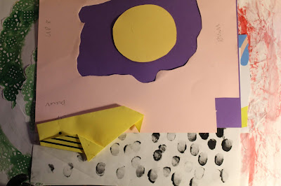
In order to make the video more entertaining I composed backgrounds made of different textures and scrap paper. This felt more 'hand made' yet also something which makes the video colourful and quirky. They give a consistent aesthetic to the video and could be something intriguing if it was to come up on social media.


Title screen

Another thing I looked at was how to make the introduction to the video entertaining and out of the ordinary. I began by developing a digital stop motion title which would flicker between the words 'how to make an origami whale' in slightly different shapes and positions. This meant that there was a juxtaposition between the hand-made style and the digital. From feedback it was suggested that this style created a more professional aesthetic to the video.


Folding Process

For the central folding process, I positioned the tripod directly over the background and made sure my hands could reach underneath. Then I rehearsed the process several times in order to make sure the footage would be seamless. Then, once a successful fold was filmed, the footage was cut together so that the process would fit within 60 seconds and so it was fast paced enough the viewer wouldn't loose interest.


Stop motion

Finally, in order for the video to have another layer of interest, I decided to create a stop motion at the end of the whale traveling across the screen. This worked quite well, although some research should have been done to make sure the ISO remains the same in each image. From feedback it was suggested that this was the best part of the video because it is more unusual. In future this is something I could experiment further with.


Wednesday, 9 January 2019

60 Second Documentry - Initial Ideas

I began generating ideas by brainstorming things I enjoy or I am knowledgeable about. Some of these included 'badass women of history', 'how to brew tea' and 'the origin of tea'. Many of these ideas felt too long to explore in 1 minute and had to be refined to ensure they could be achieved and fulfilled in a short space of time.


Idea 1: Tea For Every Mood'

My first idea was to create a video going through several different teas and their purposes and uses. I planned ways that the teas could travel across the screen using stop motion. However, after some research, it became clear that there is such a wide variety of teas and they have so many different purposes it would be difficult to condense this into one 60 second film. Instead perhaps one tea could be explored for it's properties. Although part of the brief suggests it should appeal to everyone and by only including one type of tea, it may narrow the audience.


Something I looked at which could have been used for the video was a style of stop motion which used tea leaves to tell a story. This could have been interesting to explore further, however this a time consuming process, which would have meant the final video would have suffered in quality. 


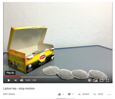
Another interesting video I looked at was a tea box animation, where the teas travel across the scene, brewing themselves. This again could have been an interesting style to explore, although it could have been quite plain without funny comentary or an unusual background.


Idea 2: 'The History of Tea'

http://www.tea.co.uk/tea-a-brief-history

http://www.tea.co.uk/history-of-tea

After doing some research on the history of tea I came across some interesting anecdotes about Chinese and Indian origins with the discovery of tea. This was another idea that I thought could be creatively conveyed through paper stop motion. I actually found a video covering this topic too which was useful, although it meant that the design would have to be quite different to this to be original.


I also printed out some images to experiment with to taste how the stories could be told through simplified collage stop motion. Although the experiment produced interesting results, which could explored further in future, the idea felt too complex to achieve within a week.


Idea 3: 'How to Help a Drunk Friend'

Another idea was to create a tutorial on ways to help a drunk friend. However, I decided that perhaps my knowledge was not extensive enough to approach this topic. Ethically it would be important to give advice that is medically approved and not just general research found online. For example, an accurate depiction of the recovery position might be difficult to achieve without possibly misinforming.


Idea 4: 'Origami Tutorial'

The final idea was to use the paper craft to create an origami tutorial, this felt like an idea that was fairly simple and could be explored thoroughly within the time given. Different types of origami were looked at, originally I thought a crane would work quite well - yet this proved difficult to condense within the 1 minute set up. Instead I studied some origami patterns and thought a whale might work a lot better.


Tuesday, 8 January 2019

60 Second Documentry - Paper Craft Research

Something I wanted to explore a style of video was paper craft animation. This felt like a fun and creative way of making a messaging more memorable an engaging. I watched several tutorials on this which gave me some ideas of techniques that could be used within the video.


I also looked at some more aesthetically driven collage animations, which were chaotic and experimental. Although these were incredibly entertaining they felt too wacky to be educational, they would certainly need to be toned down in order to carry a message. Something historical or fast paced might suite this style, with figures popping in and out rapidly without having to illustrate each individual change in movement.  

Monday, 7 January 2019

60 Second Documentry - Research

Research

I began researching some informative and memorable videos I'd seen online before and thinking about the qualities which made them so popular.

Something I thought was particularly successful was the tea and consent video. Although the illustration and animation is quite a basic level, the composition and voice over make the video humerus and clever. People connect with it because of the clear and simple message. It would be interesting to explore something similarly simple for a different cause.


I also looked at 'The Pushover' which was a skit created by the creator 'KickThePj', which again dealt with a serious topic - alcohol poisoning - in a light-heartened and simplified way. The quirky style of editing and set design, makes the video very entertaining whilst the information is taken in. Again something like this could be developed to advice the population on a serious issue, without making the actual content too serious.


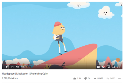
I also looked at a few of the Headspace animations. Although the illustrations are quite simple and short, the designs have been effectively developed to be calming and informative. The smooth transitions are part of the overall experience. Perhaps a meditation video could be produced that takes inspiration from this style. Although some skills in After Effects would have to be learnt.

60 Second Documentry - Brief

7/1/19

Deadline - Friday 11th 12pm

Format - mobile media friendly (tall/portrait)

Audience - everyone 
About something meaningful and relevant. It needs to reflect contemporary culture - the 'fresh and now'. It doesn't have to be serious. Consider punchiness and immediacy.

Consider how it could be viewed without sound? Often scrolling though facebook most things are viewed without sound - in working or busy environments - subtitles?

Monday - Ideas
Tuesday - Concept proof, pitch
Wednesday - Working
Thursday - Working/ 5 min feedback
Friday - Deadline and viewing.