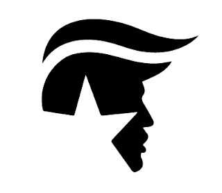
However, for the composition of the sign, we printing many Trump logos and arranged them around a pre-existing element of the cafeteria (~due to research.) This worked effectively in communicating a political statement, as the logos highlighted the word enemy behind it, but this wasn't what we set out to achieve. People responded to it like it was art to understand and respect, not like it was a sign to react to. The destructive behavior we did catch on camera was choreographed, so we could show what we were hoping to achieve. However, I don't think this reflects the raw research we were asked to produce.
One interesting response we did have was that one person photographed the logos and put it on Instagram. This shows that people did change their routine in order to comprehend what the sign meant and were furthering the response on a wider scale.
Video Link: https://www.youtube.com/watch?v=Imi9jrfdkSg
Adrian Frutiger Research:
In Frutiger's Signs and Symbols: Their Design Meaning I researched one of his theories about the combining of signs, he suggests the graphical aspects can create a 'mental, philosophical, or "alchemical" impression.' Especially when certain symbols or elements are combined which can create a symbolic expression or language of its own through 'juxtaposition and combination.' This is why we decided to develop a sign that incorporated a pre-exisiting sign within the background- so the two elements could create an entirely different meaning.
Frutiger also places great importance on the use of duality, maybe this could have been more successful if we had presented the Hilary Clinton logo and placed them side by side. People then might be forced to show which they favoured. Other groups split paths and labeled doors- we could have applied this to political stance. So that most people would be likely to take the door labelled with Hilary's logo.
David Rudnick Piece inspiration:
After doing some research, I found a piece by David Rudnick that I thought related to our signs and the background design already on the wall. This piece works because each of the symbols are simplistic, dark shapes on a background with only one strip of colour. Perhaps our symbols would have worked with more impact if they had been bolder, to transcend the type written behind it. We could redo the Trump logo to just be black, to see if just the shapes (without any colour) could provoke a more direct reaction.
 |
| David Rudnick |
 |
| Trump 2016 campaign logo |


No comments:
Post a Comment