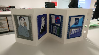
For my final layout I decided to make three concertinas, each with a serrated edge so that had the potential to be torn. Because there was restrictions on printing I decided to make each centre element of the postcard separately and stick it down with raised pads. Then on the back I used corner holders to keep the information in place- to give it a classic and layered appearance. Of course this made each concertina thick and raised, so it was difficult to lay them flat.
For this I decided to create an elastic strap, in order to make it feel
like a pack or collection wrapped together. However the strap was too
loose, this could have been more effective if I had included a button or
some form of attachment that would fasten it closed.
I also wanted to add layers of punched shapes in the concertinas, so they could work layered on top of each other, as well as individual postcards. For example on the front facing postcard I made sure the cut out squares would show small elements of my Otl Aicher inspired design. But cut out squares also meant that light could be shone through the holes, adding another component to the concertinas. As show below, I also raised squares that would fit through the punched holes, so they could appear on the front design and that behind it. People love to interact with elements like this, it derives from childhood to want to connect things together- so I thought including it would mean there was more involvement from the viewer in the information.
In my overviews of designers involved in colour theory, I decided to do illustrations inspired by Milton Glaser's Bob Dylan album design. Each had wild, colourful strands of hair, just using the colours from the pantone. This meant that in doing my research I felt I could connect more with who the designer was and not just what they theorised. I also thought it would be a good way to use the colours in the context of a real design, as a pallet for clothes and hair.


No comments:
Post a Comment